


Sélectionnez ce type de licence lorsque vous développez une application pour iOS, Android ou Windows Phone et que vous intégrez le fichier de fonte dans le code de votre application mobile.
Librum Sans
par Hackberry Font Foundry
Styles individuels à partir de $24.95 USD
Famille complète de 4 polices: $74.95 USD

Librum Sans Font la famille était
conçu par
David Bergsland et
publié par
Hackberry Font Foundry. Librum Sans contient
4
styles et des offres familiales.
En savoir plus sur cette famille
- Aa Glyphs
-
Meilleure offreOffres familiales
- Styles individuels
- Spécifications techniques
- Licences
Par style :
$18.73 USD
Paquet de 4 styles:
$74.95 USD
À propos de la famille Librum Sans Police
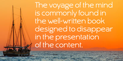
This is the companion sans family to make the Librum serif families work as well as they do. By companion, I do mean stylistically compatible. But mainly, they have the same vertical metrics. So they work very well for run-in heads, inline character styles, and all the rest of the needs in large books with complex formatting. They are designed for use in InDesign, and they work very well in that environment. The fonts use the same OpenType feature files as the rest of the Librum families. The feature files for the italic and bold are more limited—as I have rarely used things like that [over the past 20+ years]. The character shapes are a bit whimsical. The original ancestor of this book design sans was a very playful font I released as Aerle. It’s been calmed down a lot but is still loose and friendly. For a great deal, see
, for a package containing all fifteen fonts!
Concepteurs: David Bergsland
Éditeur: Hackberry Font Foundry
Fonderie: Hackberry Font Foundry
Maître d'ouvrage: Hackberry Font Foundry
MyFonts débout: Jan 19, 2016
Librum Sans

À propos Hackberry Font Foundry
- The Hackberry Font Foundry was founded in the 1998 to sell the fonts David Bergsland designed to be used in his digital publishing training books.
- The goal of David’s fonts is to add a hand-drawn edge to them. In this age of increasing technological “slickness” he purposely loosens the structure and adds “air” to the glyphs with breaks.
- All fonts are designed as OpenType Pro fonts with special production features. Almost all of the fonts have oldstyle numbers as well as small cap figures, plus small caps, discretionary ligatures & special dingbats.
- They really shine in book production.
- The production families have contrasting serif and sans serif families both using the same vertical font metrics—for run-in heads and the like.
- At present he mainly writes and designs books.
En savoir plus
Lire moins
- Le choix d'une sélection entraîne l'actualisation de la page entière.