


Sélectionnez ce type de licence lorsque vous développez une application pour iOS, Android ou Windows Phone et que vous intégrez le fichier de fonte dans le code de votre application mobile.
Manchego
par Fenotype
Styles individuels à partir de $25.00 USD


Manchego Font la famille était
conçu par
Emil Karl Bertell et
publié par
Fenotype. Manchego contient
1
styles.
En savoir plus sur cette famille
À propos de la famille Manchego Police
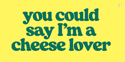
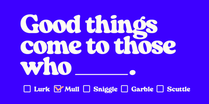
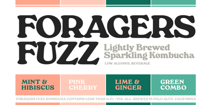
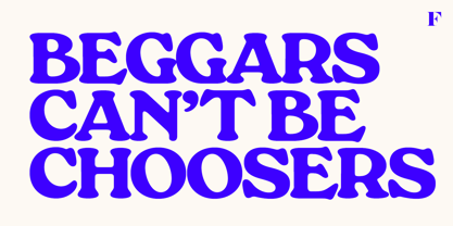
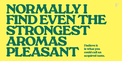
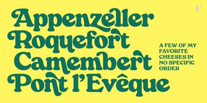
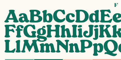
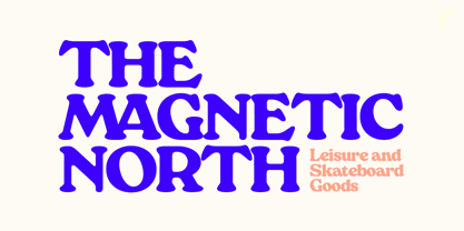
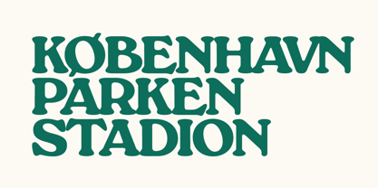
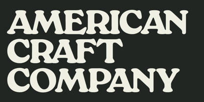
What do you get when you mix iconic Cooper Black from 1922 with an even older font, equally iconic Windsor from 1905? Well of course, you get Manchego!
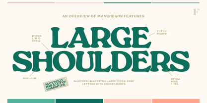
Manchego combines the best of both: the plump features and serifs from Cooper with seriously bold forms, such as the oversized bowl of R, peg-legged N, pinched U and leaning a, h, m & n giving it an adorable retro-appeal. With these distinguishable features Manchego works extremely well with illustrations or can actually be used as an illustration per se.
Despite its vintage charm, Manchego is fully equipped with modern OpenType features. Standard ligatures help with certain difficult character combinations. In addition Manchego sports Swash, Titling & Stylistic Alternates that can be deployed for more original look.
Try Manchego with a bit tighter kerning for more 70s feel.
Concepteurs: Emil Karl Bertell
Éditeur: Fenotype
Fonderie: Fenotype
Maître d'ouvrage: Fenotype
MyFonts débout: Nov 24, 2022
Manchego
À propos Fenotype
Emil Bertell has done it all. Having published his first font files at 16, he was considered to be an international free-font hero while still in his teens. He went on to attend design college, drop out, and become a well-known graphic designer and illustrator. Now one of the most successful type designers from the Nordic countries on MyFonts, the Finland-based designer said in his Creative Characters interview that he’s “had an obsession with visual culture from the beginning.” Before turning his attention to type design full-time, Emil had a very successful career as an award-winning illustrator. “Illustration became my main livelihood,” he said. “I drew painstaking pencil illustrations for magazines, advertising, stamps, etc. I often designed my own fonts for festivals and hand-drew the lettering posters; I also did a few pencil illustrations based on lettershapes, and that got out of hand, so I had to do a lot more of them.” In 2012 he finally made the switch and committed all of his time to type design. Emil first saw success with his Billboard typeface. “It became my first Rising Star on MyFonts and made me realize that I could actually make a living by designing fonts,” he said. “I realized that there’s actually a market out there that I could become a part of.” Throughout the rest of that year he began to see even more success. It began in January, when his font, Mishka, was featured in our Most Popular Fonts of 2011 list. He went on to find a way to bookend the year and was listed among the Most Popular Fonts of 2012 with his Mercury Script design. Since then, his foundry’s success has continued on with best sellers like Voyage and The Carpenter. Fans of the foundry have a lot to look forward to in the near future. Emil will continue to produce beautiful scripts (some coming soon to MyFonts!) and has plans to expand his business.
En savoir plus
Lire moins
- Le choix d'une sélection entraîne l'actualisation de la page entière.