


Sélectionnez ce type de licence lorsque vous développez une application pour iOS, Android ou Windows Phone et que vous intégrez le fichier de fonte dans le code de votre application mobile.
Milibus
par Typodermic
Styles individuels à partir de $69.95 USD
26% Off
Famille complète de 8 polices: $109.95 USD

Milibus Font la famille était
conçu par
Ray Larabie et
publié par
Typodermic. Milibus contient
8
styles et des offres familiales.
En savoir plus sur cette famille
- Aa Glyphs
-
Meilleure offreOffres familiales
- Styles individuels
- Spécifications techniques
- Licences
Par style :
$13.74 USD
$10.17 USD
Paquet de 8 styles:
$109.95 USD
$81.36 USD
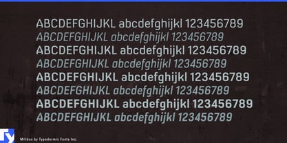
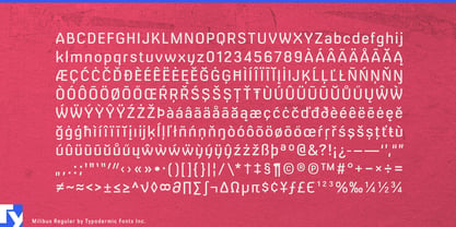
À propos de la famille Milibus Police
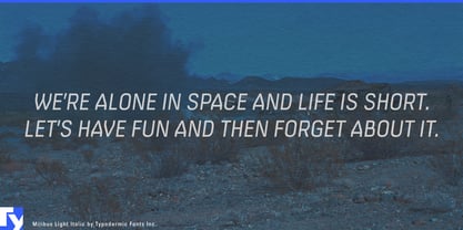
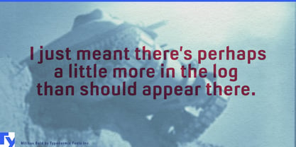
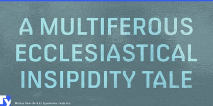
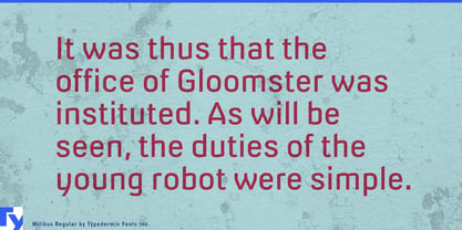
Prepare to revolutionize your designs with Milibus, the sans-serif typeface that defies the laws of conventional typography. This groundbreaking typeface isn’t just a collection of letters—it’s a precisely calibrated instrument for visual communication, as meticulously engineered as a particle accelerator.
Milibus emerges from the collision of utilitarian alphabets and cutting-edge design, fusing the DNA of DIN’s clarity with the binary precision of 1980s plotter fonts. The result? A typeface that speaks the language of science with the eloquence of art. Its robotic angles aren’t just design choices—they’re calculated vectors, each stroke a trajectory plotted with mathematical perfection. Observe Milibus under the microscope of design scrutiny, and you’ll discover a universe of detail. Its angle-cut stroke endings, reminiscent of industrial typefaces like Expressway, aren’t mere aesthetics—they’re functional elements that enhance readability at the quantum level of typography. Each character is a testament to the principle that form follows function, yet transcends it to achieve a beauty as profound as the golden ratio.
But Milibus isn’t content with theoretical excellence—it’s built for practical application across the spectrum of scientific and technical communication. Available in three weights and their italic counterparts, Milibus adapts to your design environment with the flexibility of a stem cell. From academic journals to aerospace schematics, this typeface transmits information with the clarity of a laser and the impact of a supernova. Milibus speaks fluently in the diverse dialects of European languages, its linguistic range spanning from Afrikaans to Zuni. This versatility ensures that whether you’re drafting a paper on astrophysics or designing a user interface for a multilingual research team, Milibus maintains its structural integrity across alphabets and accents.
Choose Milibus when your designs demand the precision of a Swiss watch and the innovation of a space probe. In the grand experiment of design, Milibus stands as proof that typography can be both a science and an art, a perfect fusion of logic and creativity.
Concepteurs: Ray Larabie
Éditeur: Typodermic
Fonderie: Typodermic
Maître d'ouvrage: Typodermic
MyFonts débout: Aug 9, 2006
Milibus

À propos Typodermic
Welcome to Typodermic Fonts, a spirited type foundry rooted in Nagoya, Japan, started by the Canadian typeface designer, Raymond Larabie in 2001. Our library brims with 500+ diverse typefaces to fuel creativity in graphic design, advertising, web, and app development. As digital type pioneers, we adopted web fonts and app licensing early, consistently pushing the design envelope. With Canadian heart and Japanese precision, we're your global partners in extraordinary typography. Explore Typodermic Fonts—where creativity meets character.
En savoir plus
Lire moins
- Le choix d'une sélection entraîne l'actualisation de la page entière.