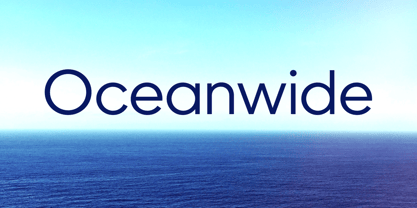
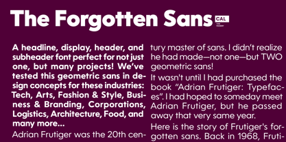
A font perfect for not just one, but many projects! Introducing Oceanwide Pro, a sans that loves to be used in just about any situation! Designed with ultra clean lines and versatility in mind, Oceanwide wants to be your new favorite sans!
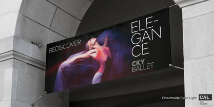
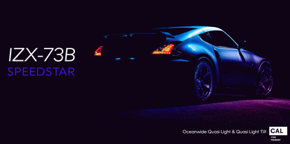
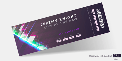
Oceanwide’s ultra clean letters work anywhere you want to communicate orderliness and competence, and designed to build trust and rapport with your audience. Its wide proportions make it ideal for display and logo use.
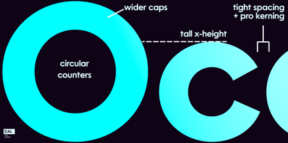
Oceanwide especially shines for white/bright letters on black/dark backgrounds! That’s because the inside shapes are nearly perfect circles in many weights.
Here's a quick video tour of Oceanwide Pro by Dave Lawrence, including all the great things Oceanwide can be used for!
We've tested Oceanwide for these industries, with stunning results!:
- Tech
- Arts
- Fashion & Style
- Business & Branding
- Corporations
- Logistics
- Architecture
- Food
- and many more...
Oceanwide can be used for:
- Headers
- Subheadlines
- Logos
- Even body text, if tracked.
- Print & Screen
The styles it can take are also many. It's great for:
- Modern/minimalist design
- Flat design
- Cut out design
- User Interface (UI)
- Technical designs
- In combination with text effects, even for grunge and other situations.
- And many others...
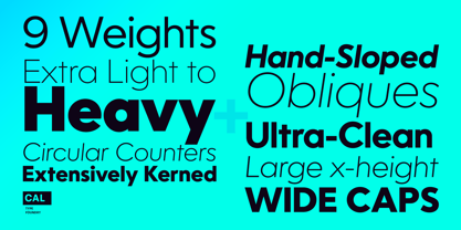
DESIGN FEATURES
- Simplicity
- Tall x-height
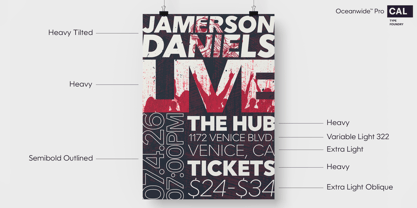
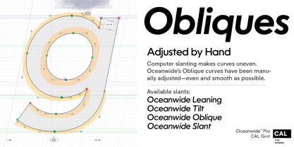
- Hand-sloped obliques (italics)
- Narrow spacing
- Semi-wide proportions
- Expert kerning
- Well proportioned, usable lights & extra lights
- Large caps
- Great ALL CAPS MODE
- Uppercase punctuation
- Uppercase spacing with California Type Foundry’s Smart Tracking™
- Advanced fraction support
- Proportional lining figures
- Thick joins
- Smooth curves
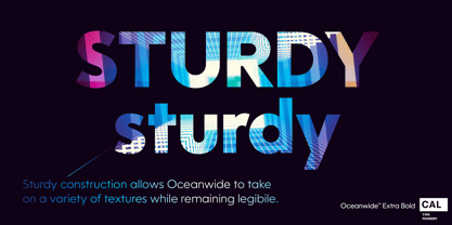
- Sturdy—great for textures and effects
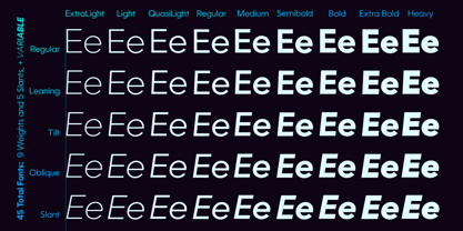
- Variable font available
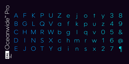
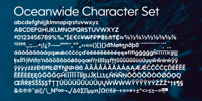
- Latin Pro character set for Central European languages. That's the writing for over 782 languages and transliterations worldwide!
DESIGN STORY—THE FORGOTTEN SANS
by Dave Lawrence, Lead Designer, California Type Foundry
Adrian Frutiger was the 20th century master of sans, but I didn't realize he had made—not one—but TWO geometric sans!
It wasn't until I had purchased the book “Adrian Frutiger: Typefaces”. I had hoped to someday meet Adrian Frutiger, but he passed away that very same year.
Here is the story of Frutiger's forgotten sans. Back in 1968, Frutiger was approached by Pentagram to make a design for British Petroleum. They wanted a "new version of Futura". However, they wanted him to make a couple adjustments. First, they felt that Futura was "too fiddly." By this, they meant that it narrowed too much at the joins. (Joins are for example where the round and straight parts of the 'd' meet.) This is something that is necessary for small print text (to prevent ink clogging), but is not necessary at large sizes.
Second, they wanted it to be entirely geometric, using the circular shape with minimal optical corrections.
Unfortunately this font was not even used very consistently in the BP brand. A haphazard mix of Futura and Frutiger's BP font ensued. It was then replaced by another font design very soon after.
My design is different in several ways. First, the commas and quotes are a more modern style. I tried his original commas, but these just didn’t work to 21st century eyes. Second, in his drawings, Frutiger went for a more standard u with a downstroke on the right. However, Oceanwide has a simpler u.
Third, I made more optical adjustments. At the direction of his employer, Frutiger reluctantly put no font optical corrections into the letters. So I think my optical adjustments are similar to what Frutiger would have wanted.
Fourth, I extended the weight into the light and extra light ranges.
Fifth, the rest of the font I created according to the principles of Adrian Frutiger, but with no sources for inspiration.
Here is Frutiger’s design philosophy, in his own words: “If you remember the shape of your spoon at lunch, it has to be the wrong shape. The spoon and the letter are tools; one to take food from the bowl, the other to take information off the page... When it is a good design, the reader has to feel comfortable because the letter is both banal and beautiful.”
The words about the spoon were the ones I kept in my mind as I tried to make the curves ultra smooth, and the shapes ultra simple.
Hopefully this font is a worthy successor to the font that inspired it.
Released on the 93rd birthday of Adrian Frutiger, to celebrate the life and achievements of this amazing designer.
———————
Simplicity. Versatility. Oceanwide.