


Sélectionnez ce type de licence lorsque vous développez une application pour iOS, Android ou Windows Phone et que vous intégrez le fichier de fonte dans le code de votre application mobile.
Palamecia™
par Typodermic
Styles individuels à partir de $69.95 USD
26% Off


Palamecia Font la famille était
conçu par
Ray Larabie et
publié par
Typodermic. Palamecia contient
1
styles.
En savoir plus sur cette famille
À propos de la famille Palamecia Police
Palamecia: where organic design meets digital resilience. This Typodermic Fonts creation is a testament to the evolution of typography in the age of diverse display technologies.
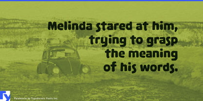
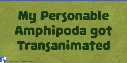
At first glance, Palamecia’s playful, almost cartoon-like appearance belies its sophisticated engineering. But look closer, and you’ll see a typeface forged to thrive in the challenging landscape of modern interfaces. Each character is a survivor, designed to maintain its integrity across a gauntlet of pixel densities and resolutions. Palamecia’s unique genesis sets it apart from its peers. Born not from the fluid strokes of a pen, but sculpted from digital clay, each letter is the result of meticulous chiseling and chipping. This unconventional approach yields forms that are both rugged and refined—letters that look as if they’ve been weathered by digital winds yet remain crisp and legible.
In user interfaces, Palamecia truly shines. Its ability to pierce through the fog of varying display qualities makes it an invaluable tool for designers grappling with the challenges of responsive design. From high-resolution retina displays to low-density screens, Palamecia stands its ground, ensuring your message remains clear and impactful. But Palamecia is more than just a workhorse for UI/UX designers. Its organic, slightly whimsical character lends itself to a wide range of applications. In branding for tech startups, it communicates innovation with a human touch. In children’s educational apps, it brings a friendly, approachable feel without sacrificing legibility.
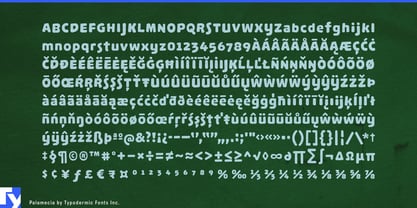
Moreover, Palamecia speaks a multitude of languages. Supporting a vast array of Latin-based European writing systems, from Afrikaans to Zulu, it ensures your designs can traverse linguistic boundaries without losing their distinctive character. Palamecia is a bridge between the organic and the digital, the playful and the precise. It’s for designers who understand that in the digital age, true versatility comes not just from aesthetic appeal, but from the ability to adapt and thrive across diverse digital ecosystems.
Ready to infuse your designs with organic resilience? Get Palamecia today. Because in a world of ever-changing displays, your typography should be a constant—not a compromise.
Concepteurs: Ray Larabie
Éditeur: Typodermic
Fonderie: Typodermic
Fonderie d'origine: Typodermic
Maître d'ouvrage: Typodermic
MyFonts débout: Jul 25, 2012
Palamecia™
is a trademark of Typodermic.

À propos Typodermic
Welcome to Typodermic Fonts, a spirited type foundry rooted in Nagoya, Japan, started by the Canadian typeface designer, Raymond Larabie in 2001. Our library brims with 500+ diverse typefaces to fuel creativity in graphic design, advertising, web, and app development. As digital type pioneers, we adopted web fonts and app licensing early, consistently pushing the design envelope. With Canadian heart and Japanese precision, we're your global partners in extraordinary typography. Explore Typodermic Fonts—where creativity meets character.
En savoir plus
Lire moins
- Le choix d'une sélection entraîne l'actualisation de la page entière.