


Sélectionnez ce type de licence lorsque vous développez une application pour iOS, Android ou Windows Phone et que vous intégrez le fichier de fonte dans le code de votre application mobile.
Parto
par Naghi Naghachian
Styles individuels à partir de $78.00 USD

Parto Font la famille était
conçu par
Naghi Naghashian et
publié par
Naghi Naghachian. Parto contient
2
styles.
En savoir plus sur cette famille
À propos de la famille Parto Police
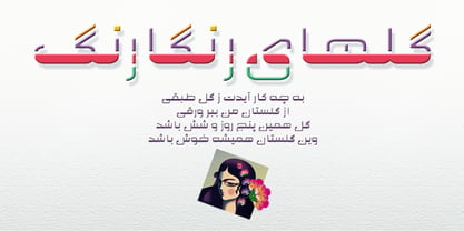
Parto Font family is designed by Naghi Naghashian. This Font is developed on the basis of specific research and analysis on Arabic characters and definition of their structure. This innovation is a contribution to modernization of Arabic typography, giving the font design of Arabic letters real typographic arrangement and providing more typographic flexibility. It enables, moreover, the use of this typeface for decorative headlines. This step was necessary after more than two hundred years of relative stagnation in Arabic font design.
Parto supports Arabic, Persian, and Urdu. It also includes proportional and tabular numerals for the supported languages. Parto Font is available in Regular and Bold.
Parto design fulfills the following needs:
A Explicitly crafted for use in electronic media fulfills the demands of electronic communication.
Parto is not based on any pre-digital typefaces. It is not a revival. Rather, its forms were created with today’s technology in mind.
B Suitability for multiple applications. Gives the widest potential acceptability.
C Extreme legibility not only in small sizes, but also when the type is filtered or skewed, e.g., in Photoshop or Illustrator. Parto's simplified forms may be artificial obliqued in InDesign or Illustrator, without any loss in quality for the effected text.
D An attractive typographic image. Parto was developed for multiple languages and writing conventions.
E The highest degree of geometric clarity and the necessary amount of calligraphic references. This typeface offers a fine balance between calligraphic tradition and the contemporary sans serif aesthetic now common in Latin typography.
Concepteurs: Naghi Naghashian
Éditeur: Naghi Naghachian
Fonderie: Naghi Naghachian
Maître d'ouvrage: Naghi Naghachian
MyFonts débout: Mar 29, 2012
Parto
À propos Naghi Naghachian
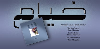
Naghi Naghashian was born in Teheran. After completing his school education in Iran, he studied illustration and book design at the Hochschule fuer Gestaltung (HfG), an academy of design, in Offenbach, Germany. Thereafter he was engaged as art director in various advertising agencies in Germany, Switzerland and England. He also worked as a freelance graphic designer with focus on illustration and brand designing for leading producers of brand articles in Europe, and also for broadcasting stations in Germany and other European countries. He was occupied with theoretical work in the field of color and research in the passive perception of color and after image phenomena. He carried out an analysis of the letters of the Arabic alphabet and a definition of their structure, enabling him to design a number of modern types of Arabic script. Naghi Naghashian created over twenty font families for Latin and Arabic characters. «Illustrated quatrains of Omar Khayyam» in four languages, English, French, German and Persian, «Geometrie als Mysterium» in German and «Design and structure of Arabic script» in English and German are his most recent publications.
En savoir plus
Lire moins
- Le choix d'une sélection entraîne l'actualisation de la page entière.