


Sélectionnez ce type de licence lorsque vous développez une application pour iOS, Android ou Windows Phone et que vous intégrez le fichier de fonte dans le code de votre application mobile.
Perron
par Fontforecast
Styles individuels à partir de $29.00 USD
Famille complète de 7 polices: $69.00 USD

Perron Font la famille était
conçu par
Hanneke Classen et
publié par
Fontforecast. Perron contient
7
styles et des offres familiales.
En savoir plus sur cette famille
- Aa Glyphs
-
Meilleure offreOffres familiales
- Styles individuels
- Spécifications techniques
- Licences
Par style :
$9.85 USD
Paquet de 7 styles:
$69.00 USD
Perron No3 Family
3 policesPar style :
$18.00 USD
Paquet de 3 styles:
$54.00 USD
Perron No2 Family
2 policesPar style :
$24.50 USD
Paquet de 2 styles:
$49.00 USD
À propos de la famille Perron Police
Meet the successor of our bestselling design kit 'Chameleon': Perron. The concept of designing multiple contrasting designs under the same name was first introduced by Fontforecast in TyfoonSans and TyfoonScript. Two font families that were designed to complement each other. And that's exactly what this new release does. With the three designs in Perron, which means 'platform' in dutch, you will be able to take your design projects where ever you want them to go.
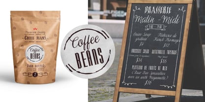
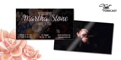
This flexible kit consists of 7 fonts in three basic designs, and when combined Perron No1, No2 and No3 reïnforce each others charm. This offers great potential for creating lively layouts for many different projects, e.g. invites, menu's, magazines, brochures, packaging, greeting cards, T-shirts, etc.
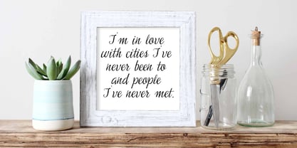
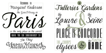
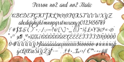
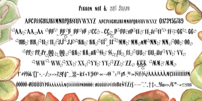
Perron No1 is a serif display font with large and small Caps. This font requires an Opentype savvy application to reach its full potential. Turn on contextual alternates and beginning and ending characters are replaced by their alternative versions, as you type. Stylistic sets and swashes offer even more variations.
Perron No1 comes in two versions: No1 and No1 Shade. They can be used separate or layered for a colorful or shaded effect (if your application allows you to stack text frames).
Perron No2 is a charming handwritten font, with slightly rough contours, that was added for an extra personal touch. It comes in regular and Italic.
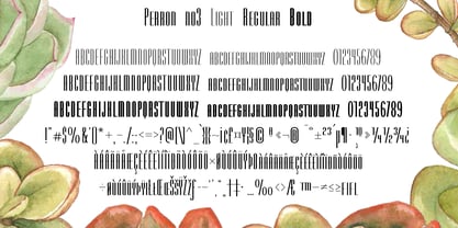
Perron No3 is a clean, tall and very skinny font family. It has large and small Caps and comes in three weights: Light, Regular and Bold. Because of its clean appearance No3 adds a modern touch to the design kit.
Concepteurs: Hanneke Classen
Éditeur: Fontforecast
Fonderie: Fontforecast
Maître d'ouvrage: Fontforecast
MyFonts débout: Feb 21, 2014
Perron
À propos Fontforecast
Hanneke Classen started Fontforecast in 2013 as a label of Storm Creative Consultancy, an advertising agency where she works to this day as a graphic and type designer. “Working with fonts as a designer day in, day out made me curious about the process of designing fonts,” she says. “As soon as I dived into the ins and outs of font design, I was hooked.” It was in that same year that she finished work on her first two font families: Tyfoon Sans and Tyfoon Script. “The concept was to combine two very different designs in such a way that they work together well. By using the same measurements as a skeleton for both font families they became interchangeable, even in the same sentence, without causing leading problems.” “The concept of making font families consisting of different designs especially made to complement and support each other was relatively new at the time Fontforecast started,” Hanneke says. “My aim is to give all of my font families a certain something extra.” This drive to push the envelope gave way to bestselling typefaces Chameleon, a design kit of 16 fonts intended to bring a personalized touch to any project, and Salt & Spices Pro, a modern collection of 9 calligraphy fonts that brings to life an authentic feel of vintage dip pen calligraphy. There is much to look forward to in the future from the Netherland-based foundry. Marloes Versluys, an Amsterdam-based art director, graphic designer and type designer, is joining the foundry and working with Hanneke to continue making a wide variety of typefaces perfect for any, and all projects.
En savoir plus
Lire moins
- Le choix d'une sélection entraîne l'actualisation de la page entière.