


Sélectionnez ce type de licence lorsque vous développez une application pour iOS, Android ou Windows Phone et que vous intégrez le fichier de fonte dans le code de votre application mobile.
Preface®
par Shinntype
Styles individuels à partir de $39.00 USD
Famille complète de 12 polices: $198.00 USD


Preface Font la famille était
conçu par
Nick Shinn et
publié par
Shinntype. Preface contient
12
styles et des offres familiales.
En savoir plus sur cette famille
- Aa Glyphs
-
Meilleure offreOffres familiales
- Styles individuels
- Spécifications techniques
- Licences
Preface 2
6 policesPar style :
$16.50 USD
Paquet de 6 styles:
$99.00 USD
Preface 1
6 policesPar style :
$16.50 USD
Paquet de 6 styles:
$99.00 USD
À propos de la famille Preface Police
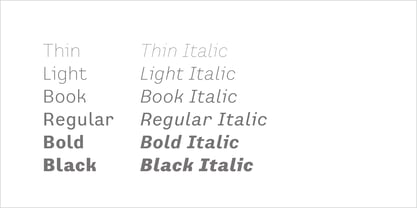
Preface vs. Helvetica/Futura/Gill: a different strategy of text color. Whereas the established classes of sans serif typeface achieve a dynamic balance between stroke and space by combining a diversity of letterform with an evenness of fit, Preface switches the emphasis, driving out diagonals to create a dominant harmony of curves and perpendiculars, matched with a greater variety of inter-character space shapes—the result of extra width introduced in the “f” and “t”, and by the openness that accompanies the wide tails of the “ a” and “l”, the long ear of the “r”, and the serif of the “i”. En masse, and in keeping with the present trend in typography, Preface exhibits a coarser texture than the traditional sans serif faces, but one that is nonetheless even and precise. With tabular, oldstyle figures.
Concepteurs: Nick Shinn
Éditeur: Shinntype
Fonderie: Shinntype
Maître d'ouvrage: Shinntype
MyFonts débout: Feb 20, 2004
Preface®
is a registered trademark of Shinn Type Foundry Inc., and Shinntype is a registered trademark of Shinn Type Foundry Inc.

À propos Shinntype
These are Nick Shinn’s designs, firmly rooted in the best of the European and North American typographic tradition as it continually evolves. They are solid in text, providing all the bells and whistles of expert typography, and smart in display, with an impeccable attention to detail. Building on his experience as an art director and graphic designer in the 1980s and 90s, and as a pioneer of digital media, Nick launched Shinntype—one of the first online type foundries—in 1998. Shinntype now presents a rich and eclectic catalogue of unique fonts, tailored to contemporary taste.
En savoir plus
Lire moins
- Le choix d'une sélection entraîne l'actualisation de la page entière.