


Sélectionnez ce type de licence lorsque vous développez une application pour iOS, Android ou Windows Phone et que vous intégrez le fichier de fonte dans le code de votre application mobile.
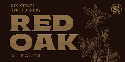
Red Oak
par Resistenza
Styles individuels à partir de $49.00 USD
Famille complète de 24 polices: $180.00 USD
Red Oak Font la famille était
conçu par
Giuseppe Salerno,
Paco González et
publié par
Resistenza. Red Oak contient
24
styles et des offres familiales.
En savoir plus sur cette famille
- Aa Glyphs
-
Meilleure offreOffres familiales
- Styles individuels
- Spécifications techniques
- Licences
À propos de la famille Red Oak Police
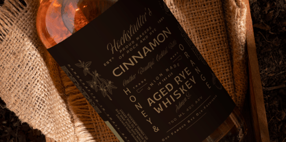
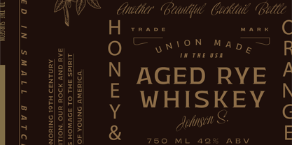
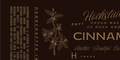
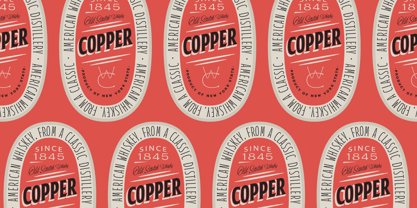
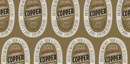
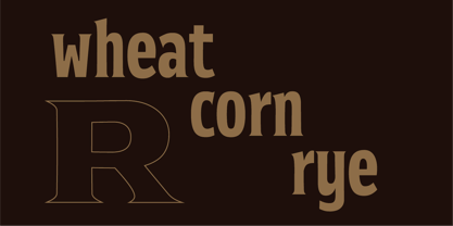
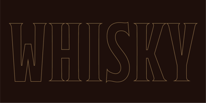
Check out Red Oak, giving a fresh vibe to the timeless wedge-serif style. It's all about blending class with flexibility. Red Oak rocks those narrow serifs that elegantly reach out, adding a touch of finesse to any text. What's cool about Red Oak? Its serifs! They're subtle but got this unique charm, smaller yet totally eye-catching against those bold letters.
This font's got you covered with a bunch of styles, 24 to be exact, from slim to stretched-out. Whether you're jazzing up a brand, laying out a magazine, or spicing up a website, Red Oak brings that vintage flair into the modern world.
Picture those narrow serifs pointing out like old-school engravings but with a twist. They mix and match beautifully with the boldness of the letters, striking that perfect balance between retro and modern vibes. From print to pixels, Red Oak is your go-to for all things design.
So, whether you're doodling a logo, coding a website, or putting together a zine, Red Oak's got your back. It's like style and functionality had a baby, and its name is Red Oak.
Concepteurs: Giuseppe Salerno, Paco González
Éditeur: Resistenza
Fonderie: Resistenza
Maître d'ouvrage: Resistenza
MyFonts débout: Feb 29, 2024
Red Oak

À propos Resistenza
Resistenza specializes in type-design, branding, calligraphy & lettering. Giuseppe Salerno and Paco González are the two founder, italian and spanish, their passion for writing and handcrafted lettering became their strenghts. Brushy types, calligraphic strokes, orginality in faces are their best distinguished characteristic. The first type was Afrobeat, a multiline circular type that grows up very fast and becase their first product on the list. But afterwards may other experiments more expressive like Berliner Fraktur, or an english copperplate like Copperlove bring Giuseppe Salerno's hand into a typeface. The Premium Foundry page can be viewed Here.
En savoir plus
Lire moins
- Le choix d'une sélection entraîne l'actualisation de la page entière.