


Sélectionnez ce type de licence lorsque vous développez une application pour iOS, Android ou Windows Phone et que vous intégrez le fichier de fonte dans le code de votre application mobile.
Sassoon Primary Cond®
par Sassoon-Williams
Styles individuels à partir de $48.00 USD


Sassoon Primary Cond Font la famille était
conçu par
Rosemary Sassoon et
publié par
Sassoon-Williams. Sassoon Primary Cond contient
1
styles.
En savoir plus sur cette famille
À propos de la famille Sassoon Primary Cond Police
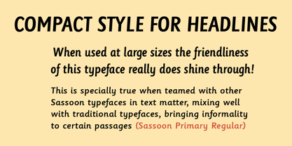
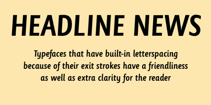
Those who design books for young children should consider the different needs of their readers. When laying out pages for young readers, particular care should be taken over word spacing. Don't forget that justifying short lines disrupts spacing. Justification should be used only when absolutely necessary. In the research undertaken with young readers the importance of consistent spacing was clear. It also appeared that the poorer readers profited from wider word spacing, while spacing that suited the poorest readers, positively annoyed the better readers. These typefaces have built-in letter spacing because of their exit strokes, as well as extra clarity designed into them. Sassoon Primary Medium Condensed is a compact style for headlines combining the right amount of weight, yet in a friendly style. When used at large sizes the friendliness of Sassoon types really shines. Why not use it for headings throughout a book. You can find many other new ways to use this typeface. Ideal perhaps for the masthead or a magazine?
Free to download resources:
How to access Stylistic Sets of alternative letters in these fonts
Concepteurs: Rosemary Sassoon
Éditeur: Sassoon-Williams
Fonderie: Sassoon-Williams
Maître d'ouvrage: Sassoon-Williams
MyFonts débout: Dec 1, 2017
Sassoon Primary Cond®
is a registered trademark of Sassoon & Williams.
À propos Sassoon-Williams
The Sassoon® font collection is a collaboration between Dr. Rosemary Sassoon and Adrian Williams. Dr. Sassoon is a noted designer who specialised in the educational and medical aspects of handwriting. After discovering that no one had found out what kind of letterforms children found easiest to read, she spent two years of research on the subject before designing the original Sassoon Primary typeface. In 1985 she began her partnership with type designer Adrian Williams to develop a whole range of fonts for schools and publishers to assist with handwriting and reading education.
En savoir plus
Lire moins
- Le choix d'une sélection entraîne l'actualisation de la page entière.