


Sélectionnez ce type de licence lorsque vous développez une application pour iOS, Android ou Windows Phone et que vous intégrez le fichier de fonte dans le code de votre application mobile.
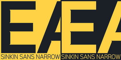
Sinkin Sans Narrow
par K-Type
Styles individuels à partir de $20.00 USD
Famille complète de 18 polices: $180.00 USD

Sinkin Sans Narrow Font la famille était
conçu par
Keith Bates et
publié par
K-Type. Sinkin Sans Narrow contient
18
styles et des offres familiales.
En savoir plus sur cette famille
- Aa Glyphs
-
Meilleure offreOffres familiales
- Styles individuels
- Spécifications techniques
- Licences
Par style :
$10.00 USD
Paquet de 2 styles:
$20.00 USD
Par style :
$10.00 USD
Paquet de 2 styles:
$20.00 USD
Par style :
$10.00 USD
Paquet de 2 styles:
$20.00 USD
Par style :
$10.00 USD
Paquet de 2 styles:
$20.00 USD
Par style :
$10.00 USD
Paquet de 2 styles:
$20.00 USD
Sinkin Sans Narrow 400 Regular + Italic
2 policesPar style :
$10.00 USD
Paquet de 2 styles:
$20.00 USD
Par style :
$10.00 USD
Paquet de 2 styles:
$20.00 USD
Par style :
$10.00 USD
Paquet de 2 styles:
$20.00 USD
Par style :
$10.00 USD
Paquet de 2 styles:
$20.00 USD
À propos de la famille Sinkin Sans Narrow Police
Sinkin Sans Narrow is a simple, pleasantly proportioned and easy to read sans-serif, available in all 9 standard web weights, 100 to 900, plus italics, so the face is a comprehensive illustration of the CSS web font numerical scale.
Sinkin Sans fonts are designed with tiny, inconspicuous notches that sink into verticals at the intersections of strokes, adding highlights to congested corners. The incisions make right angles appear sharper and improve definition in more intricate characters.
Sinkin Sans Narrow inherits the enviable clarity and readability of the luxuriously wide original family. The Narrow typeface, however, is designed to economise on space within busy web pages and has been sensitively condensed for maximum legibility.
Each weight of Sinkin Sans Narrow is supplied with a free Italic.
Concepteurs: Keith Bates
Éditeur: K-Type
Fonderie: K-Type
Maître d'ouvrage: K-Type
MyFonts débout: Mar 20, 2015
Sinkin Sans Narrow

À propos K-Type
K-Type is a small, independent type foundry based in Manchester England, offering a unique range of high quality fonts which are modestly and simply priced for designers, small businesses and large organisations.In addition to creating new typefaces resulting from formal experimentation, many K-Type fonts show the influence of inspirational artists and designers, many exploring the mix of insular and eclectic that has forged the typographical landscape of Britain and America.K-Type is also keen to make affordable fonts from styles which possess cultural currency or an existing social presence, generally redrawn to include comprehensive character sets containing a full complement of Latin Extended-A glyphs. New, previously unavailable weights and italics are often designed and added.
En savoir plus
Lire moins
- Le choix d'une sélection entraîne l'actualisation de la page entière.