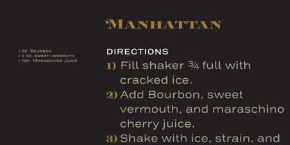
Ignorer et passer au contenu
Accueil / Polices / Sudtipos / Speakeasy
Speakeasy

Speakeasy

par Sudtipos
Styles individuels à partir de $39.00 USD
Famille complète de 5 polices: $149.00 USD
Speakeasy Font la famille était conçu par Alejandro Paul et publié par Sudtipos. Speakeasy contient 5 styles et des offres familiales.

En savoir plus sur cette famille
ESSAI GRATUIT DE 30 JOURS de Monotype Fonts pour obtenir plus de 150 000 polices de plus de 1 400 fonderies de caractères. Démarrer l'essai gratuit
Démarrer l'essai gratuit

    Réinitialiser

    À propos de la famille Speakeasy Police


    Speakeasy is a 5-font combo thematically built as a toolset for designing menus and liquor labels as well as coffees, restaurants and signs when the desire is to communicate with style. Originally put together to be used by the most famous speakeasy in Buenos Aires, this set contains a script, a minor (almost flat) wedge serif, a flare serif, a sans serif, and a bold Didone. The seed for the script was found in a German lettering book, and the other fonts reflect the familiar advertising and announcement styles of the early 20th century. The Speakeasy script comes with two different ways to connect the letterforms. Also included are many alternates, swashes, endings and flourishes — all accessible via OpenType features or glyph palettes. Speakeasy Modern and Speakeasy Flare are small cap fonts, and come with a few alternates. Speakeasy Sans and Speakeasy Gothic come with full sets of majuscules and minuscules, but contain small caps and a few alternates as well. A few rules and ornaments are also sprinkled throughout the set. This combination of fonts worked wonderfully for the project that called for it. Hopefully it will work just as well for your project.

    Concepteurs: Alejandro Paul

    Éditeur: Sudtipos

    Fonderie: Sudtipos

    Maître d'ouvrage: Sudtipos

    MyFonts débout: May 22, 2018

    Speakeasy

    À propos Sudtipos

    Sudtipos is a new collective Argentinian type foundry. New blood, new attitude. A joint venture of four professional designers with lots of expertise in different areas like branding, packaging design, corporate identity, television and new media. “The foundry, or collective as we prefer to designate it, started because of that — packaging, editorial or brand designers making fonts for real designers” Alejandro Paul, one of the company’s founders, said in his Creative Characters interview. Alejandro “Ale” Paul made a name for himself drawing and programming some of the most intricate script fonts ever digitized. “My experience in branding product packaging was a natural catalyst for me to be interested in scripts and seek like-minded people for the collective.” The collective’s bestselling scripts include Bowling Script, Horizontes Script and Hipster Script Pro, which was named one of MyFonts’ most popular fonts of 2012, and was recognized by both Typographica and Type Directors Club that same year. “Our aim is to always be graphic designers making typefaces for graphic designers,” Ale said. “We try not to lose that particular focus. We’re always thinking about how to make a graphic designer’s work easier when it comes to using the type element in his or her design.”

    The Premium Foundry Page can be viewed Here.

    En savoir plus

    Lire moins