


Sélectionnez ce type de licence lorsque vous développez une application pour iOS, Android ou Windows Phone et que vous intégrez le fichier de fonte dans le code de votre application mobile.
Stadtmitte
par Letritas
Styles individuels à partir de $25.00 USD
Famille complète de 16 polices: $169.00 USD


Stadtmitte Font la famille était
conçu par
Juan Pablo De Gregorio et
publié par
Letritas. Stadtmitte contient
16
styles et des offres familiales.
En savoir plus sur cette famille
- Aa Glyphs
-
Meilleure offreOffres familiales
- Styles individuels
- Spécifications techniques
- Licences
À propos de la famille Stadtmitte Police
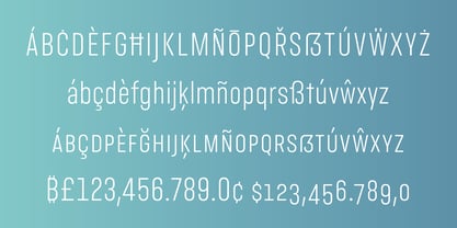
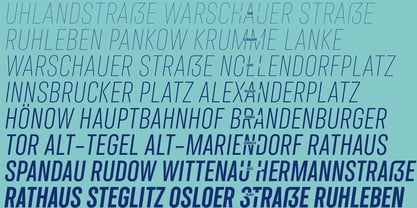
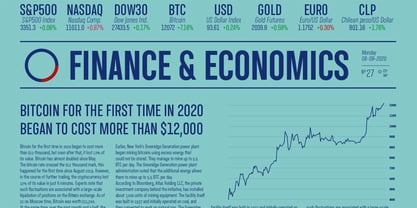
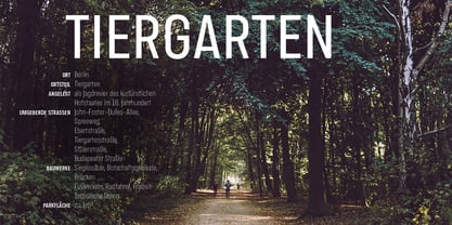
Stadtmitte is a grotesque font with a distinctly industrial flair. It is inspired on a reinterpretation of the Berlin’s vernacular signs and characters created under the DIN 1451 norm.
By the early 1900s, german painters and sign makers started to spread this unmistakable way of font drawing used back then on freight trains. Such letter design was both very easy to read and build, hence it started to quickly spread until it became a standard in 1936 for highway signage.
Stadtmitte is not aimed to be yet another literal remake of those drawings but rather a revision of shapes and concepts that seeks to transport us to Germany’s industrial way of creating and displaying information, therefore being suitable for a wide scope of design uses, considering its own nature and different available weights.
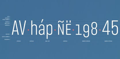
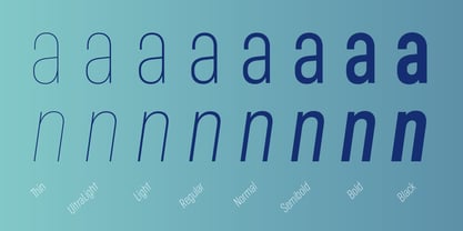
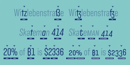
The typeface has 8 weights, ranging from “thin” to “black”, and two versions: "regular" and "italic". Its 16 files contain 618 characters with ligatures, alternates, small caps, old-style and tabular numbers, and case sensitive figures. It supports 219 Latin-based languages, spanning through 212 different countries.
Stadtmitte supports this languages: Abenaki, Afaan Oromo, Afar, Afrikaans, Albanian, Alsatian, Amis, Anuta, Aragonese, Aranese, Aromanian, Arrernte, Arvanitic (Latin), Asturian, Atayal, Aymara, Bashkir (Latin), Basque, Bemba, Bikol, Bislama, Bosnian, Breton, Cape Verdean Creole, Catalan, Cebuano, Chamorro, Chavacano, Chichewa, Chickasaw, Cimbrian, Cofán, Corsican Creek,Crimean Tatar (Latin),Croatian, Czech, Dawan, Delaware, Dholuo, Drehu, Dutch, English, Estonian, Faroese, Fijian Filipino, Finnish, Folkspraak, French, Frisian, Friulian, Gagauz (Latin), Galician, Ganda, Genoese, German, Gikuyu, Gooniyandi, Greenlandic (Kalaallisut)Guadeloupean, Creole, Gwich’in, Haitian, Creole, Hän, Hawaiian, Hiligaynon, Hopi, Hotcąk (Latin), Hungarian, Icelandic, Ido, IgboI, locano, Indonesian, Interglossa, Interlingua, Irish, Istro-Romanian, Italian, Jamaican, Javanese (Latin), Jèrriais, Kala Lagaw Ya, Kapampangan (Latin), Kaqchikel, Karakalpak (Latin), Karelian (Latin), Kashubian, Kikongo, Kinyarwanda, Kiribati, Kirundi, Klingon, Ladin, Latin, Latino sine Flexione, Latvian, Lithuanian, Lojban, Lombard, Low Saxon, Luxembourgish, Maasai, Makhuwa, Malay, Maltese, Manx, Māori, Marquesan, Megleno-Romanian, Meriam Mir, Mirandese, Mohawk, Moldovan, Montagnais, Montenegrin, Murrinh-Patha, Nagamese Creole, Ndebele, Neapolitan, Ngiyambaa, Niuean, Noongar, Norwegian, Novial, Occidental, Occitan, Old Icelandic, Old Norse, Oshiwambo, Ossetian (Latin), Palauan, Papiamento, Piedmontese, Polish, Portuguese, Potawatomi, Q’eqchi’, Quechua, Rarotongan, Romanian, Romansh, Rotokas, Sami (Inari Sami), Sami (Lule Sami), Sami (Northern Sami), Sami (Southern Sami), Samoan, Sango, Saramaccan, Sardinian, Scottish Gaelic, Serbian (Latin), Seri, Seychellois Creole, Shawnee, Shona, Sicilian, Silesian, Slovak, Slovenian, Slovio (Latin), Somali, Sorbian (Lower Sorbian), Sorbian (Upper Sorbian), Sotho (Northern), Sotho (Southern), Spanish, Sranan, Sundanese (Latin), Swahili, Swazi, Swedish, Tagalog, Tahitian, Tetum, Tok Pisin, Tokelauan, Tongan, Tshiluba, Tsonga, Tswana, Tumbuka, Turkish, Turkmen (Latin), Tuvaluan, Tzotzil, Uzbek (Latin), Venetian, Vepsian, Volapük, Võro, Wallisian, Walloon, Waray-Waray, Warlpiri, Wayuu, Welsh, Wik-Mungkan, Wiradjuri, Wolof, Xavante, Xhosa, Yapese, Yindjibarndi,
Concepteurs: Juan Pablo De Gregorio
Éditeur: Letritas
Fonderie: Letritas
Maître d'ouvrage: Letritas
MyFonts débout: Aug 18, 2020
Stadtmitte
À propos Letritas
Letritas is a design brand founded in 2006 by Juan Pablo de Gregorio with the aim of being a resource of any typographical conversation. It was created due to the need to feel the vacuum left by the disappearance of the internet forum Typophile. It was opened to encourage a public debate of type, typefaces, fonts and typography.
En savoir plus
Lire moins
- Le choix d'une sélection entraîne l'actualisation de la page entière.