


Sélectionnez ce type de licence lorsque vous développez une application pour iOS, Android ou Windows Phone et que vous intégrez le fichier de fonte dans le code de votre application mobile.
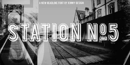
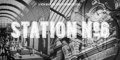
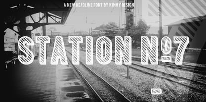
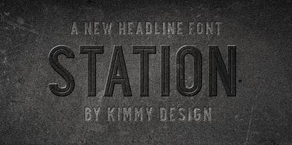
Station
par Kimmy Design
Styles individuels à partir de $15.00 USD
Famille complète de 7 polices: $60.00 USD


Station Font la famille était
conçu par
Kimmy Kirkwood et
publié par
Kimmy Design. Station contient
7
styles et des offres familiales.
En savoir plus sur cette famille
- Aa Glyphs
-
Meilleure offreOffres familiales
- Styles individuels
- Spécifications techniques
- Licences
Par style :
$8.57 USD
Paquet de 7 styles:
$60.00 USD
À propos de la famille Station Police
Station is a bold headline typeface inspired by old Train Station type and graphics. It can be used in a modern and retro way, and its different patterns and styles give a unique look to any design.
Concepteurs: Kimmy Kirkwood
Éditeur: Kimmy Design
Fonderie: Kimmy Design
Maître d'ouvrage: Kimmy Design
MyFonts débout: Mar 6, 2013
Station
À propos Kimmy Design
“Kimmy Design is based out of Santa Monica, CA, but it’s as mobile as I am,” Kimmy Kirkwood says. “I love finding new inspiration and I work from Seattle, Palm Springs, Santa Monica, or wherever the next adventure takes me!” Kimmy founded her company in 2010; the same year that she graduated from college. Her first typeface, Madeleine, which is based on a logotype that she had created for a hotel in Positano, Italy, was actually a part of one of her final collegiate projects. She used it as an opportunity to teach herself about the intricacies of type design and develop the programming skills needed to create a true working font. Since then, her most successful designs have included Lunchbox and Lunchbox Slab: quirky hand-drawn typefaces that give an incredible array of customizable options and an authentically hand-crafted look. “My goal with these,” she says, “was to make them unique enough that the end product from any designer would look as if it was all made by hand.” “I love organic typefaces. Creating something that looks naturally handcrafted and letting the customers make it their own. In every hand drawn family I make I include multiple weights, styles and variations.” Kimmy uses contextual alternates in her typefaces and typically creates 3-5 variations of each letter, giving her fonts a truly hand-lettered feel. “I also usually include stylistic alternatives, which range from creating simple variations on specific letters to a unique style alternative for every character. Small Caps are a great way to give more options to designers while keeping the width and size of the font consistent. All of my font families are multilingual, and many include full Cyrillic and Greek alphabets. Whenever possible, I always include some sort of swash - either in fancy capitals, at the beginning and end of characters, or stylistic swashes.” All of these customizable options give the young designer’s families an intimate, personal feel. “Two different people could use my font and create something totally unique from one another. That’s what makes them so fun to use!”
En savoir plus
Lire moins
- Le choix d'une sélection entraîne l'actualisation de la page entière.