


Sélectionnez ce type de licence lorsque vous développez une application pour iOS, Android ou Windows Phone et que vous intégrez le fichier de fonte dans le code de votre application mobile.
Sui Generis™
par Typodermic
Styles individuels à partir de $0.00 USD
26% Off
Famille complète de 29 polices: $169.95 USD


Sui Generis Font la famille était
conçu par
Ray Larabie et
publié par
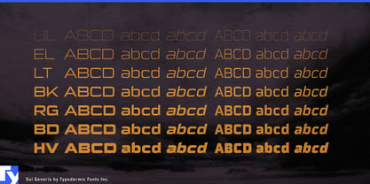
Typodermic. Sui Generis contient
29
styles et des offres familiales.
En savoir plus sur cette famille
- Aa Glyphs
-
Meilleure offreOffres familiales
- Styles individuels
- Spécifications techniques
- Licences
Par style :
$5.86 USD
$4.34 USD
Paquet de 29 styles:
$169.95 USD
$125.76 USD
À propos de la famille Sui Generis Police
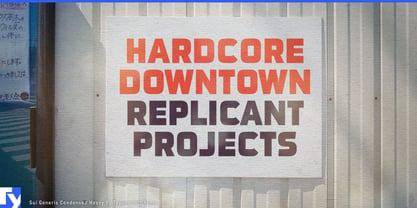
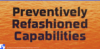
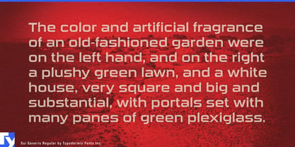
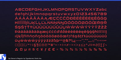
Sui Generis is a rebellion against the mundane, a celebration of the unconventional. This rounded square sans-serif marches to the beat of its own drum, eschewing the polished perfection of its peers for something far more intriguing: character.
At first glance, Sui Generis might seem a bit… off. Its technical letterforms and boxy curves don’t conform to traditional notions of elegance. But therein lies its genius. In a world of cookie-cutter designs, Sui Generis stands proudly awkward, turning its quirks into strengths. It’s not trying to be the prettiest face at the party—it’s aiming to be the most memorable. The typeface’s industrial character isn’t just unique; it’s unapologetic. Sui Generis doesn’t whisper for attention—it commands it through sheer force of personality. Its understated charm is like that slightly eccentric friend who always has the best stories at dinner parties. You can’t help but be drawn in, even if you’re not quite sure why.
But don’t mistake its quirkiness for impracticality. Sui Generis is a chameleon, adapting to a variety of design challenges with ease. With four weights, two widths, italics, and an outline style, it’s ready to tackle everything from edgy brand identities to avant-garde editorial layouts. It’s the Swiss Army knife of unconventional typography—versatile, reliable, and always interesting. Sui Generis speaks fluently in a multitude of languages, its distinctive voice carrying across borders and cultures. From the cobblestone streets of old European towns to the bustling markets of Southeast Asia, this typeface communicates with a universal language of individuality.
Choose Sui Generis when you’re ready to break free from the tyranny of the expected. It’s for the brands that dare to be different, the messages that refuse to blend in, and the designers who understand that perfection is overrated. In a sea of sameness, Sui Generis is the typographic equivalent of a purple cow—impossible to ignore and delightfully unforgettable.
So embrace the quirks, celebrate the unconventional, and let Sui Generis be the voice of your design’s unique personality.
Concepteurs: Ray Larabie
Éditeur: Typodermic
Fonderie: Typodermic
Fonderie d'origine: Larabie
Maître d'ouvrage: Typodermic
MyFonts débout: Oct 18, 2004
Sui Generis™
is a trademark of Typodermic.

À propos Typodermic
Welcome to Typodermic Fonts, a spirited type foundry rooted in Nagoya, Japan, started by the Canadian typeface designer, Raymond Larabie in 2001. Our library brims with 500+ diverse typefaces to fuel creativity in graphic design, advertising, web, and app development. As digital type pioneers, we adopted web fonts and app licensing early, consistently pushing the design envelope. With Canadian heart and Japanese precision, we're your global partners in extraordinary typography. Explore Typodermic Fonts—where creativity meets character.
En savoir plus
Lire moins
- Le choix d'une sélection entraîne l'actualisation de la page entière.