


Sélectionnez ce type de licence lorsque vous développez une application pour iOS, Android ou Windows Phone et que vous intégrez le fichier de fonte dans le code de votre application mobile.
TradaSerif
par Hoftype
Styles individuels à partir de $0.00 USD
Famille complète de 20 polices: $198.00 USD


TradaSerif Font la famille était
conçu par
Dieter Hofrichter et
publié par
Hoftype. TradaSerif contient
20
styles et des offres familiales.
En savoir plus sur cette famille
- Aa Glyphs
-
Meilleure offreOffres familiales
- Styles individuels
- Spécifications techniques
- Licences
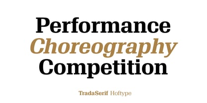
À propos de la famille TradaSerif Police
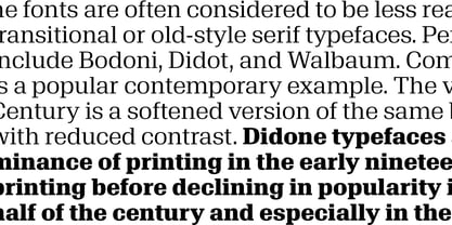
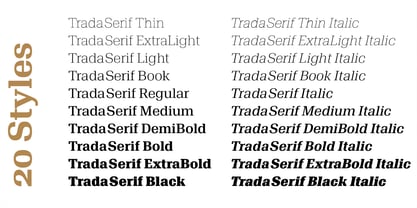
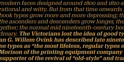
TradaSerif is a new addition to the Trada family. Crisp and clear in appearance, it preserves
the same formal spirit and the principal structural elements of TradaSans. TradaSerif offers
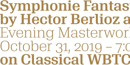
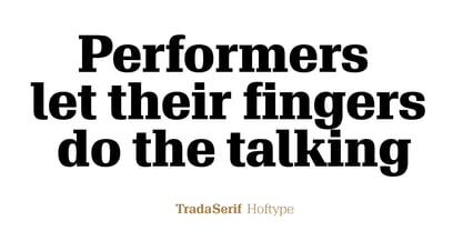
a wide range of styles, from tenderly thin to thundering black. It also affords excellent text qualities and
works brilliantly as a distinctive headline face.
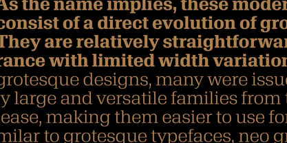
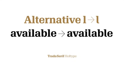
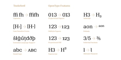
TradaSerif consists of 20 well-tuned weights and is well-equipped for advanced typography.
It comes in OpenType format with extended support for up to 80 languages. All weights
contain small caps, ligatures, superior characters, proportional lining figures, tabular lining figures,
proportional old style figures, lining old style figures, matching currency symbols, fraction- and
scientific numerals, matching arrows, and alternate characters.
Concepteurs: Dieter Hofrichter
Éditeur: Hoftype
Fonderie: Hoftype
Maître d'ouvrage: Hoftype
MyFonts débout: Apr 22, 2020
TradaSerif
À propos Hoftype
German designer Dieter Hofrichter started his foundry in 2010. Since then, he has remained focused on developing text fonts that integrate the rich history and tradition of typography with contemporary styles. Based in Munich, his first typeface on MyFonts was Impara, a sans serif with lively stroke ductus and distinct humanistic characteristics that is a representation of linear coolness and classic elegance. Since his debut, he has continued to produce beautiful, high quality serif faces. Capita, one of the foundry’s best sellers, is a self-dominated face with a fresh style that avoids the harshness of many slab serifs. Dieter has also seen success with one of his most recent designs, Mangan, a text face that combines classical rationality with contemporary design. “One of our intentions is to utilize the knowledge of the history of type to create contemporary types,” Dieter says. “Style consciousness and many years of experience in type design are our qualifications for producing functional and usable types of high quality.”
En savoir plus
Lire moins
- Le choix d'une sélection entraîne l'actualisation de la page entière.