


Sélectionnez ce type de licence lorsque vous développez une application pour iOS, Android ou Windows Phone et que vous intégrez le fichier de fonte dans le code de votre application mobile.
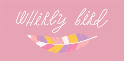
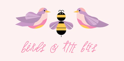
Whirly Birds
par Great Lakes Lettering
Licences à partir de $30.00 USD
Famille complète de 4 polices: $30.00 USD
Whirly Birds Font la famille était
conçu par
Liz Bartucci et
publié par
Great Lakes Lettering. Whirly Birds contient
4
styles et des offres familiales.
En savoir plus sur cette famille
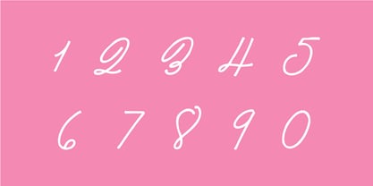
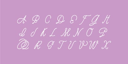
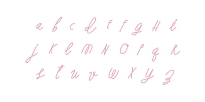
- Aa Glyphs
-
Meilleure offreOffres familiales
- Styles individuels
- Spécifications techniques
- Licences
-
Whirly Birds Pro
-
Whirly Birds Basic
-
Whirly Birds Alt
-
Whirly Birds Alt 2
Par style :
$7.50 USD
Paquet de 4 styles:
$30.00 USD
À propos de la famille Whirly Birds Police
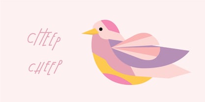
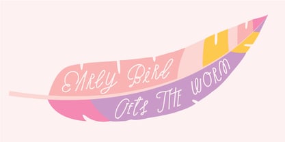
Whirly Bird was drawn by the talented Liz Bartucci of Tuccicursive and fonted by GLL. It has a playful bouncy baseline and tons of ligatures and alternate characters to capture a genuinely hand-drawn look.
Concepteurs: Liz Bartucci
Éditeur: Great Lakes Lettering
Fonderie: Great Lakes Lettering
Maître d'ouvrage: Great Lakes Lettering
MyFonts débout: Apr 19, 2018
Whirly Birds
À propos Great Lakes Lettering
Dathan Boardman and Molly Jacques Erickson founded Great Lakes Lettering with a mutual appreciation for artful calligraphy. “In 2012 I had been working on lots of calligraphic fonts and came across Molly’s work and was immediately struck by how visceral it was and how it didn’t really look like any other kind of calligraphy that I’ve come across,” Dathan says. “I reached out to her wondering if she had any interest in turning her lettering into fonts.” The duo’s first typeface, Frosted, was released later that year. Dathan and Molly’s bestselling typefaces include Asterism, a calligraphy style font with a moving baseline and lots of shining personality, and Kailey, a hand lettered typeface that was inspired by Molly’s signature lettering style, consisting of bold brush strokes, fluid flourishes, and distinctive characters. Alissa Mazzenga joined the team in 2014 with the the foundry’s debut of her design, Feast; a typeface whose magic seems to reside in the ethereal movement of fluid wisps of ink, forming soft arched lines and design that stands alone. The group’s fonts are best known for working in a variety of settings, both formal and informal. They’ve worked with brands such as Nike and Martha Stewart and have a lot more ahead of them. “We have a lot of exciting collaborations ahead. As our fonts are becoming more refined and more formal, we are reaching a new level of elegance that makes us excited to keep going and keep perfecting our working method.
En savoir plus
Lire moins
- Le choix d'une sélection entraîne l'actualisation de la page entière.