


Sélectionnez ce type de licence lorsque vous développez une application pour iOS, Android ou Windows Phone et que vous intégrez le fichier de fonte dans le code de votre application mobile.
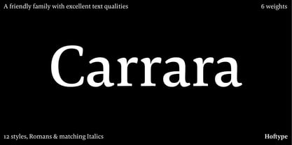
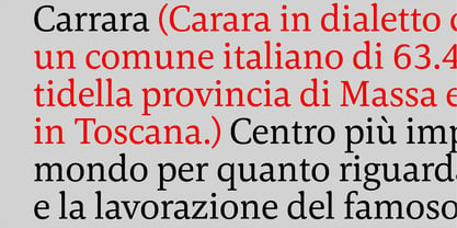
Carrara
par Hoftype
Styles individuels à partir de $198.00 USD
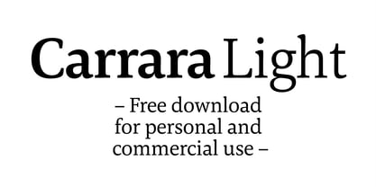
Carrara Font la famille était
conçu par
Dieter Hofrichter et
publié par
Hoftype. Carrara contient
1
styles.
En savoir plus sur cette famille
À propos de la famille Carrara Police
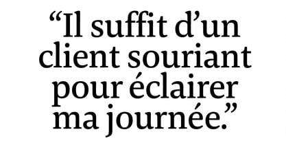
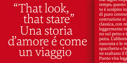
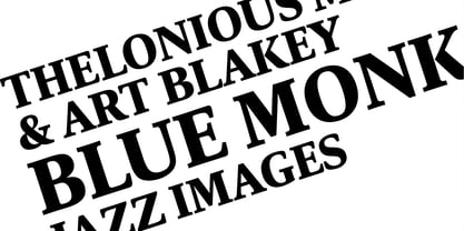
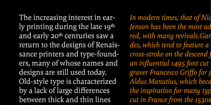
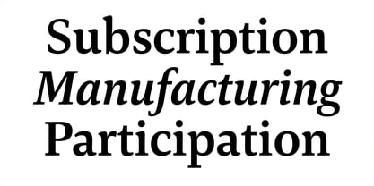
Carrara is a highly readable text face with a loose reference to classical transitional types.
Carrara was designed 2016. It presents a solid structure which makes it very assertive in text applications. In headlines it shows the individual details of the forms which gives it a gentle flow and makes for a distinguished and distinct appearance, while avoiding any noisiness.
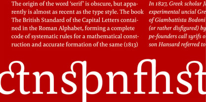
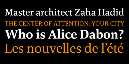
The Carrara family consists of 12 styles and is well equipped for ambitious typography.
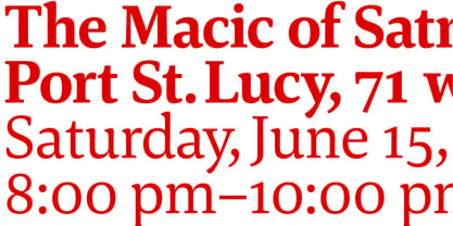
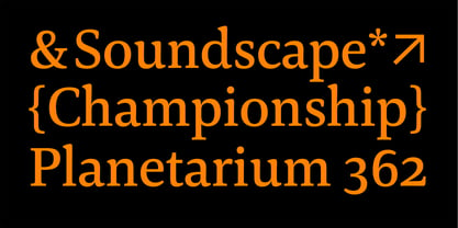
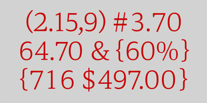
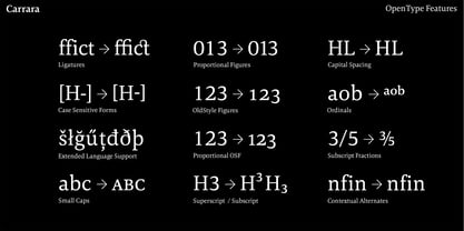
It comes in OpenType format with extended language support. All weights contain ligatures, superior characters, proportional lining figures, tabular lining figures, proportional old style figures, lining old style figures, matching currency symbols, fraction- and scientific numerals, matching arrows and alternate characters.
Concepteurs: Dieter Hofrichter
Éditeur: Hoftype
Fonderie: Hoftype
Maître d'ouvrage: Hoftype
MyFonts débout: Jul 21, 2016
Carrara
À propos Hoftype
German designer Dieter Hofrichter started his foundry in 2010. Since then, he has remained focused on developing text fonts that integrate the rich history and tradition of typography with contemporary styles. Based in Munich, his first typeface on MyFonts was Impara, a sans serif with lively stroke ductus and distinct humanistic characteristics that is a representation of linear coolness and classic elegance. Since his debut, he has continued to produce beautiful, high quality serif faces. Capita, one of the foundry’s best sellers, is a self-dominated face with a fresh style that avoids the harshness of many slab serifs. Dieter has also seen success with one of his most recent designs, Mangan, a text face that combines classical rationality with contemporary design. “One of our intentions is to utilize the knowledge of the history of type to create contemporary types,” Dieter says. “Style consciousness and many years of experience in type design are our qualifications for producing functional and usable types of high quality.”
En savoir plus
Lire moins
- Le choix d'une sélection entraîne l'actualisation de la page entière.