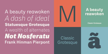
Ignorer et passer au contenu
Accueil / Polices / Monotype / Classic Grotesque
Classic Grotesque

Classic Grotesque™

par Monotype
Styles individuels à partir de $40.99 USD
Famille complète de 56 polices: $524.99 USD
Classic Grotesque Font la famille était conçu par Rod McDonald et publié par Monotype. Classic Grotesque contient 56 styles et des offres familiales.

En savoir plus sur cette famille
ESSAI GRATUIT DE 30 JOURS de Monotype Fonts pour obtenir Classic Grotesque et plus de 150 000 polices. Démarrer l'essai gratuit
Démarrer l'essai gratuit

Par style :

$9.37 USD

Paquet de 56 styles:

$524.99 USD

Voir 46 plus Voir moins

À propos de la famille Classic Grotesque Police


Classic Grotesque by Rod McDonald: a traditional font with a modern face. The growing popularity of grotesque typefaces meant that many new sans serif analogues were published in the early 20th century. Setting machines were not compatible with each other but all foundries wanted to offer up-to-date fonts, and as a result numerous different typeface families appeared that seem almost identical at first glance and yet go their separate ways with regard to details. One of the first fonts created with automatic typesetting in mind was Monotype Grotesque®. Although this typeface that was designed and published by Frank Hinman Pierpont in 1926 has since been digitalised, it has never achieved the status of other grotesque fonts of this period. But Monotype Grotesque was always one of designer Rod McDonald’s favourites, and he was overjoyed when he finally got the go-ahead from Monotype in 2008 to update this “hidden treasure”. The design process lasted four years, with regular interruptions due to the need to complete projects for other clients. In retrospect, McDonald admits that he had no idea at the beginning of just how challenging and complex a task it would be to create Classic Grotesque™. It took him considerable time before he found the right approach. In his initial drafts, he tried to develop Monotype Grotesque only to find that the result was almost identical with Arial®, a typeface that is also derived in many respects from Monotype Grotesque. It was only when he went back a stage, and incorporated elements of Bauer Font’s Venus™ and Ideal Grotesk by the Julius Klinkhardt foundry into the design process, that he found the way forward. Both these typefaces had served as the original inspiration for Monotype Grotesque. The name says it all: Classic Grotesque has all the attributes of the early grotesque fonts of the 20th century: The slightly artificial nature gives the characters a formal appearance. There are very few and only minor variations in line width. The tittles of the ‘i’ and ‘j’, the umlaut diacritic and other diacritic marks are rectangular. Interestingly, it is among the uppercase letters that certain variations from the standard pattern can be found, and it is these that enliven the typeface. Hence the horizontal bars of the “E”, “F” and “L” have bevelled terminals. The chamfered terminal of the bow of the “J” has a particular flamboyance, while the slightly curved descender of the “Q” provides for additional dynamism. The character alternatives available through the OpenType option provide the designer with a wealth of opportunities. These include a closed “a”, a double-counter “g” and an “e” in which the transverse bar deviates slightly from the horizontal. The seven different weights also extend the scope of uses of Classic Grotesque. These range from the delicate Light to the super thick Extrabold. There are genuine italic versions of each weight; these are not only slightly narrower than their counterparts, but also have variant shapes. The “a” is closed, the “f” has a semi-descender while the “e” is rounded. Its neutral appearance and excellent features mean that Classic Grotesque is suitable for use in nearly all imaginable applications. Even during the design phase, McDonald used his new font to set books and in promotional projects. However, he would be pleased to learn of possible applications that he himself has not yet considered. Classic Grotesque, which has its own individual character despite its neutral and restrained appearance, is the ideal partner for your print and web project.

Concepteurs: Rod McDonald

Éditeur: Monotype

Fonderie: Monotype

Maître d'ouvrage: Monotype

MyFonts débout: Apr 5, 2016

Classic Grotesque™ is a trademark of The Monotype Corporation and may be registered in certain jurisdictions.

À propos Monotype

The Monotype Library is one of the world’s largest and most comprehensive collection of typefaces, featuring original designs of historical importance and a fresh range of contemporary and fashionable fonts. The Monotype Library includes thousands of timeless classics, hand-crafted revivals and original designs from many of the most innovative type designers and foundries in history. This distinctive, award-winning library of premium fonts provides brands and designers with a broad and reliable selection of typefaces for expressive typography in print and on screen. The Premium Foundry page can be viewed Here.

En savoir plus

Lire moins