


Sélectionnez ce type de licence lorsque vous développez une application pour iOS, Android ou Windows Phone et que vous intégrez le fichier de fonte dans le code de votre application mobile.
VLNL Vondelpark™
par VetteLetters
Styles individuels à partir de $35.00 USD

VLNL Vondelpark Font la famille était
conçu par
Donald Beekman et
publié par
VetteLetters. VLNL Vondelpark contient
1
styles.
En savoir plus sur cette famille
À propos de la famille VLNL Vondelpark Police
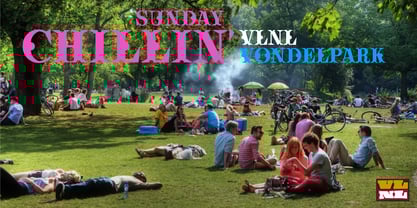
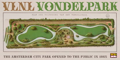
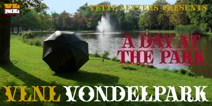
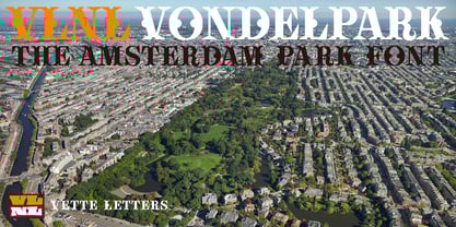
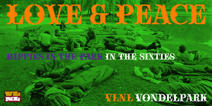
The Vondelpark is the famous Amsterdam city park, 47 hectares stretching out from Leidseplein to the Amstelveenseweg. It was founded in 1864 when a group of well-to-do Amsterdam citizens got together and bought land at the (then) edge of the city centre in order to create a park ‘for riding and strolling’. Designed by architect J.D. Zocher, it opened officially in 1865. The park received its name two years later when a statue of Dutch writer Joost van den Vondel was placed in the park. In the 1960s and 1970s the Vondelpark became a symbol and epicenter of the hippie flower power era. The park was declared a state monument in 1996.
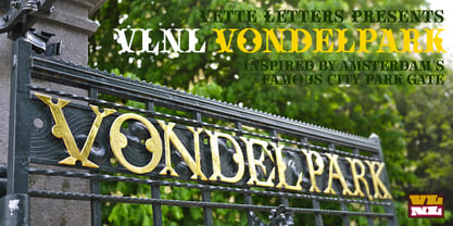
Donald DBXL was intrigued by the handmade iron nameplate lettering on the park’s entrance gates, and decided to design VLNL Vondelpark in its glory. The somewhat clumsy iron letters were not revived as is but optimized to turn it into a useful typeface. The all-caps serif with a deliberate constructed feel, contains a Positional Open Type feature that places half circles on the vertical stems, at the beginning and end of a word, to enliven the rhythm.
Concepteurs: Donald Beekman
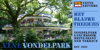
Éditeur: VetteLetters
Fonderie: VetteLetters
Maître d'ouvrage: VetteLetters
MyFonts débout: Oct 29, 2014
VLNL Vondelpark™
is a trademark of VetteLetters.
À propos VetteLetters
VetteLetters.nl is fascinated by kebab shops, local chinese restaurants and fish-and-chips joints – not just the food but especially the shopfront typography. If all the other type foundries are like haute cuisine restaurants, then VetteLetters is the font-imbiss in the world of exclusive and expensive font foundries. VetteLetters, based in Amsterdam, loves food and loves fonts. So let’s introduce our chefs: After a wonderful career as a dishwasher, assistant cook, some kind of designer, and last but not least type designer, Donald® Roos is now one of VetteLetters CEOs. Donald DBXL Beekman is “the other Donald” and also the other CEO. DBXL produces as many typefases as Prince makes records. Jacques “Sardines” Le Bailly also known as the Baron von Fonthausen is Chief Type Tech. Dev. Dept. and we have Martin “TwoPoints” Lorenz, baking his fonts in the lovely climate of Barcelona. The latest addition to the VetteLetters stable is designer Henning Brehm aka “Design Tourist” hailing from Berlin.
En savoir plus
Lire moins
- Le choix d'une sélection entraîne l'actualisation de la page entière.