Applied Sans
The new Applied Sans: a historic grotesque in contemporary garb
Applied Sans from Akira Kobayashi and Sandra Winter is a very well-equipped, neutral grotesque based on the early serifs of the 20th century. The universally versatile family shows off its discreet charm in longer text as well as headlines. Use Applied Sans for large projects like magazines, navigational systems or company stationary, for example.

Serif fonts, known as “grotesques”, first gained commercial success at the end of the 19th and beginning of the 20th centuries. A short time later, nearly every font foundry had them on offer. In the decades that followed, many popular designs of the 20th century like Helvetica® or Arial® picked up on these early sans serifs.
Akira Kobayashi and Sandra Winter were also inspired by the early grotesques – from the typographic perspective of the 21st century, however. They captured the flair of the hand-cut forms with their slightly structured, somewhat square appearance, as well as the partially irregular curves, but smoothed them out in places where the letters would seem inconsistent by today’s standards.
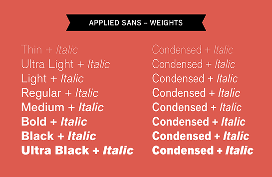
The modern and contemporary appearance of Applied Sans is also reflected in the extensive options. Eight finely graded weights are available, from Thin to Extra Black, each with an italic in two widths. The selection of characters covers most Western and Eastern European languages and offers a number of ligatures.
Applied Sans brings the first popular sans serif, originally optimized for typesetting by hand, into the 21st century as a powerful and versatile digital font. Thanks to the perfect options, you can use the restrained, extended family not only in commercial typesetting, but also in corporate design or as a universal font system for signalization.
Akira Kobayashi and Sandra Winter were also inspired by the early grotesques – from the typographic perspective of the 21st century, however. They captured the flair of the hand-cut forms with their slightly structured, somewhat square appearance, as well as the partially irregular curves, but smoothed them out in places where the letters would seem inconsistent by today’s standards.
The modern and contemporary appearance of Applied Sans is also reflected in the extensive options. Eight finely graded weights are available, from Thin to Extra Black, each with an italic in two widths. The selection of characters covers most Western and Eastern European languages and offers a number of ligatures.

Applied Sans brings the first popular sans serif, originally optimized for typesetting by hand, into the 21st century as a powerful and versatile digital font. Thanks to the perfect options, you can use the restrained, extended family not only in commercial typesetting, but also in corporate design or as a universal font system for signalization.