Avenir™ Next
Or why there´s now an Avenir Next
While Adrian Frutiger has created such famous typefaces as Univers™ or Frutiger™, another matter has remained very close to his heart – the design of his linear sans serif – the Avenir™.
In 1988, the Swiss typeface designer first presented Avenir to the public, which already at that time marked an excellent alternative to other well known typefaces such as Futura® or Avant Garde®. Compared to the mere metric construction of other typefaces, Avenir was convincing because of its optical construction which lent it a more humane appearance, as seen, for instance, in the classically drawn "a".
Avenir was originally released with 6 weights for which Frutiger had carefully selected the increments in line thickness. In typographical practice, however, this proved to be a limiting factor, along with the missing bold weights. Hence, the true potential of Avenir as a contemporary typeface failed to be recognized.
The love of linear symbols
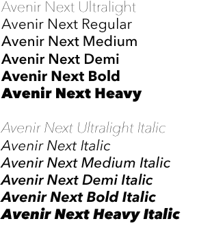
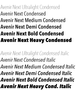
Adrian Frutiger has completely reworked the Avenir type family in close cooperation with Akira Kobayashi, Type Director at Linotype. The result is the Avenir Next with harmoniously incremented weights and matching condensed versions.
Avenir Next is part of the Platinum Collection and comes in 4 typeface sets, Regular, Italic, Condensed and Condensed Italic, each equipped with 6 different stem weights. All 24 weights include true small caps and old style figures.
Avenir Next thereby now offers an optimal balance of harmony and contrast. With the addition of the condensed variants, Avenir Next represents a full-fledged contem-porary grotesque, providing professional graphic designers with the greatest degree of typographical flexibility and optimal legibility.
How to order Avenir Next:
Please note: Before you order Avenir Next, you should make a printout of the license agreement, which is attached here in english (504 kb), german (508 kb) and french (508 kb) in PDF format.
Please complete, sign and send it to us by fax (Fax: +49-(0)6172 484 429).
Avenir Next, along with Compatil™, Optima™ nova, Linotype Univers™, Frutiger™ Next, Sabon™ Next, Linotype Syntax™, Linotype Syntax™ Letter and Linotype Syntax™ Serif belongs to the typefaces of the Linotype Platinum Collection.
These fonts were carefully digitized and have the high quality demanded by professional typography. All fonts of the Platinum Collection were produced according to the Linotype tradition of quality.
Linotype and its authorized partners offer these fonts only as complete typeface families on Platinum Collections CDs.
Search with the keyword for ‘Frutiger’ to find all fonts in the Linotype Library designed by Adrian Frutiger.
more ... Dialogue between Frutiger & Kobayashi

