Discover legacy content from linotype.com, preserved for your reference.
Berling Nova Sans
Berling™ Nova Sans joins the enterprising Berling Nova superfamily
Sweden: a country famous for IKEA furniture, disco-pop music, fancy meatballs, and long winter nights. Now you can align yourself and your documents with pure Swedish design, thanks to a very Scandinavian serif and sans serif type superfamily – Berling Nova.
Berling Nova and Berling Nova Sans are inspired by the original Berling type, a 1950s masterpiece from Swedish designer Karl-Erik Forsberg. While these faces may be “old style,” they are certainly not old fashioned! The superfamily’s serif and sans variants are both 21st century OpenType tools, ready for use in contemporary work. Developed by some of Stockholm’s finest graphic designers, these fonts are the result of years of testing and refining.
Berling Nova and Berling Nova Sans are inspired by the original Berling type, a 1950s masterpiece from Swedish designer Karl-Erik Forsberg. While these faces may be “old style,” they are certainly not old fashioned! The superfamily’s serif and sans variants are both 21st century OpenType tools, ready for use in contemporary work. Developed by some of Stockholm’s finest graphic designers, these fonts are the result of years of testing and refining.
Berling Nova, the serif half of the family, ships with two optical sizes: normal and display. While the display fonts were specially drawn for large headlines, the four normal faces are optimized for serious text-based typography. Aside from both oldstyle figures, these fonts contain small caps, and a character set prepared to most Latin-based languages from Western, Central, and Eastern Europe.
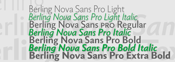
Just released in time for the new year, Berling Nova Sans adds even more to the sturdy Berling repertoire. With seven fonts, Berling Nova Sans take you up the scale from Light to Extra Bold. The Light, Regular, and Bold weights also have true-italic companions.
 |