Bradley Texting
Bradley Texting: a clear, friendly and easily legible calligraphy font, also suited to electronic devices – now with new italic styles
With Bradley Texting™, Richard Bradley has published another calligraphic typeface that recalls the style of Bradley Hand and Bradley Type. In this case, however, Bradley has advanced the style with clearer forms for display on electronic instruments and on other formats. A few months later, Bradley added matching italic styles.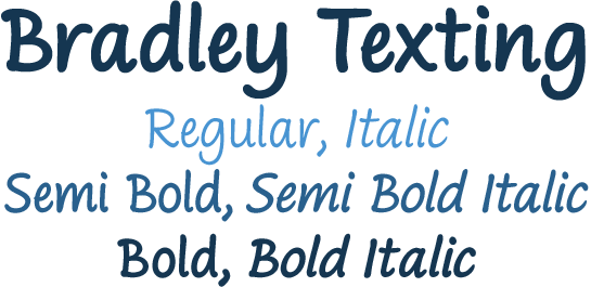 Two other font families paved the way to the newly introduced Bradley Texting.
 In the mid-1990s, Bradley published Bradley Hand™, with its rough contours. Since these coarse forms do not cut a good figure in the larger font sizes, Bradley Type™ followed, with smooth letters. During the development of Bradley Type, the idea for a further font came about – one in the style of the two other calligraphic typefaces, but with simpler, easily legible forms and suited to electronic devices like mobile phones
or tablets.
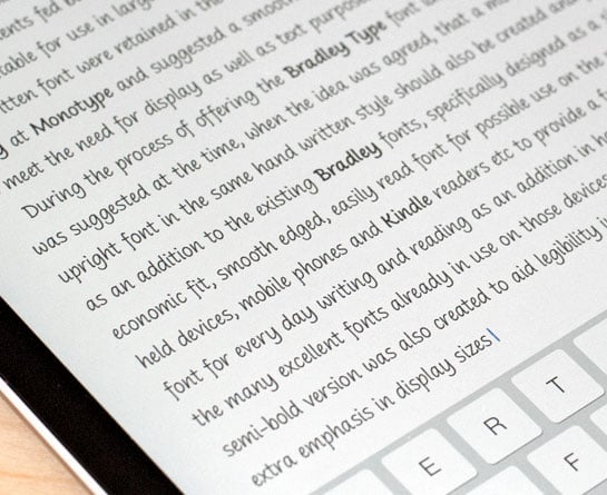
The letters for Bradley Texting began with a marker on paper. Looking back, Bradley describes one of the biggest challenges as having the calm required to draw the relaxed-looking letters repeatedly while still making them fit the general style.
The somewhat narrow and dynamically designed letters have round line ends,
like those left by a felt-tipped pen. As a hand-written print font, the individual letters are not connected to one another. Nonetheless, they demonstrate the influence
of a written font, such as the extended ends and the flowing transitions.
Designer Interview
-
Richard Bradley
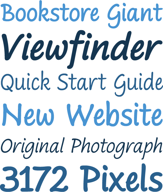 Clear forms with open counters and a large x-height guarantee Bradley Texting good legibility in the smaller font sizes. Bradley Texting is also effective under more challenging conditions, such as on mobile phones, e-book readers or tablets;
 the fonts friendly and lively character comes through.
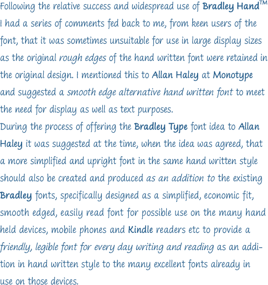
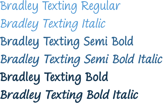
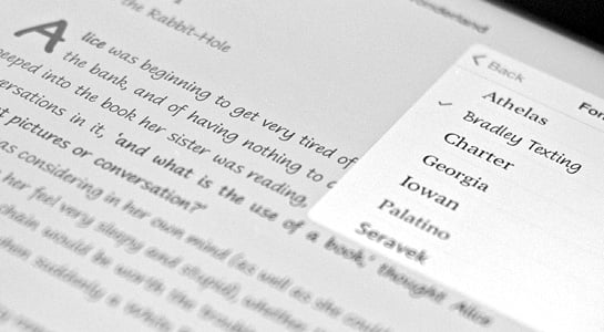 With Regular, Semibold and Bold, Bradley Texting is adequately equipped for use
 as a headline or text font in various sizes. Each weight comes with an italic version, with a much stronger slant. It emphasizes the dynamic character of the font and further expands its potential for use.
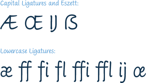
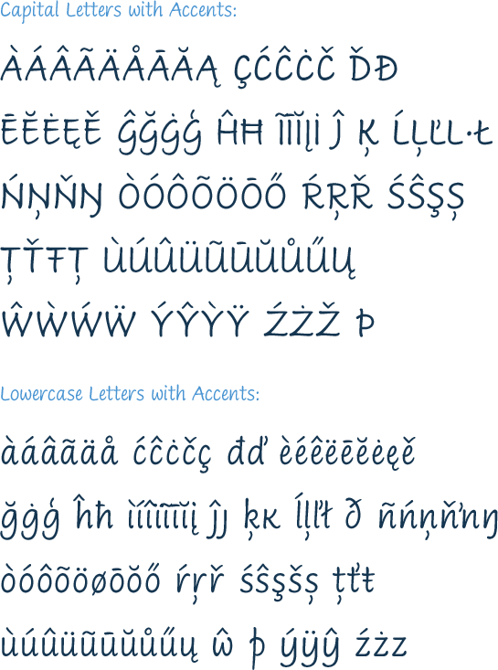
The selection of characters for Bradley Texting covers the Western European languages and German typographers will be happy to note the presence of the upper-case ß.
 Use the dynamic and clear forms of Bradley Texting anywhere you need a friendly character with a personal accent. Bradley Texting is persuasive in the print realm,
 in advertisements or on posters, as well as on electronic devices.