Burlingame
Burlingame by Carl Crossgrove: A font with optimal readability on screen that is also great
in print
You expect optimum readability for the font on a navigation device, and rightly so. Carl Crossgrove developed his new grotesque Burlingame for just this purpose. Burlingame is also an attractive font for other applications, however, like on the web or in print.
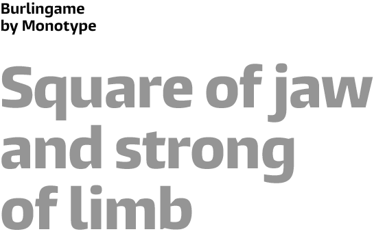 Carl Crossgrove created the first drafts of the Burlingame font for a computer game. The manufacturer eventually chose another script and Crossgrove set the drafts aside for a while. The foundation for the later Burlingame was there, however: a font that is very legible on a screen.
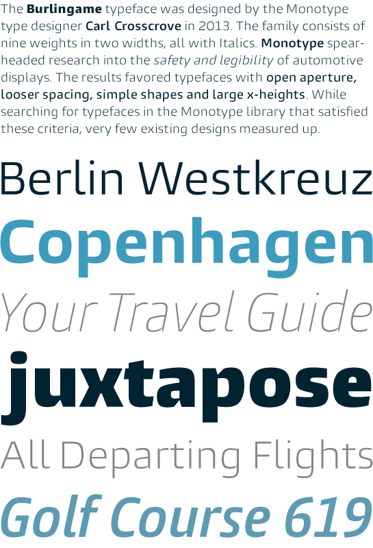
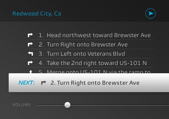 It makes sense, then, that Monotype’s search for monitor-friendly fonts would bring these drafts to light a while later. The prerequisites are all there: a large x-height, clear and simple forms with open counters and generous letter spacing. These primary design characteristics give Burlingame individuality and personality. The draft has been expanded into a comprehensive font family.
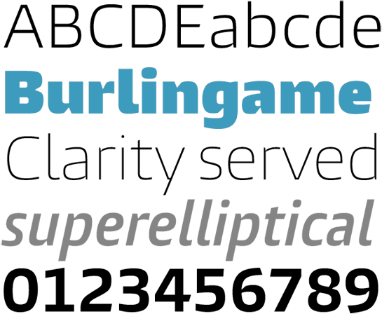 The basis of its design is the shapes of the Square Sans. According to Crossgrove, the main challenge was to lend the letters more clarity and make them crisper while maintaining the impression of a monolinear font. He managed this with an ingenious trick: he kerned the line terminals, emphasizing the letter form and making the type face more dynamic. This kerning is evident not only on curves like “h”, “g” or “p”, for example, but also on the leg of “k”, in a slightly modified form.
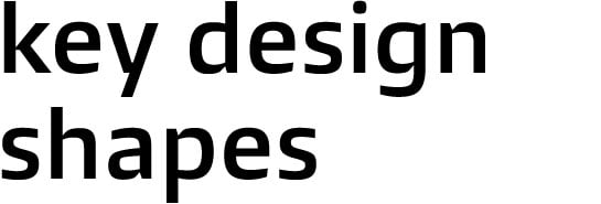 The letters in Burlingame have a technical, almost tight character thanks to the horizontally cut apex, in “v” and “w”, for example, as well as the uppercase “A”, “N”
and “M”.
 The filling on the inside of the apex, also horizontal, adds additional emphasis to this design element. The center of the “x” and the tail of the “y” also interpret this characteristic in their own way.
 Burlingame also has a friendly liveliness thanks to dots in the shape of the superellipse and partially beveled line ends.
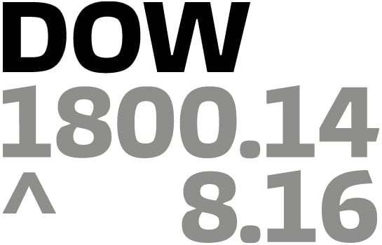
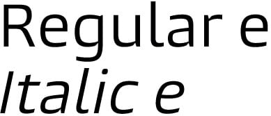
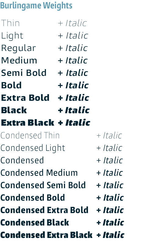
Burlingame is available in nine weights, graded from thin to extra black. Apart from the horizontal styles, there is an italic with slanted letters and a rounded, lowercase “e” available.
Designer Interview
-
Carl Crossgrove
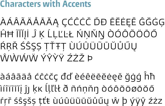
 In addition, Crossgrove has created a condensed variant for all styles with significantly reduced letter-spacing. The selection of characters in OpenType Pro format covers Western and Central European languages.
 While the strengths of Burlingame are most evident on the computer monitor, it is also a perfectly readable font for a variety of other applications, including print. Its many special design traits ensure readability in small type sizes, in particular, but also lend headlines and logos a very striking and unique character. A perfect selection not only in terms of weights, but also in terms of variable letter-spacing, lends you the necessary flexibility for larger corporate identity projects.
In this way, Burlingame is the ideal font for modern designs that require an optimal font for print as well as on the screen
 or web.
more ... First Sketches