Classic Grotesque
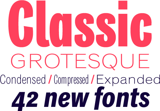
Three new width and 42 new fonts for the Classic Grotesque: Condensed, Compressed and Expanded
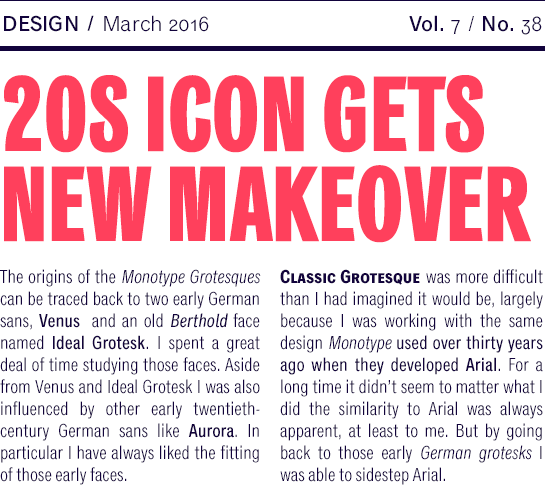
A revision and extension of the historic Monotype Grotesque, Rod McDonald’s Classic Grotesque has won plenty of acclaim since its publication. Now three more widths – Condensed, Compressed and Expanded – add to the previous 14 base styles and extend the potential of the calm and neutral family.

The new styles blend seamlessly with the existing designs and their typographic features. With a lightly structured character and angular points, McDonald picks up on the typical serif fonts from the beginning of the 20th century. A number of slanted line ends and lively details in “J” and “Q”, however, give the Classic Grotesque a very friendly flair.
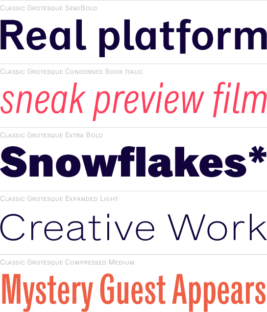
 With Classic Grotesque™ Condensed and Classic Grotesque™ Compressed, you now have two new styles to choose from with reduced widths. While the space savings in the Condensed is significant, the basic shape and expression of the letters remains the same. As a result, you can easily use Classic Grotesque Condensed for high-volume typesetting.
 The Compressed is different: the extremely narrow letters appear slim and tall and require some size to remain legible. The strong characters make for headlines with plenty of individuality.
 As a third new version of the font, Classic Grotesque™ Extended adds letters with increased width. In these styles, Rod McDonald emphasizes the generous and often noble character of his font.
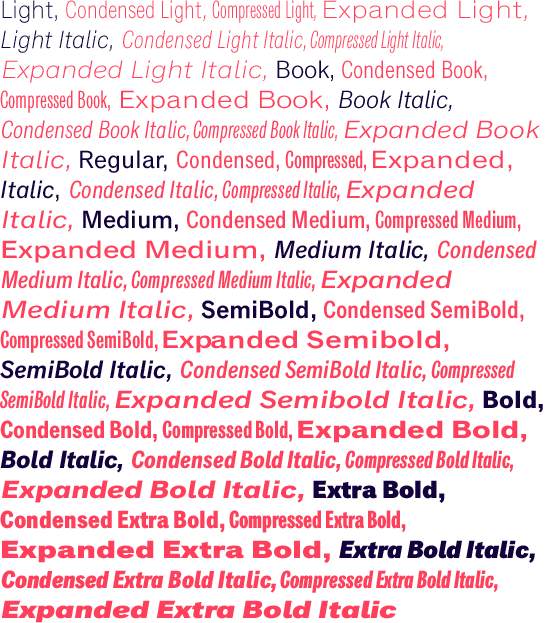
 The new styles are available in seven weights and each have a true italic with modified letter forms. Including the expansion, Classic Grotesque is now available in four widths with up to 56 styles.
 Whether in print or on the Web, the restrained layout of the Classic Grotesque can be used in headlines, in body text, logos or signalization systems, thanks to its perfect options. Classic Grotesque is a unique all-rounder that does not impose.
