David Hadash
David Hadash: an extensive and highly versatile Hebrew font family
The sophisticated yet uncomplicated forms of the “David” font created by Ismar David in the 1950s ushered in a new era in the design of Hebrew typefaces. Monotype has now made an entire font family available for digital typesetting in the form of David Hadash™ (“New” David).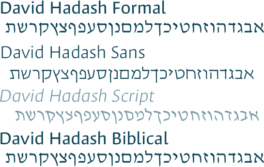 In the early 1930s, the designer Ismar David became acutely aware of the lack of good quality Hebrew fonts and decided to make up for this by creating a new, extensive typeface family. He started working on his undertaking in 1933 in Jerusalem, well before the typeface was first published in the 1950s. The 21-year-old had arrived in Jerusalem a year previously, after graduating from the Berlin-Charlottenberg School of Arts and Crafts, to supervise a design project that he had been awarded. He decided to stay and did not return to Germany.
Inspired by his new surroundings, he decided that he would not employ European design principles but would base his font on ancient Semitic forms. However, he also moved away from the sombre and ostentatious style used for Hebrew fonts of the early 20th century and furnished David with soft and straightforward forms that reduce the characters to their essential elements. The typical features of historical Hebrew lettering were retained but discreet curves were used to generate new emphases and, last but by no means least, Ismar David ensured that similar letters can be readily distinguished from each other. Employing this basic approach, he designed three stylistic variants that, in the case of David Hadash™, are called Sans, Formal and Script. All styles are available in the weights Regular, Medium and Bold.
With its variations in line width and the clearly manifest stem ends, David Hadash Formal gives the impression of having been produced with an ink pencil. Almost imperceptibly curved letters with rounded contours highlight its lively and dynamic character.
This is an image detail. Please click on the image to see the complete version.

Usage sample of David Hadash Formal.
(Excerpt from “A City and the Fullness thereof” by Nobel Prize laureate Shmuel Yosef Agnon).
Language: Modern Hebrew.
Although the forms of the David Hadash Sans are essentially similar to those of David Hadash Formal, there are marked differences in terms of visual effects. In some cases, curves are replaced by acute angles and the characters have much more of an appearance of having been chiselled in stone. With its less diverse range of form and almost monolinear stroke make-up, Sans seems much more stringent and technical in comparison with Formal.
This is an image detail. Please click on the image to see the complete version.
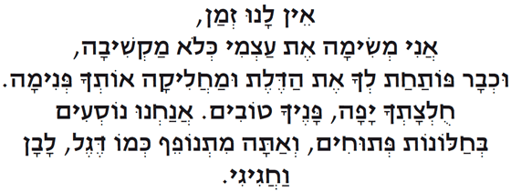
Usage sample of David Hadash Sans.
Extracted from Orit Gidali. Smichut, Hakibbutz Hameuchad Publishing House Ltd., Tel Aviv 2009 (Published with permission of the author).
Language: Modern Hebrew.
This is an image detail. Please click on the image to see the complete version.
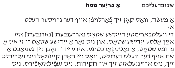
Usage sample of David Hadash Sans.
(Work by renowned author, Shalom Aleichem “A frier fest”).
Language: Yiddish.
This is an image detail. Please click on the image to see the complete version.

Usage sample of David Hadash Sans.
Haaretz, 13 April 2011: Basketball: The “Hapoel” Jerusalem fall again into routine (by Tal Ben Ezra).
Language: Modern Hebrew.
David Hadash Script was originally conceived as a display version of Formal, but looks good even on its own. Its dynamic letters are subtly slanted from right to left and have considerably greater vitality in comparison with Formal – in some cases, they exhibit stylistic analogies with Rahi script. David Hadash Script can justifiably be called a genuine cursive which, thanks to its special charm and charisma, is one of the special jewels in the treasure chest of Hebrew fonts.
This is an image detail. Please click on the image to see the complete version.
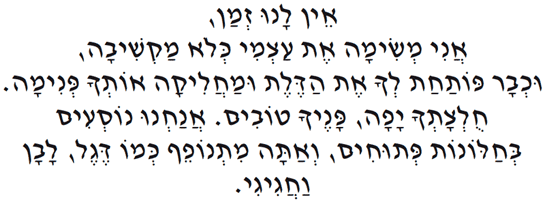
Usage sample of David Hadash Script.
Extracted from Orit Gidali. Smichut, Hakibbutz Hameuchad Publishing House Ltd., Tel Aviv 2009. (Published with permission of the author).
Language: Modern Hebrew.
Available as a fourth font style is a variant of Formal, David Hadash Biblical. Supplied with this font are not only the consonants and the vowel pointings, but also the cantillation marks or accents that are used to provide a guide to the ritual chanting of Hebrew Biblical texts in the synagogue.
This is an image detail. Please click on the image to see the complete version.
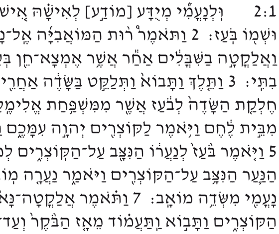
Usage sample of David Hadash Biblical (David Hadash Formal with cantillation marks).
Language: Biblical Hebrew.
This is an image detail. Please click on the image to see the complete version.
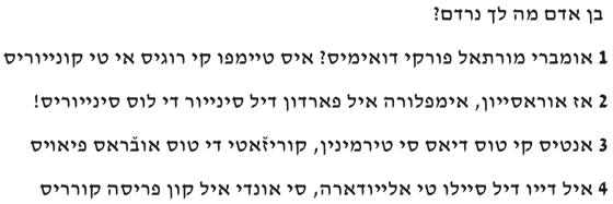
Usage sample of David Hadash Formal.
(From the Digitized Ladino Library, Stanford University.
An extract from “The Selihoth of the Sephardim” by Josef Alschech).
Language: Ladino.
This is an image detail. Please click on the image to see the complete version.
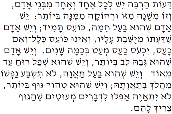
Usage sample of David Hadash Formal.
Text by Moses Maimonides (Commentary on the Torah).
Language: Modern Hebrew.
Thanks to the various styles and the range of characters, David Hadash can be used in a multiplicity of very different contexts. This range of alternatives means that imagination alone limits the potential applications for the font, either alone or in combination. David Hadash is the ideal corporate font, text or headline typeface.