Daytona
Daytona by Jim Wasco: a dynamic, sporty, Grotesque ideal for the screen
Jim Wasco is an old hand among the font designers at Monotype, responsible for quite a few fonts over the decades. Disappointed by the poor quality of fonts in sports broadcasts, Wasco decided to design a new font for that area. And so, Square Sans Daytona was born.
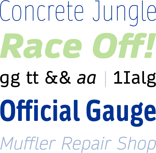 The starting point for and precursor to the Daytona™ is a sans serif that Wasco designed over ten years ago for the Xbox game console, Wasco Sans. Although he kept the basic structure of a humanist square sans, Wasco revised the characters and letter shapes with an eye to the intended area of application.
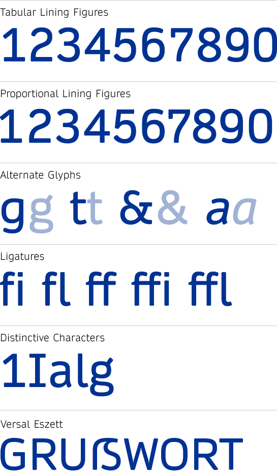
With gently rounded corners, Wasco gave Daytona a warm, friendly and somewhat soft character. At the same time, he cleverly picks up on the round base shape of the letters, based on the superellipse. Abandoning spurs or implied serifs, he ensures a reduced, slightly futuristic appearance. Although the shapes of the letters are derived mainly from an Antiqua, the contrast in stroke width is not very pronounced and is clearly visible only in the bolder styles. Wasco devoted a great deal of attention to the readability his new font. The large X-height and the open forms guarantee the necessary clarity even in the small sizes. In addition, Wasco designed additional distinct characteristics for the particularly critical letters to support the differentiation. In this way, for example, the lower-case “l” has a rounded base and the upper-case “I” has serifs.
 With many ligatures, you can optimize or customize the appearance of Daytona. To this end, several alternate characters are available: for example, a two-story “g” in the upright styles, or a “t” without a rounded connection of the bar to the stem, or the closed “a” in the italic styles.
 Characters aimed at proportional and table setting are also included, rounding out the options of Daytona. German typesetters and typographers will be very happy about the uncommon shape of the upper-case “ß”.
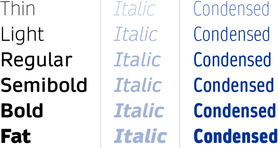
 Daytona is available in six weights from thin to fat, each with a matching italic. The upright weights also have a condensed version.
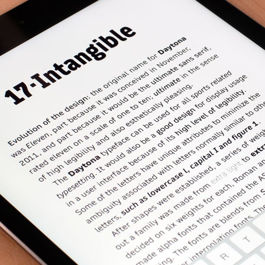
 With its neutral, dynamic, modern and slightly futuristic character, Daytona not only suits the sports environment. The well-developed, space-saving and perfect-to-read font cuts a fine figure in other projects, as well. Daytona is at its best on screen – on web pages, for example – but also in user interfaces on navigation devices, TVs or mobile phones. ZTE China has recognized this and uses a slightly modified form of the Daytona for the MiFavor interface in Android.
Designer Interview
-
Jim Wasco
Read also the Interview with Jim Wasco.
* Gross price 117,81 USD/EUR including German sales tax.
The offer does not apply to holders of user accounts who already receive a fixed price reduction.
