DIN Next Stencil
The new DIN Next Stencil – a strong and distinctive addition to the super family
With its technical and neutral character, DIN Next™ has earned a permanent place in contemporary typography and in the hearts of designers. Originally developed by Akira Kobayashi, the font has been expanded over the years, and has now grown into a large family with DIN Next™ Slab, DIN Next Condensed, DIN Next Rounded and the international versions DIN Next™ Arabic and DIN Next™ Devanagari.
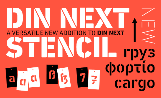
The youngest member of the super family is DIN Next™ Stencil, created by Sabina Chipară. The Romanian-born designer has added additional tonality to the DIN Next family and offers you, the designer, new potential for expression.
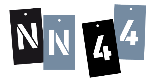
Derived from the upright DIN Next, the strips in the stencil version emphasize the technical and industrial character of the open sans serif. The positions of the strips are set so realistically that you could easily cut out DIN Next Stencil and use it as an actual stencil. Thanks to this realistic approach, the letters are reminiscent of a freshly painted stencil, adding the character of industrial equipment, transport boxes or military equipment into your designs.
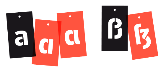
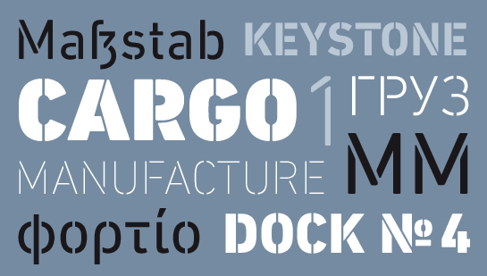 Chipară designed DIN Next Stencil in seven weights that fit the rest of the DIN Next family, so that the family not only looks good on its own, but can also be easily combined. In addition to the support of most Western European languages, there are also characters for Greek and Cyrillic and alternative forms for some of the capital letters.
 The new DIN Next Stencil is somewhat more present compared to the other styles of the super family, but is not intrusive. The bars look their best in the bigger sizes and underline the strong and striking flair of the family. Use DIN Next Stencil for posters, magazine titles or headlines, for example – anywhere you want to emphasize the technical and neutral character of DIN Next a little more.

Derived from the upright DIN Next, the strips in the stencil version emphasize the technical and industrial character of the open sans serif. The positions of the strips are set so realistically that you could easily cut out DIN Next Stencil and use it as an actual stencil. Thanks to this realistic approach, the letters are reminiscent of a freshly painted stencil, adding the character of industrial equipment, transport boxes or military equipment into your designs.
 Chipară designed DIN Next Stencil in seven weights that fit the rest of the DIN Next family, so that the family not only looks good on its own, but can also be easily combined. In addition to the support of most Western European languages, there are also characters for Greek and Cyrillic and alternative forms for some of the capital letters.
 The new DIN Next Stencil is somewhat more present compared to the other styles of the super family, but is not intrusive. The bars look their best in the bigger sizes and underline the strong and striking flair of the family. Use DIN Next Stencil for posters, magazine titles or headlines, for example – anywhere you want to emphasize the technical and neutral character of DIN Next a little more.
