FF Enzo
 FF Enzo®, which he published in 2008, boasts a strong, Scandinavian-inspired character. An extreme X-height, short ascenders and descenders as well as huge punches provide for an appearance that is compact, yet very open.
Kvant cleverly combines influences from various styles. He picks up on the neutral, technical flair of an almost monolinear square sans, adds influences of Antiqua and, finally, counters the strictness with numerous and very vivid details. The line ends are cut at an angle, the crossbar in the small “e” is slightly diagonal, the lower-case “i”, “l” and “t” show a gently curved foot and the slightly asymmetrical design of the “x” almost recalls a comic font. These many details of FF Enzo are most evident in the heavier weights, in particular, and lend the font a dynamic, friendly and lively character.
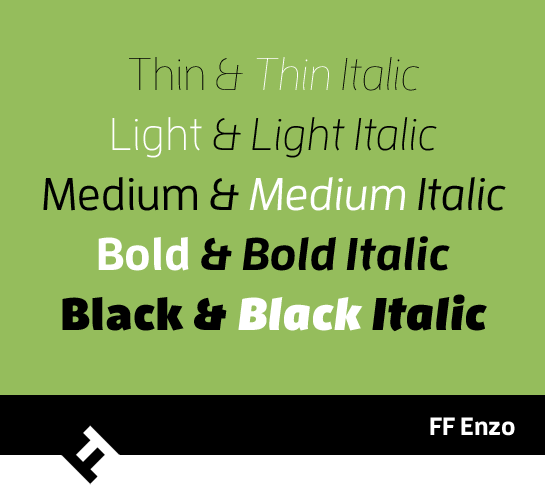
 FF Enzo is available in five weights, Thin, Light, Medium, Bold and Black. Each weight has its own true italic. The italic styles emphasize the partially curved nature of the letters and the lower-case “a” changes to a closed design.


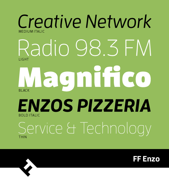
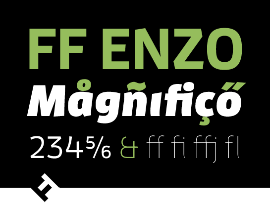
In addition, all styles have numerous ligatures, table figures and smaller numbers in four vertical positions. With its striking, very lively, but unconventional character, FF Enzo is also suited to headlines because of its compact design. Thanks to its large punches and X-height, the font is also perfectly legible in smaller sizes, however, and can be used for longer texts.

