FF Marselis
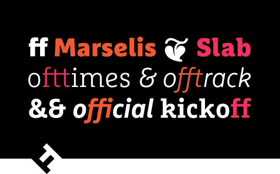
FF Marselis and FF Marselis Slab:
a strong team for corporate design
The fonts of the extended family FF Marselis® by Jan Maack draw attention to themselves with their unique and memorable blend of geometric and humanist influences. Both the sans and the slab are perfectly legible and can be used for signage, headlines, logos, and longer texts. In combination, both families are ideally suited to large corporate design projects.
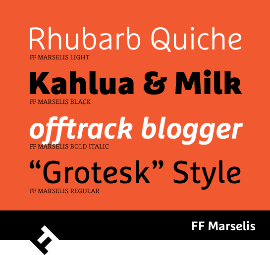
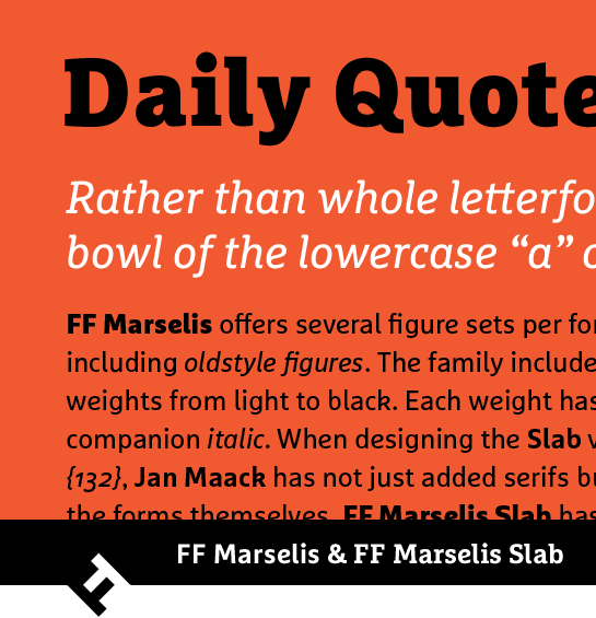 Different typographical influences come together in the lively sans FF Marselis and lend the font an entirely unique, lively, and individual character. Letters such as the lowercase “c”, “d” or “g” are reminiscent of a humanist sans. The lack of spurs on the “b” and “q” letter add a technical flair.

It is an altogether different trick on the part of Maack that sets the font apart, however: since the loops connect fluidly to the stems, the points in “a” and “e” have a very striking, drop-like shape. Maack cleverly adds this stylistic detail to the lowercase “k” and the uppercase “Q”, and to a lesser extent the “P” and “R”. The vibrant and dynamic impression is supported in numerous letters by stems that curve slightly outwards.
If you look closely, you’ll notice that the spurs in the lowercase letters have a very slight curve.
 All in all, Maack was able to take back the formal character of the font a little in favor of a joyous, lively flair. The italic styles do not simply expand the round character of the letters; there are other changes as well. For example, the small “a” changes to the closed form and the “f” gets a descender.
 The sans FF Marselis is accompanied by the slab serif FF Marselis® Slab. While Maack transferred the basic form and essential character traits from the sans, he did not simply expand the serifs. Rather, the designer carefully adjusted the letters to the new circumstances. In addition, the lowercase “b” and “q” have a spur and the foot of the “k” is extended slightly. The strong, rectangular serifs give FF Marselis a significantly more robust character, but Maack manages to preserve the warm and friendly appearance of the font with the round ends of the serifs.

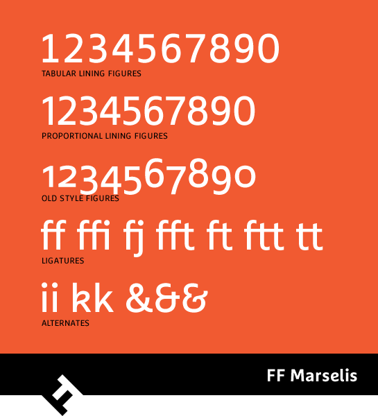
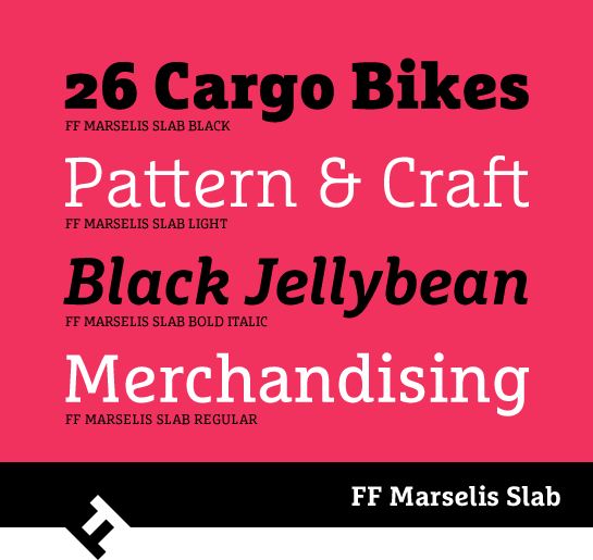 The two families FF Marselis and FF Marselis Slab are available with identical options and four weights, from Light to Black, each with a matching italic. You also have the option of various numeral sets with old-style and uppercase numbers as well as numerous ligatures.
 With the somewhat restrained sans and the powerful slab serif, the FF Marselis extended family works well in very diverse application scenarios. In combination, the perfectly harmonious family is in top form and can work in very large corporate projects without any problem.