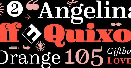
FF Quixo
FF Quixo came about as a result of a typographic experiment. During his studies at the Royal Academy of Art in The Hague, Frank Grießhammer was so fascinated by the different writing tools like feathers and brushes that he decided to design a font in which each style would be created with a different tool. Many of the original differences among the styles did not make it to the finished, homogenized font. They have left their traces, however, and make for a lively, cheerful, almost playful calligraphic font. It is precisely these irregularities that, along with the heavily curved serifs, lend FF Quixo its striking character. Each of the six weights includes a dynamic, unique italic.
FF Quixo won a Certificate of Typographic Excellence at the TDC as well as the Out of Box Award in 2014. It was also one of Typographica magazine’s “Favorite Typefaces of 2013”.
FF Quixo won a Certificate of Typographic Excellence at the TDC as well as the Out of Box Award in 2014. It was also one of Typographica magazine’s “Favorite Typefaces of 2013”.
