FF Suhmo
FF Suhmo – a flexible, warm and friendly slab serif
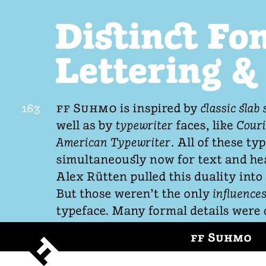
By combining very different typographic influences, Alex Rütten gave his slab serif FF Suhmo™ a very special character. Apart from the classic slab serifs, the so-called typewriter fonts, like American Typewriter™ or Courier, for example, had an enormous influence on the shape of the font. A low contrast in weight and rounded line ends support the formal, yet warm and friendly flair for which the font is well known.
To add that special something, Alex Rütten added the character of the neon advertisement fonts from the 1960s and 1970s to FF Suhmo:
here an extended foot that recalls a typewriter, there a small loop. In this way, the designer emphasizes the casual, fun and somewhat playful character of the font. Take, for example, the design elements on the lower-case “g” and “k” or upper-case “C” and “R”.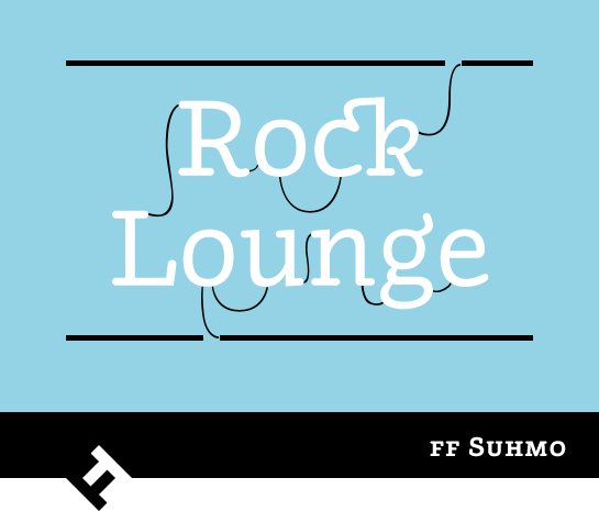

The cursive, available for all styles, brings these influences to the forefront and sometimes blurs the boundary of a dynamic, handwritten font. Many of the only slightly inclined letters are designed to be more lively than the upright ones. They hint at loops and have swinging curves as well as extended ends. Alex Rütten also sets the italic apart with a slightly leaner design for the upright sections.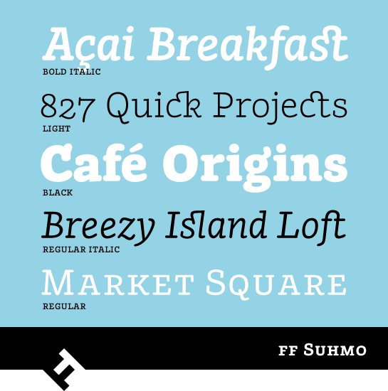 FF Suhmo is available in four weights from Light to Black, each with matching italics. Alex Rütten has two pairs in mind: the Light works perfectly with the Bold and the Regular with the Black. Small caps are also available for emphasis in all styles. Furthermore, FF Suhmo offers various numeral sets with old style and upper-case numerals for proportional or the table setting. In addition to the standard ligatures, FF Suhmo also has more, very beautifully designed ligatures.
 The many lively details in the FF Suhmo have been designed with enough restraint so as not to be disruptive in body text. In headline sizes, the font adds a special note with a high degree of recognition value. The great options and suitability as a web font open this friendly and diverse font up to a wide range of potential applications.
The Type Directors Club recognized the quality of FF Suhmo and awarded it the “Certificate of Excellence in Type Design” in 2011.
here an extended foot that recalls a typewriter, there a small loop. In this way, the designer emphasizes the casual, fun and somewhat playful character of the font. Take, for example, the design elements on the lower-case “g” and “k” or upper-case “C” and “R”.


The cursive, available for all styles, brings these influences to the forefront and sometimes blurs the boundary of a dynamic, handwritten font. Many of the only slightly inclined letters are designed to be more lively than the upright ones. They hint at loops and have swinging curves as well as extended ends. Alex Rütten also sets the italic apart with a slightly leaner design for the upright sections.
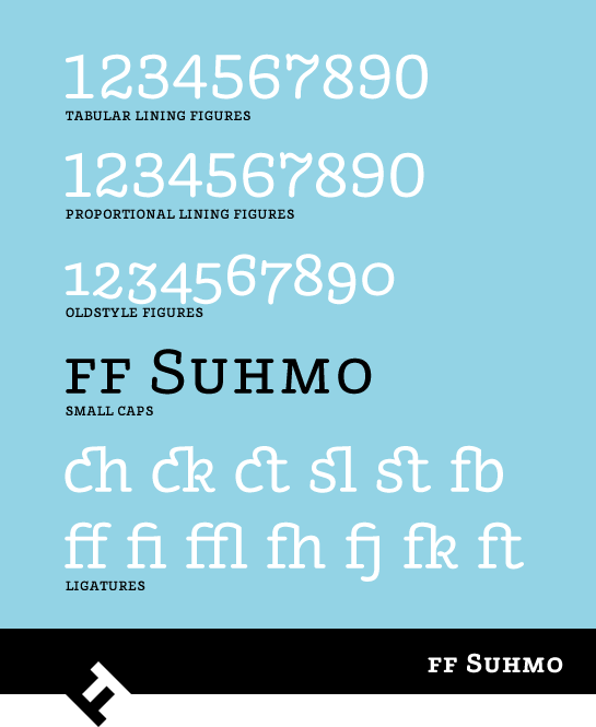
 FF Suhmo is available in four weights from Light to Black, each with matching italics. Alex Rütten has two pairs in mind: the Light works perfectly with the Bold and the Regular with the Black. Small caps are also available for emphasis in all styles. Furthermore, FF Suhmo offers various numeral sets with old style and upper-case numerals for proportional or the table setting. In addition to the standard ligatures, FF Suhmo also has more, very beautifully designed ligatures.
 The many lively details in the FF Suhmo have been designed with enough restraint so as not to be disruptive in body text. In headline sizes, the font adds a special note with a high degree of recognition value. The great options and suitability as a web font open this friendly and diverse font up to a wide range of potential applications.
 The Type Directors Club recognized the quality of FF Suhmo and awarded it the “Certificate of Excellence in Type Design” in 2011.
