FF Tundra
FF Tundra: a solid and narrow Antiqua
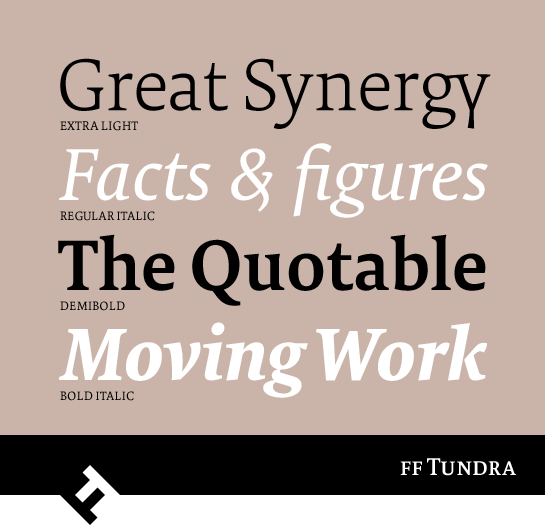
Ludwig Übele designed the well-equipped Antiqua FF Tundra® with solid, narrow letterforms for high-volume typesetting. The font’s distinctive charisma, even in the extreme weights, lets FF Tundra cut a fine figure in headlines as well, however.
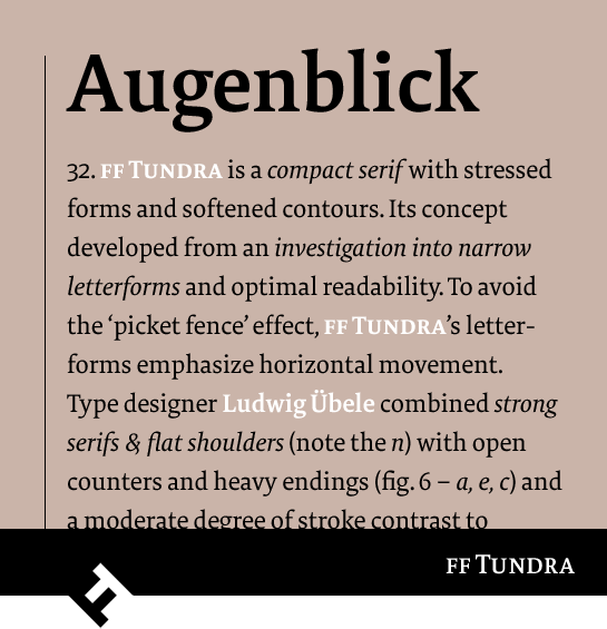
Übele developed FF Tundra based on research about easily legible, condensed Antiquas. Strong serifs, which connect to the stems with sharp curves, combined with flat shoulders, determine the character of this font, which is based on the Renaissance Antiqua. Careful allusions to a calligraphic font along with round points add a very lively feel to FF Tundra, which was designed with only minor contrast. Moreover, Übele emphasized the horizontal movement in the letterforms in order to avoid the typical “fence effect” of some text fonts. The solid letterforms and large x-height help the font achieve perfect legibility in small font sizes.
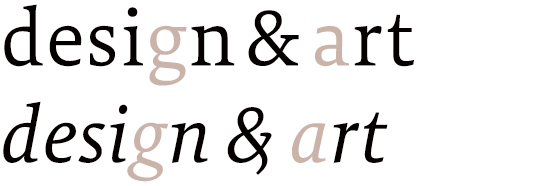
 FF Tundra is available in eight weights, from Extra Light to Bold, each with their own true italic. In the italic, the narrower, rounder and more dynamic letters have extended line ends, and the “a” changes to a closed format and the “f” has a descender.
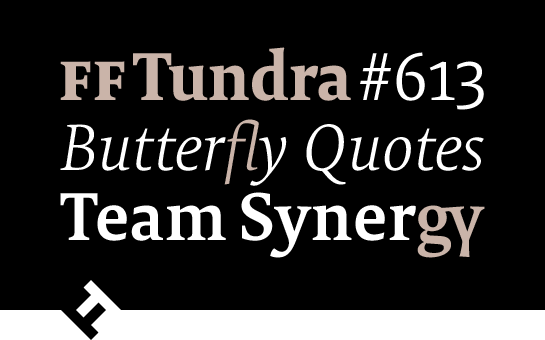
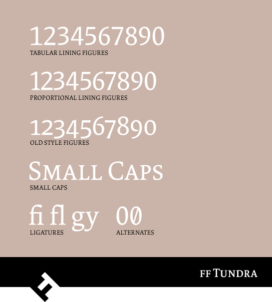
 The character options for FF Tundra also leave no wish unfulfilled. Übele designed different number sets with upper-case and old-style figures, ligatures and small caps.
 The magazine “Stern” used FF Tundra as a text font for many years. FF Tundra has proven its quality in this magazine, given the difficult conditions of the rotogravure printing. The TDC also recognized these qualities, awarding the font the Certificate of Excellence in Type Design in 2011.

 FF Tundra is available in eight weights, from Extra Light to Bold, each with their own true italic. In the italic, the narrower, rounder and more dynamic letters have extended line ends, and the “a” changes to a closed format and the “f” has a descender.
 The character options for FF Tundra also leave no wish unfulfilled. Übele designed different number sets with upper-case and old-style figures, ligatures and small caps.
 The magazine “Stern” used FF Tundra as a text font for many years. FF Tundra has proven its quality in this magazine, given the difficult conditions of the rotogravure printing. The TDC also recognized these qualities, awarding the font the Certificate of Excellence in Type Design in 2011.
