Discover legacy content from linotype.com, preserved for your reference.
Frutiger Serif
Adrian Frutiger’s newest typeface: Frutiger Serif

It isn’t every day that one of the world’s most popular sans serif typeface families receives a new serif companion. When this happens, it is certainly reason to celebrate. Linotype is proud to release Frutiger® Serif, a new typeface family from Adrian Frutiger and Akira Kobayashi.
The idea for Frutiger Serif began as an updated and expanded version of Frutiger’s classic serif typeface Meridien®, which was originally released in 1957 for the French foundry Deberny & Peignot.
 |
| Scan of an Deberny & Peignot specimen showing Meridien Roman |
 |
| Scan of an Deberny & Peignot specimen showing Meridien Italic (enlarged) |
Linotype’s Type Director, Akira Kobayashi, began by returning to prints made from the original metal type version of Meridien. In his opinion, the phototype and digital versions had been drawn too wide; the original phototype and digital Meridien had been optimized for 10–12 point text, but even these sizes are not really small enough! A typeface named Frutiger Serif would have to be able to function in smaller sizes, too.
 |
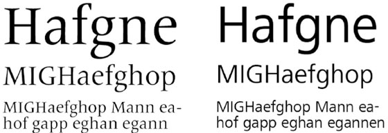
| Linotype’s digital Meriden Regular (top) and Frutiger Serif Regular (bottom) |
 |
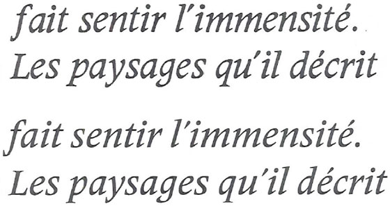
| Deberny & Peignot Meridien Italic 8-point type, enlarged (top two lines). Frutiger Serif Medium (bottom two lines) |
Additionally, the range of weights and styles in the Frutiger Serif family has been restructured from Meridien in order to match with those from Frutiger’s sans serifs. The Frutiger Serif family includes five weights, Light to Heavy. Each weight also has two widths, Regular and Condensed. This brings the number of fonts in the family up to 10. Yet that’s not all! Every one of these fonts has an Italic companion, bringing the total number of fonts in the family up to 20. This means that Frutiger Serif includes Condensed Italics, which is quite an improvement. Neither the Frutiger nor the Frutiger Next families include these to date.
 |
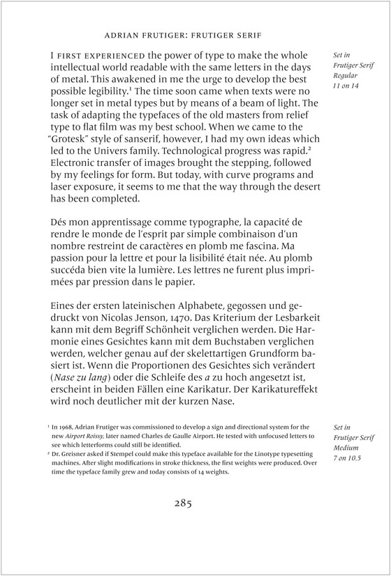
| Sample of the typeface in use. Body text set in Frutiger Serif Regular, footnotes in Frutiger Serif Medium |
Just as Meridien was once one of the finest choices for serif text setting, Frutiger Serif may be used brilliantly on its own. Yet the typeface’s true versatility shines through when it is combined with others. Astute typographers will enjoy pairing Frutiger Serif with many other of Adrian Frutiger’s sans serif designs. Or perhaps even with sans serif typefaces created by other designers!
The fonts in the Frutiger Serif family support 48 Latin-based Western, Central, and Eastern European languages, including those spoken in the Baltic States and Turkey. Additional OpenType features include ligatures, small caps, ornaments, and a range of numerals, such as proportional and tabular-width lining and old style figures, fractions, inferiors, and superiors.
Search with the keyword for ‘Frutiger’ to find all fonts in the Linotype Library designed by Adrian Frutiger.

