Louisville Script
Louisville Script: dynamic, casual and versatile
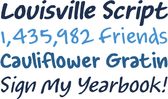
The letters of Louisville™ Script are loosely based on the handwriting of designer Steve Matteson. Use the dynamic, very informal font not only for greeting and invitation cards, but also for teaching materials, school and yearbooks, for example.

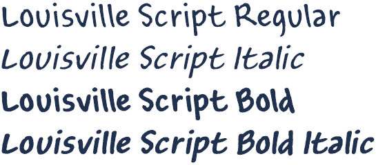
The reduced, nearly monolinear letters of Louisville Script are easily legible and appear very realistic, even a little hastily written. The rough contours, which are reminiscent of coarse paper, only serve to reinforce this appearance. The unconventional slant against the direction of writing lends Louisville Script a special touch. Consequently, the italic version is not slanted in the direction of writing, but stands upright. Matteson cleverly added a slight contrast in the stroke width, creating a typical and dynamic flair for the italic.
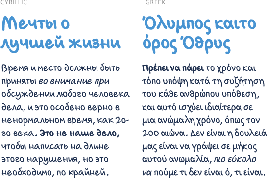
 Louisville Script is available in two weights, each with a matching italic. In addition to Western and Central European language support, it also has Cyrillic and Greek letters.
 Louisville Script has an unobtrusive, easy-going sensibility that works well in countless application scenarios. Apart from greeting cards and invitations (applications typical to the genre), Matteson recommends the friendly, informal character of his font for use in education. Thanks to its great options, it can also be used in an international context.

 Louisville Script is available in two weights, each with a matching italic. In addition to Western and Central European language support, it also has Cyrillic and Greek letters.
 Louisville Script has an unobtrusive, easy-going sensibility that works well in countless application scenarios. Apart from greeting cards and invitations (applications typical to the genre), Matteson recommends the friendly, informal character of his font for use in education. Thanks to its great options, it can also be used in an international context.
