Discover legacy content from linotype.com, preserved for your reference.
Luba
Luba – This informal sans helps introduce readers of the Latin script to Cyrillic

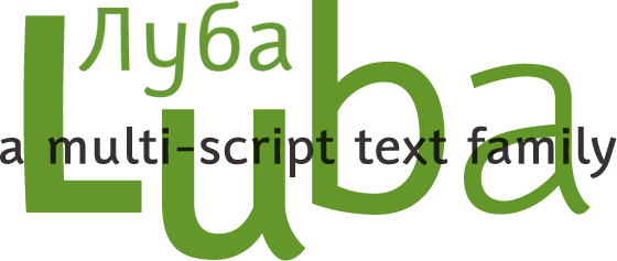
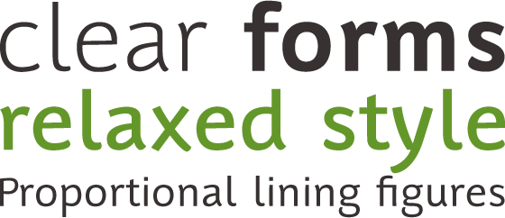
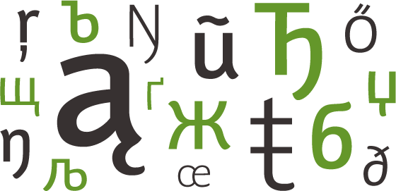
Luba™ is a multi-script text family designed by Hendrik Möller. The family includes four weights: Light, Regular, Medium, and Bold. Each of these fonts may be purchased with both Latin and Cyrillic script coverage, or with support for just the Latin script. Möller initially developed Luba to assist speakers of languages using the Latin script who are just embarking upon learning a language that uses the Cyrillic script, i.e., French, Germans, or Italians who are learning Russian or Ukrainian. Luba’s letters place significant emphasis on their identifying elements; clear forms and a relaxed style help familiarize the reader with the foreign glyphs. The typeface makes clear distinctions between Latin and Cyrillic letters, without covering up their shared heritage.
 |
Luba’s OpenType Features
| 1. | Proportional Lining Figures |
| 2. | Tabular Lining Figures |
| 3. | Proportional Oldstyle Figures |
| 4. | Tabular Oldstyle Figures |
| 5. | Numerators |
| 6. | Denominations |
| 7. | Superior Figures |
| 8. | Inferior Figures |
| 9. | Diagonal Fractions |
| 10. | Slashed Zeros |
| 11. | Ligatures |
| 12. | Discretionary Ligatures |
| 13. | Historical Alternates |
| 14. | Historical Ligatures |
| 15. | Stylistic Sets |
 |
Helpful Hints
Some of Luba’s OpenType features may require further explanation:
Historical Alternates
Currently, no major layout applications support the Historical Alternates feature. Luba’s font character sets include just one Historical Alternate: the long s. Adobe InDesign users who wish to use the long s in their text may substitute the glyph for a normal lowercase s manually via the Glyph Palette, or via Stylistic Set 2 (see below).
Historical Ligatures
Currently, no major layout applications support the Historical Ligatures feature. Luba’s font character sets include a number of long s ligatures, e.g., for ssi, ssl, etc.. Adobe InDesign users who wish to use these long s ligatures in their text may substitute them in manually with the Glyph Palette, or via Stylistic Set 2 (see below).
 |
Stylistic Set 1
Luba’s Latin character set includes alternate, informal versions of the lowercase a, e, and g characters. Customers who purchase licenses for the Luba Cyrillic fonts will also notice that the fonts include alternate informal versions for quite a few Cyrillic letters. In order to substitute these letters for the standard forms, users must simply highlight a block of text in Adobe InDesign, and then choose Stylistic Set 1 from the OpenType menu. Please not that QuarkXPress currently does not offer support for Stylistic Sets.
Stylistic Set 2
By selecting Stylistic Set 2 from the Adobe InDesign OpenType menu, all of the Historical Alternates and Historical Ligatures mentioned above will appear in your text.