Masqualero
Jazz music, poured into letters. The new Masqualero typeface by Jim Ford
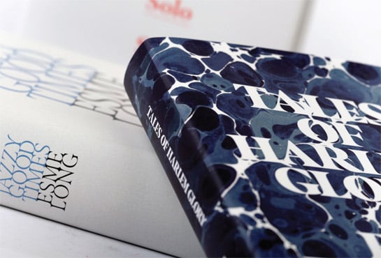
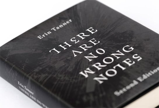
The Masqualero™ typeface by Jim Ford features a high contrast in its stroke widths, as well as a striking interplay between its sharp and rounded shapes, giving the font an unmistakable character. These lend the font an unmistakable character. Inspired by jazz, the typeface’s noble and fine forms work best in magazine titles, headlines or logos. The perfectly equipped Masqualero also cuts a fine figure in long texts, as well.
Jim Ford first had the idea for the Masqualero typeface while driving through a snowstorm, listening to Miles Davis. Somewhere on Route 14 between Chicago and Wisconsin, the magical interaction of loose, meandering, seeking, swelling and diminishing tones formed letters in his thoughts. Ford first sketched the word “Masqualero” in bold letters after arriving home, and then proceeded to build out the rest of the typeface, drawing the characters like noble, abstract, sharp, black marble structures in a park. It took a few years before his magnum opus came to life and he published the typeface Masqualero, named after the song by Miles Davis.
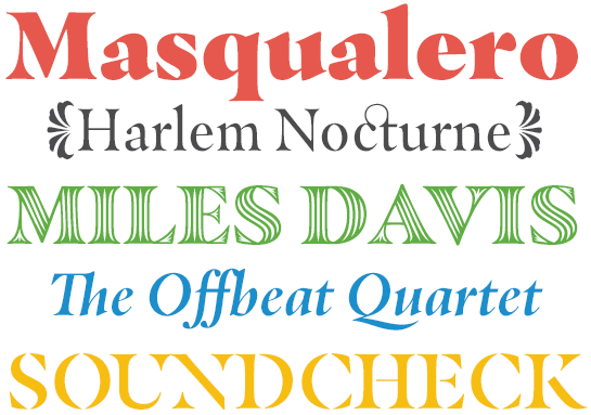
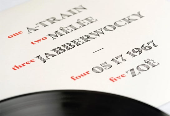 On the one hand, Masqualero recalls the character of a calligraphic font or even a Gothic script, with its strong contrast in weight, sharp transitions and the occasional edge. On the other hand, the pointed serifs, which connect softly to the slightly grooved stems, give the font a friendly character. This warm flair is also supported by the rounded forms and very striking, rotated and drop-shaped points over the “i” and the “j” as well as an almost floral stroke design.
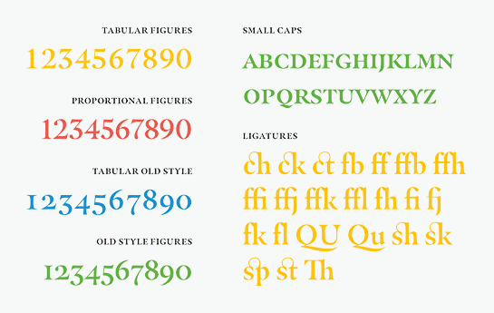
 Each of the finely graded weights of Masqualero includes a genuine italic. Here, the handwritten character of a calligraphic font definitely lends the typeface a very dynamic flair and numerous letters change into the typical italic forms. Beautifully designed ligatures, small caps and various number sets round off the available characters in all styles.
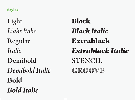
 Ford also designed two decorative styles in capital letters for display typesetting, Masqualero Stencil and Masqualero Groove.
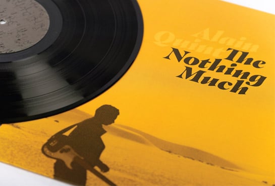
 Masqualero is Jim Ford’s homage to Jazz musician Miles Davis in letter form. The typeface is as enigmatic and complex as the so-called “Prince of Darkness” and the composition from 1967 that shares its name. Masqualero’s cool and contradictory, yet dark and restless character works best in large sizes. The font has a rhythm of jazz and is most well suited to designing posters, covers and logos. Masqualero’s bold and versatile design makes it an eye-catching typeface for a wide array of projects and applications.


 On the one hand, Masqualero recalls the character of a calligraphic font or even a Gothic script, with its strong contrast in weight, sharp transitions and the occasional edge. On the other hand, the pointed serifs, which connect softly to the slightly grooved stems, give the font a friendly character. This warm flair is also supported by the rounded forms and very striking, rotated and drop-shaped points over the “i” and the “j” as well as an almost floral stroke design.
 Each of the finely graded weights of Masqualero includes a genuine italic. Here, the handwritten character of a calligraphic font definitely lends the typeface a very dynamic flair and numerous letters change into the typical italic forms. Beautifully designed ligatures, small caps and various number sets round off the available characters in all styles.

 Ford also designed two decorative styles in capital letters for display typesetting, Masqualero Stencil and Masqualero Groove.
 Masqualero is Jim Ford’s homage to Jazz musician Miles Davis in letter form. The typeface is as enigmatic and complex as the so-called “Prince of Darkness” and the composition from 1967 that shares its name. Masqualero’s cool and contradictory, yet dark and restless character works best in large sizes. The font has a rhythm of jazz and is most well suited to designing posters, covers and logos. Masqualero’s bold and versatile design makes it an eye-catching typeface for a wide array of projects and applications.
