Mengelt Basel Antiqua
Mengelt Basel Antiqua: a reading font with
historic connections
The task of finding a suitable font for the re-edition of a historical anatomy atlas led experienced typographer Christian Mengelt to research book fonts from the 16th-century Basel. He distilled the major design characteristics of the original prints and created Mengelt Basel Antiqua, a font with historical references that is not only suited to demanding, scientific texts.
 The first edition of the anatomy atlas “De humani corporis fabrica” came out nearly 500 hundred years ago. It was published in 1543 in Basel by Andreas Vesalius. The work was published in multiple volumes and is extraordinary not only for its content and design, but also its typography. It excites philologists and typographers to this day. “De humani corporis fabrica” was printed in the workshop of Johannes Oporinus, who was considered one of the major printers and publishers in Basel in his time. He used one of the Venetian Antiqua-inspired fonts for the typesetting. This is a genre of fonts which was much loved by the Basel printers. The printer Johann Amerbach brought it to Switzerland from Italy a few centuries earlier.
The American philologist Daniel H. Garrison provided the initiative for Mengelt to explore the Basel Antiqua fonts from the 16th century. He is working on a re-edition of the “De humani corporis fabrica” and is looking for a fitting print font which has historical references, but the technical characteristics of a modern font. Mengelt takes on the challenge and designs his Mengelt Basel Antiqua font on the basis of the original Basel prints.
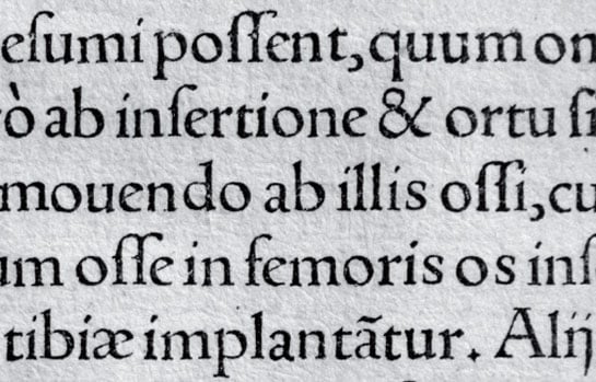 Detail of the anatomy atlas “De humani corporis fabrica”, workshop Oporinus, Basel, 1543
Simply digitalizing the historical texts was out of the question, since the majuscule, minuscule and cursive fonts were independent alphabets with little in common back in those days. In the texts, written in lower-case, the upper-case letters appear as headlines and as initials in some cases. The cursives are also used as an independent font and not as a variation for emphasis as they are today.
Detail of the anatomy atlas “De humani corporis fabrica”, workshop Oporinus, Basel, 1543
Simply digitalizing the historical texts was out of the question, since the majuscule, minuscule and cursive fonts were independent alphabets with little in common back in those days. In the texts, written in lower-case, the upper-case letters appear as headlines and as initials in some cases. The cursives are also used as an independent font and not as a variation for emphasis as they are today.Mengelt extracted the commonalities and began a very careful adaptation of the characters, without taking them too far from the original font. As a result, elements of the various alphabets are reflected in the Mengelt Basel Antiqua font.
The letter forms of the Mengelt Basel Antiqua font and their contrast among the weights recall the proportions of the Renaissance Antiqua. The axis of the letters is inclined strongly to the left, which is easily noticeable in the lower-case “o” or “d”. The lower-case “e”, with its inclined crossbar, also picks up on this design principle.
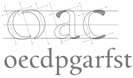 Marked curve starts and ends as well as careful, yet distinct modulation of the weights in the stems are reminiscent of the formerly handwritten book fonts and lend Mengelt Basel Antiqua a lively, historic flair.
The strong, carefully grooved serifs have been designed with slanted terminals and thus provide for an additional dynamic character in the Mengelt Basel Antiqua font. Among the capital letters, the “R” with its curved leg or the “M” with its stems curved slightly outwards also add to the font’s lively character.
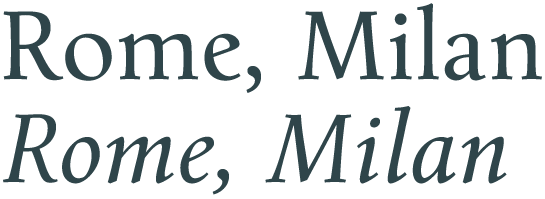 Since the cursive Mengelt Basel Antiqua was designed as a variation to the base font, it demonstrates the most significant changes compared to the historical originals. In the somewhat more narrow italic, the letters have extended line ends and demonstrate in general a more round and curved design. Apart from that, the lower-case “a” changes to a closed shape and the “f” has a descender.
 The “De humani corporis fabrica” required Greek letters in addition to the Latin ones. Mengelt Basel Antiqua has these letters and the Cyrillic symbols, as well. All in all, the Mengelt Basel Antiqua font covers the pan-European W1G area with up to 89 languages.
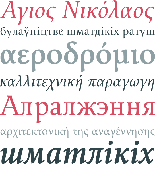
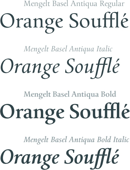
Mengelt Basel Antiqua is available in two weights, Regular and Bold, each with an italic. In this way, it has the base features of a text font.
Designer Interview
-
Christian Mengelt
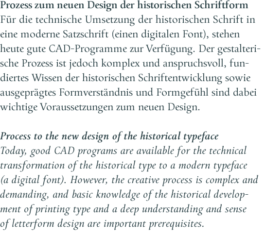 Thanks to its great legibility, the historically inspired font is suited to comprehensive texts, in particular multi-lingual literary and scientific works. However, the many, carefully thought-out details lend it a unique character in the larger font sizes, which makes it great for headline designs, for example. And last, but not least, the italic scores points with its elegant flair.