Quitador Sans
Quitador Sans: an individual sans for major projects
Two years after publishing his slab serif font Quitador™, Arne Freytag has expanded the popular design into an extended family. With the Quitador™ Sans he not only creates a sans serif companion for the Quitador, he also introduces a well-constructed, modern, contemporary sans, which is ideal for major projects, such as corporate equipment, business reports or magazines.
-
Feature on Quitador
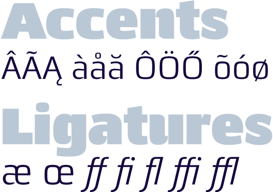
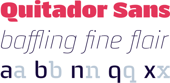
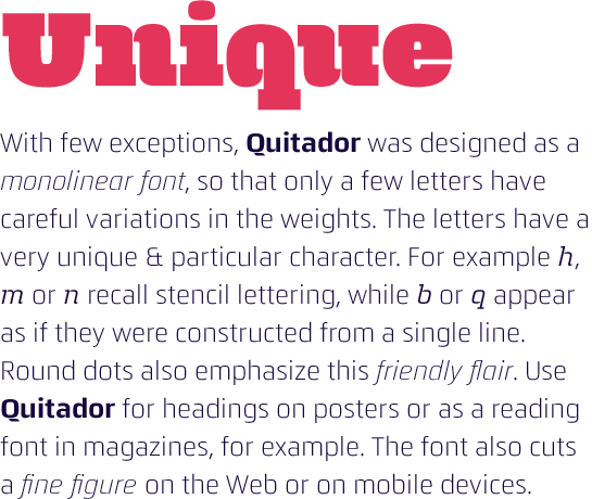
From the original Quitador, the sister font, the sans serif Quitador Sans inherits a basic shape derived from the super-ellipse and arches in some letters, the arches of some of which are not closed and have terminals which come together in a point. Despite these distinctive common features, however, the Quitador Sans is not just characterized by a lack of serifs. Freytag picks out every letter and rejuvenates the ends by giving them a somewhat more dynamic, softer character, enhances, if possible, as in “a” and “d”, the contrast in the weight, opens up “c” and “e” and produces a special effect here and there with rounded terminals on one side.
 Although, despite these changes to the basic character, the new sans remains a slightly stencil-like, technical font with humanist influences, in the Quitador Sans Freytag has certainly succeeded in producing distinct design. It is not only that the missing serifs make themselves noticeable, but, thanks also to numerous further design details, the new font moves away from the robust flair of a slab serif and inclines rather towards a distinctive humanist sans.
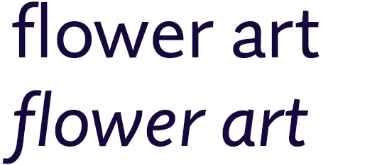
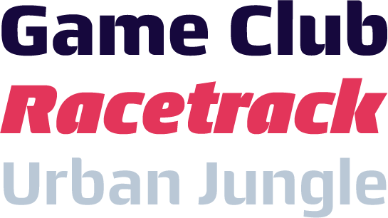 Freytag carries these design concepts forward even in the genuine italic, which is available in all styles. Just as with its sister the sans also changes the lowercase “a” into the closed form and the “e” into a round form and the “f” is given a descender. Furthermore, Freytag emphasizes the contrast in the weights and thus gives the fonts a dynamic radiance.
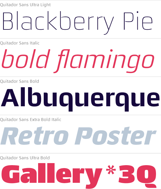
 The new Quitador Sans, like its sister, the slab serif Quitador, is available in seven well-coordinated weights from Ultra Light to Ultra Bold, each with its matching italic. The font family’s features also include numerous ligatures and extended language support in OpenType Pro format.
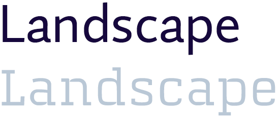
 The new Quidator Sans and the original slab serif Quitador are well-matched not only as regards the weights, they also complement each other creatively and are a perfect combination for major projects. Independently of its sister, however, the new Quitador Sans can also perfectly well be used on its own, both in large sizes for logos and headlines and in small sizes for longer texts.
