Richie
Richie, an eccentric brush font
with a unique character
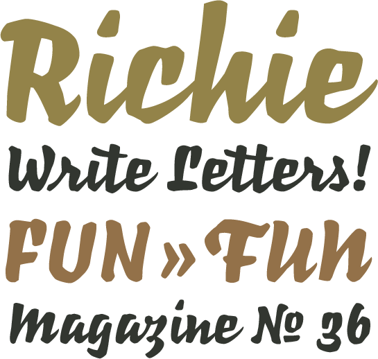
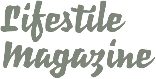
The strong, somewhat eccentric brush font Richie™ was designed as a headline font. With its rough, slightly clunky design, it stands out pleasantly from the smooth design typical to other script fonts. Use Richie in titles, on posters or packaging design, for example.

Inspired by the fonts of Czech type designer Oldrich Menhart (1897-1962), Jim Ford started to experiment with a wide marker. He wondered what would Menhart’s calligraphic font, designed for typesetting, look like as a headline font? Ford began by drawing numerous and diverse versions of the letters on paper. He chose the best ones to digitalize and optimize further.
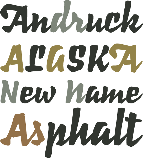
 The result? Lines that are sometimes sharp and very rich in contrast; they recall a font written with a quill combined with the careful influence of a brush font. Along with some unconventional letter shapes – like the lower-case “z” with descender or the hook-shaped, upper-case “L” – the result is an interesting flair with a bit of vintage, old-style feel.
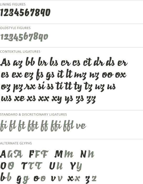
 Numerous ligatures and some alternative characters help add an even flow to your designs. You can also use the swash letters, small caps and number sets.
 The distinctive and powerful shapes make Richie an eye-catcher with a lot of recognition value. Whether you use Richie for headlines, titles or logos, the font will draw attention to itself. Use Richie in areas of fashion, music or gastronomy, for example.