Discover legacy content from linotype.com, preserved for your reference.
Tendria and Saussa
Two new fonts from Patricia Roesch-Pothin:

Tendria
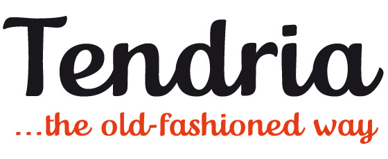
This typeface’ letterforms are based on the French “Tendriade” logo. Clearly inspired by writing and hand lettering, Patricia Pothin-Roesch began her work on Tendria™ in Adobe® Illustrator®. After a few letters, she went back to designing the old-fashioned way: drawing by hand on layers of tracing paper.
 |
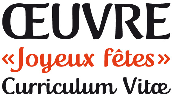
Tendria is a sturdy upright script face with a warm, childlike feeling. Its letters are like the typefaces often used in primary schools; the counterforms are large and open.
 |
The name Tendria is reminiscent of the French word for tender, “tendre.” Designers who set Tendria lovingly will reap rewards; this is an excellent addition to a display heading toolkit.
 |
Saussa
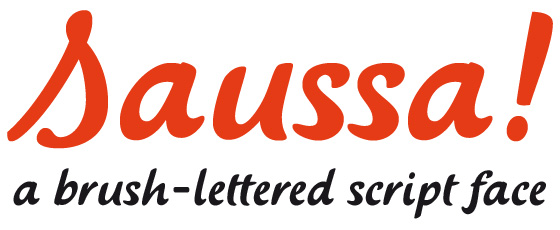
Saussa™ began life as brush-lettered artwork for fruit salad packaging in France. After the key letters had been painted, Patricia Pothin-Roesch switched to digital tools to create the final font.
 |
True to its roots, Saussa is a real advertising face, perfect for point-of-purchase displays. Even its name is consistent with its intended area of application: Saussa sounds a lot like the word “sauce.”
 |
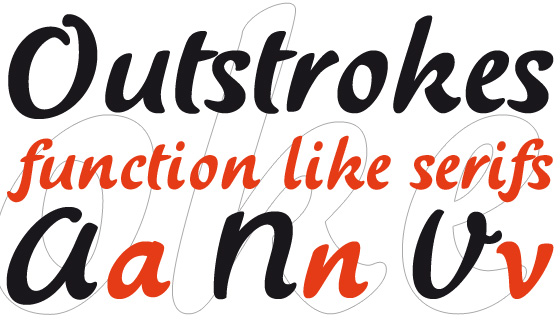
Saussa is an informal script; its outstrokes function almost like serifs, and the capitals have a lowercase structure. The feelings this typeface conveys are due to the hand of its creator, an experienced brush-letterer.
 |