Discover legacy content from linotype.com, preserved for your reference.
Ysobel
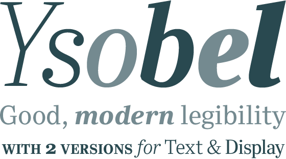
Ysobel: a new typeface family available in text and display versions

Ysobel™ is a new serif typeface family, consisting of text and display versions, inspired by the Century® and Century Schoolbook® typefaces of the early twentieth century. Ysobel picks up on some of the soft, rounded letter shapes of Century Schoolbook but contrasts these with more incised serifs and terminals. The capitals are narrower than those of Century Schoolbook and have less weight contrast to the lowercase, thus giving a more even colour to text settings. The ‘x’ height has been increased but the typeface still retains a nice balance of proportions and does not take on the ungainly look of some large ‘x’ height designs. Curved terminals, such as those found in ‘C’ ‘c’ and ‘e’ are more open to aid legibility and improve the flow in text setting. Weight stress is near vertical, as in Century Schoolbook, but hairlines are stronger to ensure characters do not visually break up in small point sizes.
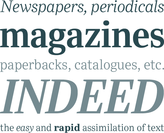
Good legibility, coupled with economy of setting and a clean, modern look, were the main objectives for a design which is aimed at text setting in newspapers, periodicals, magazines, paperbacks, catalogues etc., indeed, wherever the easy and rapid assimilation of text is required.
 |
Development started with the text version of the typeface which has four weights, each in Roman and Italic. All weights feature lining and old style numerals, fractions, superiors and extended Latin language coverage, small caps are available in the Regular weight. Design work was carried out in the Monotype Studio by Robin Nicholas and Delve Withrington.
 |
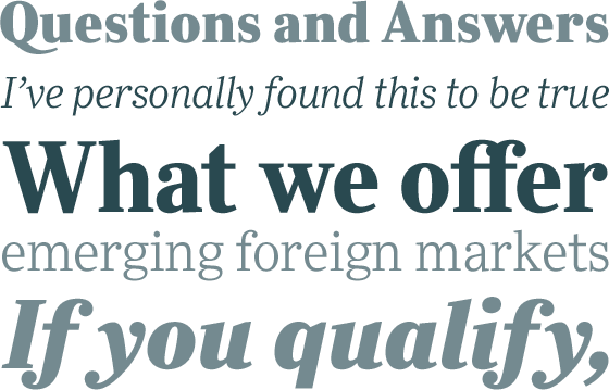
Ysobel Display is a completely re-drawn version of the typeface which is narrower, has a slightly smaller ‘x’ height, thinner hairlines and features many subtle design changes to improve it’s appearance when used for display and headline setting. Tighter fit and careful attention to kerning also help to acheive compact word shapes at large point sizes. The weight range has been expanded to six, and like the text version each is available in Roman and Italic.
The Display Italic has received particular attention in order to make it suitable for setting headlines, sub-heads, strap lines and display text in it’s own right, rather than the text italic which is designed primarily to give emphasis to words or phrases within Roman text. Changes include a slightly greater italic angle and more cursive treatment of some letter shapes.
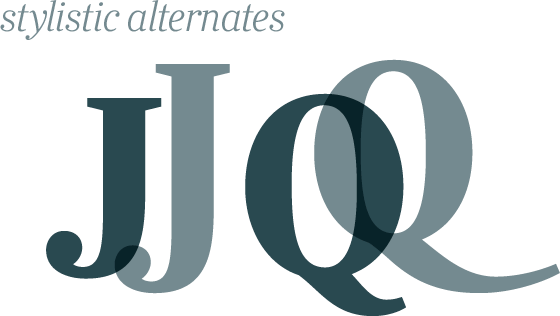
Alternative styles of capital ‘J’ and ‘Q’ are available in all weights to provide some variation. Design work for the Display family was carried out by Robin Nicholas and Alice Savoie.
 |