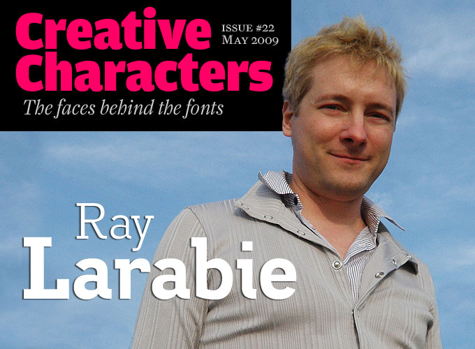
A decade ago, he was the prince of free fonts. Today, his Typodermic foundry is one of MyFonts’ most successful type libraries, although hundreds of his freeware fonts are still out there. His output is awe-inspiring, his tastes as diverse as can be, and his sense of style spot-on. His tool of choice is the computer. Don’t look for pencil sketches or brush-drawn alphabets in this newsletter; it was all done on the screen — with a trackball. Meet Ray Larabie, a Canadian in Nagoya, Japan.
Ray, I’ve been aware of you as a type designer for twelve years or so. I remember spotting your early free fonts all over the internet and downloading some of them from your Larabiefonts website. Were these your first endeavors in type design? You must have been pretty young back then.
I was in my mid-twenties when I started publishing fonts. I feel younger now. I think back then I was less in sync with the contemporary than I am today. I sort of had to kick the retro habit. My fonts had a liberal “post-’em-on-your-free-font-site” policy so they ended up on every site.
What got you into type design?
When I was about five years old, living near Ottawa, my grandmother brought me stacks of partially used dry transfer lettering sheets from the government department where she worked. Helvetica, Clarendon, Franklin Gothic, Futura, Univers. I really got to know those fonts well and I was able to recognize them in the environment. That was around the time of my earliest memories, so my brain is kind of hard-wired for fonts. My folks bought me a computer in the early ’80s and I made some bitmap fonts, mostly knockoffs of Letraset fonts. Letraset was the most popular brand of dry transfer lettering… these plastic sheets that you’d rub down to transfer letters onto a surface. The catalogs came out once a year, they were free at art supply stores. I was just crazy about those Letraset catalogs, still am.
In spite of your love of type, you embarked on a career in animation and video games. Was that your other big fascination at the time?
When I was sixteen I worked on Alien Fires, a game that nobody remembers. But it made me confident that I could work in games. And you know… explosions are fun to make. In high school, I asked my layout teacher (it was an art/high school) about the prospects of designing fonts for a living. This was in the late ’80s, before digital design really took off as a career path. She told me I could become a typopgrapher or submit designs to Letraset and maybe they’d accept it… but I probably wouldn’t be able to live off that. Back in those days the number of fonts released in a year was about the same as what gets released at MyFonts in a week today. It just wasn’t a practical career path in 1988.
I wanted to get into computer graphics and and the particular college I was interested in required 3 years of animation training. I graduated at the beginning of the 1990s recession at a time when more and more animation work got outsourced to Korea. I did a lot of watercolor painting to pay the bills and I made free video games for fun. That got me a job in video games and the fonts were put aside for a few more years. I really enjoyed working on games. You had these really tight technical restrictions to deal with; I like being forced to innovate. Saving a kilobyte in those days felt like a major victory.
When you finally got into type design for real, you began making fonts like crazy.
Once I tried font software for the first time, I was completely hooked. I never had a long term plan, I just started working on fonts because I couldn’t stop. Also, most of my early fonts really weren’t very professional. Over the years I’ve been fixing them up or completely rebuilding them. Most freeware font sites still carry that old junk… which is why I encourage people to pick up fresh versions at MyFonts.
amienne

Amienne, Typodermic’s current bestseller, is a remarkable departure from such techno-oriented and streetwise display fonts as Neuropol X or Bomr. Amienne was designed to resemble handwriting done with a watercolor brush. Charmingly informal, Amienne is a lively and graceful brush script font that moves with a nimble rhythm. It comes with some handy arrows and there is an additional set of old-style numerals, great for titling.
SINZANO

For those who use InDesign or other layout programs with full OpenType functionality, Sinzano is a treat. It has over 400 interlocks which automatically replace the letter combinations you type. The comics-inspired style is certainly not new (Larabie himself already experimented with it in his mid-1990s fonts, and others have since) but the programming on this one is something really special.

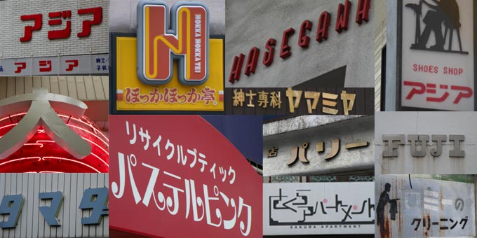
Vernacular signage photographed by Larabie in Nagoya, Japan, where he lives.
As a type designer, you’ve “grown up in public”: people with an eye for type have been able to watch you learn, acquire more skills and get rid of mistakes. Did you ever feel uncomfortable about that?
I guess I didn’t have as much of an eye for type design as I had thought. Everyone has some kind of artistic blind spot. The thing about blind spots is… you don’t see them. I considered going back to school but I took a driving course and was reminded how much I truly hated school. What was really helpful to me was the occasional e-mail from very brave people who pointed out faults. In 2000, I remember someone letting me have it about my overshoots. That’s what I needed to hear. I had been making overshoots…. but so tiny. I wasn’t uncomfortable with it because I never thought real type designers would ever notice my work. The world of freeware font design, back then, was disconnected from the mainstream. There was a divide and if you trace it back I think you’ll see that MyFonts and MyFonts alone broke that divide. It seems really clear to me. MyFonts took the “quality bar” and put it in the control of the customer. We’ll let the historians deal with that one.
You have made over 1,000 fonts. Why so many?
The first few hundred were easier because there was so much less to make back then. I’d bash out an alphabet, autokern it, come up with a funny name and upload it to my website. I didn’t have to deal with accents, proper kerning, proper metrics, OpenType coding, promo graphics, ad copy, keywords, testing, multiple formats, etc. Within minutes of finishing a font it was on my site. One Saturday I created 3 fonts.
MELORIAC

Meloriac is a straightforward Ultra Black all-caps face — until you use the E (and who doesn’t?). Then it suddenly becomes something special: a streetwise, unicase display font. Says Ray: “My goal with Meloriac was a dry geometric sans. With geometrics, if you try to make it neutral and balanced you’re always going to end up looking like Avant Garde or Futura… that’s just the way it goes unless you give it a definite flavor. But I wanted it to be neutral. Heavy and neutral. So you get this kind of comfortable familiarity but just not the way you remember it.” Meloriac is ideal for tight headlines and logos. Check out the trendy J-pop Katakana letters.

To judge from your output, you still work faster than most. Are you impatient? Do you ever wish you could spend six months or a year on a single type family, like some designers do?
I was pretty slapdash back then. Impatient? Yeah, a bit, but not like I used to be. I certainly don’t make three font families in a day. I do like to get ’em out the door though, that’s true. A year, every day in Fontlab… on one font. Hmmm. I don’t make a lot of text fonts. Mine are mostly catchy display fonts. Plus, you never know what people are going to buy. Some of my most popular fonts are ones I didn’t have high hopes for, and vice versa. It may sound crass but a year spent on a font that doesn’t sell is a wasted year — to me anyway. If you can’t be realistic about that aspect of font design then you probably can’t make a living from it. It’s a big gamble. I guess some people can do it but that’s not for me.
A related question about pricing: For a serious type foundry, Typodermic’s prices are extremely low. Most of your fonts cost less than $9, and if a customer decides to buy one of your value packs, the price may go down to as little as 33¢ per font. In a world where $30 to $70 is considered a fair price for a fully featured OpenType font, that’s a pretty good deal. And probably some of your peers find it really annoying. What’s the thinking behind that policy?
My prices have gone up and down over the years. Of course, changing the price has an effect on sales and I’ve adjusted them accordingly over the years; the market determined the price. But consider this: I make mostly display fonts. I think designers buy them because they have a particular need based on whatever project they are working on. Text fonts are different. They’re an investment for a designer. Spending a couple of hundred bucks on them is worthwhile because of the years of rigorous use you’re going to get out of them. Display fonts are… well, they’re more like art supplies. Like those dry transfer lettering sheets back in the day. They were about $10. Fonts didn’t have to be an investment — sometimes artboard was more expensive than a font. The number of jobs you can use a font for isn’t limited like it used to be with dry transfer sheets, but what matters is how most people use them. And most people buy a display font for a specific use.
MADAWASKA

Although he is best known for his prolific output of display fonts, Ray has actually produced several families of eminently legible text fonts. The popular Madawaska, a rather idiosyncratic slab serif family, has a bit of both. It has some of the funky qualities and techno vibrancy of his display work, combined with the extensive structure and clarity of a text family. With seven weights, including some very subtle hairline versions, it’s versatile and widely usable.

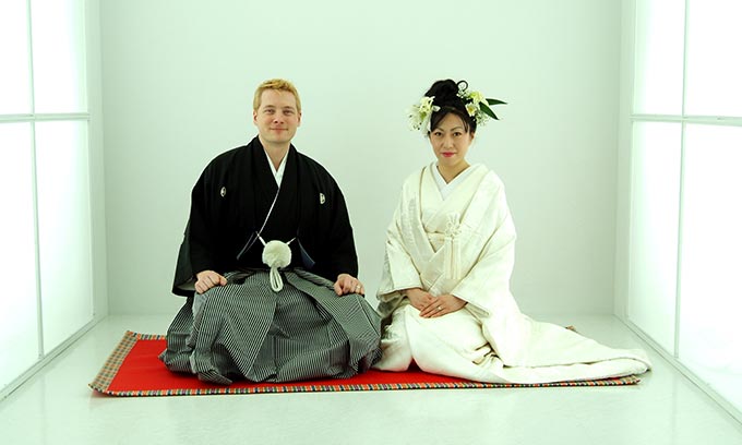
Ray and his wife Chikako in traditional Japanese attire.
It seems you are gradually moving toward a more personal, thoughtful idiom. Yet you still do quick-and-dirty reworkings of existing typefaces, like Soap — a kind of unicase Cooper Black — or Tight, a washed-out version of the 1970s font Quicksilver by Dean Morris. Is that because you like seeing quick results? Because of an anarchistic streak? Or because there’s still a 1990s typographic DJ in you, remixing old favorites?
I really just try to think of what designers are going to find useful or inspiring. Often I see designers modifying type in a way that indicates a need for a certain kind for thing. With Soap, I had seen many cases where designers had messed around with Cooper Black to give it more funk. Tight, Reagan, Rinse and Teeshirt were designed to evoke a certain era. I could easily have come up with my own fonts or plundered my own catalog but the effect wouldn’t be nearly as good. If you want to make a ’70s or ’80s worn t-shirt font, you have to use fonts that would have been used in that era. I knew using those fonts would cause some members of the typographic establishment to look down on me (even further) but I had to do it. My goal was to make ’70s and ’80s t-shirt fonts… of course I was cringing a bit: those fonts are my heroes. They’re actually a lot of work because I have to create a fully functional, clean version of the font before I do the grunge thing. My samples are pretty blurry and the character sets, very sparse. On the other hand — though not in the cases you mentioned — I do like to mess around with very familiar forms to freak people out. Order is based on Univers Condensed proportions. So from a distance, it looks like Univers but when you get close, you realize it’s all robotic. Jillican has that sort of thing going on. Yes, it looks like Gill but that’s the whole point. I could have easily come up with my own fonts in those cases but the familiarity is the whole point. I think some people get what I’m try to do… I hope so.
Where do you find your inspiration? Are you a great collector and/or photographer of typographic ephemera?
There are exceptions but usually a typeface is an accumulation of influences from multiple sources and thoughts I’ve been keeping in mind for a while. I try not to copy directly from source material if I can help it. I’ve always got a few fonts that I’m mentally constructing. I don’t do sketches. I like to keep those ideas flexible and somewhat nebulous. A font starts to form while I’m working on it and I can test it in words. That way I don’t get pushed into a design corner I can’t get out of… the ideas kind of gel on their own during creation.
I’m not a collector of typographic ephemera. Most of my old font catalogs and books have been scanned and destroyed. I’m a real computer guy but I still have my old Letraset catalog by my side. I’m not one of these font designers who has a reverence for type history or physical books on paper. I couldn’t care less about that stuff. I just want to make fonts that designers find useful. That’s it… plus have some fun along the way.
For inspiration, I look at how fonts are currently being used by designers. When they start dragging up old fonts, it often means there’s a need for something new to do the job.
KORATAKI

Korataki is a tribute to a mid-1970’s retro-futuristic classic, M. Mitchell’s China. It is wide, angular, almost monolinear and utterly cool. Executed in five weights, from the feathery Ultra Light to the euphemistically named Regular (an Extra Bold, if you ask us), Korataki’s simple design appeals directly to the imagination. As its designer wrote, tongue firmly in cheek, “it transfers messages invisibly without a trace of manipulation. Readers are left aware of only a bright future stretching out ahead of them.”
POUND

Although the overall effect is one of in-your-face simplicity, several things are happening at the same time in Pound. Its basic shapes are geometric, like those of a constructed art deco font. They lack counters, like other heavyface typefaces that came out lately. But Pound does not have the smoothness of those computer-perfect fonts: it has the rugged edges and irregular texture of potato stamps, resulting in a strong visual punch.

Among your many fonts, do you have any absolute favorites?
I always like my newer ones because they’re more in sync with what’s going on today. I really like how Movatif turned out. I don’t think everyone’s going to “get the joke”… you know? Mashup music had its heyday a couple of years ago but I got back into it recently. If you don’t know what mashups are, check out this link. So I was in a mashup kind of mood when I came up with Movatif. I had just finished a remake of Coolvetica, an old Larabie Font based on a scratchbuilt sort of Helvetica thing… which was in turn based on a 1970s trend where logo designers and even font designers were goofing around with Helvetica shapes. So I started obsessing on doing the Avant Garde Gothic slanted “A” with something built off Coolvetica to generate a kind of 1980s “rad” feeling. I was travelling through Osaka and came up with a few ideas from old store signs. So the whole effect you get when you use it is kind of a custom logo look that gives people an unnerving sense of deja vu. It looks like a bunch of things you’ve seen before in an alternate universe or in a dream. That kind of effect really excites me.
You’re Canadian, but you recently moved to Nagoya. Please tell us about Japan, and your relationship with it.
This is my wife’s hometown and I’ve only been here for a little over half a year. It’s a really friendly, comfortable, interesting place to live. I’ve been learning so quickly… I thought there would be some kind of culture shock, but for me, not really. Every day I see something new and exciting. As for fonts, I’ve had a chance to get a clearer image in my mind of the evolution of industrial minimalist display fonts. I didn’t set out to do that but it surrounds me so it’s hard not to take notice. Back in Canada, I’d only seen glimpses of Japan, so the image was distorted. I now live in an area which is partially medium residential and partly light commercial. So I can take a walk and see these really small, quiet industrial spaces with barrels, old signs, rusty machines. I can kind of make out a timeline, not accurately, but an idea of how the industrial minimalist style came to be, and its relationship to Katakana lettering, a more simple, linear character set often used to display English words phonetically. So the first font I created in Japan was Uniwars, a culmination of the best aspects of that style. Living in Japan is helping me grow as a font designer, and as a person too.
What are your plans for the near future, type-wise?
I don’t think more than one font ahead. I figure it’s part of my job to try to pick up on design trends… long term plans work against me.
Thanks Ray. Keep going with the flow.
Cinecav X

The Cinecav X family is based on Cinecav™, a typeface created for closed caption television applications, used to produce optional subtitles for viewers with hearing difficulties. The idea to provide an alternative to the fonts normally used for CCTV came from Larabie’s agent David Delp, who is well-connected in the American TV world. “The US government has mandated a set of technical specs,” explains Larabie, “which TV manufacturers selling sets in the US are forced to abide by. I had a lot of experience in the video game industry dealing with on-screen type. From what I had seen from competitors’ CCTV fonts, they were going about it wrong. I tested the Cinecav fonts on less than ideal equipment to make sure they could take punishment. My toughest test was a color TV I’d picked out of someone’s trash, with playback on 1980s thrift shop VHS tape.” Cinecav X is the affordable consumer version of that remarkable family.

Who would you interview?
Creative Characters is the MyFonts newsletter dedicated to people behind the fonts. Each month, we interview a notable personality from the type world. And we would like you, the reader, to have your say.
Which creative character would you interview if you had the chance? And what would you ask them? Let us know, and your choice may end up in a future edition of this newsletter! Just send an email with your ideas to [email protected].
In the past, we’ve interviewed the likes of Cyrus Highsmith, Dino dos Santos, Rian Hughes, Nick Shinn, Veronika Burian and Underware. If you’re curious to know which other type designers we’ve already interviewed as part of past Creative Characters newsletters, have a look at the archive.
Colophon
This interview was conducted & edited by Jan Middendorp, and designed by Nick Sherman.
The Creative Characters nameplate is set in Amplitude and Farnham; the intro image and pull-quotes feature Madawaska; and the large question mark is in Farnham.
Comments?
We’d love to hear from you! Please send any questions or comments about this newsletter to [email protected]
Subscription info
Want to get future issues of Creative Characters sent to your inbox? Subscribe at www.myfonts.com/MailingList
Newsletter archives
Know someone who would be interested in this? Want to see past issues? All MyFonts newsletters (including this one) are available to view online here.
