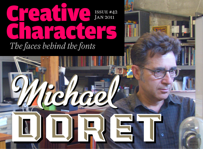
He started up his foundry Alphabet Soup seven years ago, and has published one typeface family a year on average. But what typefaces they are! With up to 2000 glyphs per font, and endless ways of using digital technology to emulate hand-lettering, his fonts are clearly the work of a seasoned scriptmeister. Indeed, before entering the font business, Michael Doret was already a household name in the design world, producing iconic designs for the likes of The New York Knicks, KISS and TIME Magazine. Having learned the trade under the guidance of no less a guru than Ed Benguiat, this month’s interviewee has been a one-man force in lettering and logotype design since the mid ’70s. These days his partners in type are designers like Stuart Sandler, Patrick Griffin and Mark Simonson. Meet Michael Doret, a man with a past... creating fonts for the future.
Michael, you grew up in Brooklyn, not far from the amusement park in Coney Island. In what ways did this background form you, and influence your later work?
I didn’t realize what an incredible influence growing up in Brooklyn in the ’50s and ’60s was to me until a couple of years ago. I came across an old stereo slide that my father had taken of my brother and me in Coney Island Amusement Park. In that photo behind and around us was the Steeplechase “Pavillion of Fun”, the Tilt-A-Whirl, Wonderland Park and the Wonder Wheel. When I saw that photo it hit me like a lightning bolt that all the incredible signage, lettering, banners, the brilliant colors — and just about everything in that photo, all that iconic imagery — had somehow made its way into my work as an adult.
I realized that my work only looks the way it does because as a kid I was constantly exposed to — and often surrounded by — an incredible visual cornucopia. I could pick almost any piece of the assignment lettering work I’ve done over the years, look at it now, and trace a direct line back to the visual influence that the Coney Island of the 1950s and 1960s had on me.
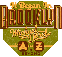
Of course it wasn’t just Coney Island that I’d cite, but also the pervasiveness of the Brooklyn baseball culture (through the Dodgers), and also my frequenting of the Times Square area where my dad had his office. I could also draw direct lines of influence to those two areas as well. As a matter of fact, for the last year or so one of the talks that I give to students and other groups is called “It Began In Brooklyn”, which details how your surroundings while growing up can influence and continue to inspire you as an adult — even if you’re not completely cognizant of it.
Could you say something about your art and design education? Who or what inspired you most during that period?
Absolutely! To begin with, as far back as I can remember I loved to draw. But my real art education began in high school with two teachers: Albert Sarney and a young instructor named Sol Schwartz. Sol was the guy who really saw something in me and was incredibly encouraging — to the point that he convinced my reluctant parents that I should apply to Cooper Union. I’m still in touch with Sol today. I owe that man a lot!
At Cooper there were two teachers who were extremely influential to me. The first was Robert Haas, a Viennese typographer who had come to the US before the war. I became sort of an apprentice to him after school hours at The Ram Press — his type shop and printing press on West 26th St. The other was George Salter, a German born calligrapher, book jacket and magazine cover designer who tried teaching this really bad student what he knew about calligraphy.
There was another extra-curricular influence that was working on my brain during that time. This was in the mid to late ’60s, and I was living in Cooper Union’s neighborhood, which was Manhattan’s “East Village”. The whole counterculture phenomenon was just starting and that neighborhood was kind of like “ground zero” for that. What sticks out in my head were the “psychedelic” posters of the time — particularly those of Victor Moscoso, Stanley Mouse & Alton Kelley, and Rick Griffin. All their imaginative work blew me away, and kind of demonstrated how one need not necessarily be constrained by conventional typography. I remember plastering the walls of my East Village railroad flat with those posters!
steinweiss script
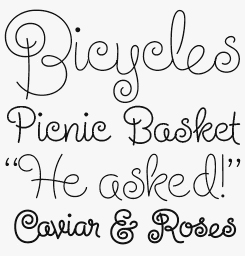
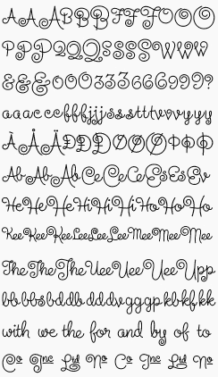
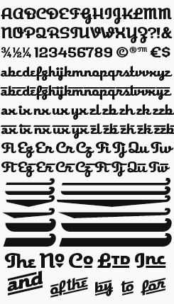
Groundbreaking 1930s album cover artist Alex Steinweiss is known not only for being the first to treat music packaging as a graphic medium in its own right, but also for the curly playful script he would use in many of his designs. An assignment from Taschen to recreate Steinweiss’ signature lettering style for a book led Doret, with OpenType programming help from Patrick Griffin of Canada Type, to transform this simple piece of guileless and free-spirited handwork into a sophisticated — and, with over 2000 glyphs, mightily extensive — bit of twenty-first century OpenType technology. As with Michael’s other script work, check the usage notes to get the most out of this endlessly variable and lively font. See below for a small selection of Steinweiss Script’s many ligatures, alternates and character combinations.
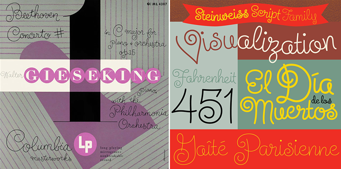
Left: an original Alex Steinweiss record cover lettered with the famous “Steinweiss Scrawl”. Right: Doret’s digital celebration of that lettering style. Read more about the design process here.
You had an early type designing experience working with Ed Benguiat and Photo-Lettering. How did you land that job? Were you immediately enamored with display font design?
While I was a student at Cooper Union there was a typography project to design a font. Being rather “rebellious” I designed a font where I reversed the positions of the thicks and thins (just to be different). The result wasn’t particularly terrible, and someone proposed that I submit it to Photo-Lettering. I did, and for some strange reason they accepted it. I hadn’t even given it a name, so they named it for me: “Doret Shaded”. Right now I think of this design as kind of embarrassing, but you know, I was only a student! I think I earned in total about $12 in royalties from that font ($1.00 per word). I still wonder who it was that actually ordered copy set in “Doret Shaded.”
Most people think that this had something to do with my actually winding up working at Photo-Letting as Ed Benguiat’s assistant. But one thing had nothing to do with the other. I got that job because of a recommendation from a friend of my parents who knew someone who worked at Photo-Lettering — pure coincidence.
So working with Benguiat was actually my first real job after graduating from Cooper. Ed taught me nearly everything I know now about how to draw letterforms. In fact, I’ve used the techniques that he showed me until I made the switch from pen and ink to digital media around 15 years ago. What I worked on at Photo-Lettering was not in any way about display font design. What Ed was in charge of there, and what I assisted him with, was the custom tailoring of typesetting for those clients who wanted more than straight typographic runoff. We would get the runoff on film from the typesetting department, then depending on what was needed, we would cut it apart, add or delete pieces, and sometimes almost completely redraw parts in order to create a piece of type that was a hybrid between typesetting and hand-lettering. Perhaps it was my experience with doing this work that helped set me on the road to doing hand-lettering way before I ever thought to get involved in the world of display font design.
The 1970s in New York must have been a Golden Age of hand-rendered illustration and type design. What did you pick up from that “scene”?
Up until about 2003 I wasn’t really involved in type design at all. All my friends and nearly everyone I knew were in the world of illustration, and some in graphic design. In fact where my studio was situated, in the East 20s in Manhattan, we were literally surrounded by many well-known illustrators. I first shared studio space and worked together with Charles White III and Doug Johnson, then with Jim McMullan, then with Doug Taylor. Lou Brooks, Elwood Smith, Doug and I all hung out together. Back then it was kind of like an illustrators’ ghetto around there. It’s no wonder that even though I was fascinated with letterforms my work always seemed to become more illustrative, combining elements of lettering, illustration and graphic design. When I started creating this type of artwork, as far as I know I was the only one doing it. I think that despite the fact that I was good friends with Tom Carnase, in some way my work was a reaction to the more traditional school of design that his work had become associated with (Herb Lubalin, et al). Although I didn’t know it at the time, I think I was sort of creating a new category — and I still don’t know what to call that part of what I do!
metroscript 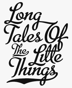
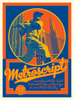
Inspired by vernacular graphic ephemera, Metroscript is the natural choice for anyone looking to evoke the New York of the 1940s — yet the appeal of this supremely well crafted and comprehensive script goes well beyond that narrow niche. Taken out of that retro-styled context, Metroscript becomes a fluid, sensuous and above all contemporary script face, its natural elegance backed up by a thorough glyph table and clever OpenType programming. As with all of Doret’s script fonts, the best results will be achieved with ligatures and alternate characters features turned on — but don’t let that stop you trying your own glyph substitution to attain an individual outcome.
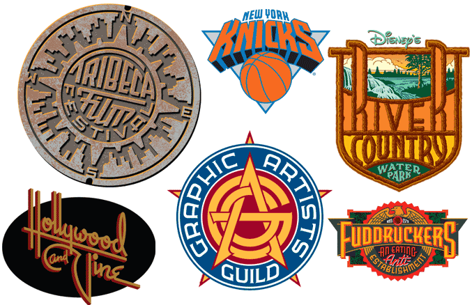
A selection of Doret’s lettering and logo work.
Your characteristic brand of illustration combined with logo-like typography shows a wildly eclectic range of references. Apart from the imagery from your childhood which you mentioned earlier, what are your main influences?
That’s not that easy to answer because I’ve always looked at a very wide range of stuff. But I think that the common thread that runs through all of it is this: often what I end up looking at turns out to be material which wasn’t created by classically trained designers, or by those in the mainstream. I have a great affinity for American pop culture — not just from the period I grew up in, but also going back before that by one or two decades. I feel that there’s a great visual tradition there that’s ignored by many who study traditional typographic design, and who take that study very seriously. So the kinds of things which I find myself most often looking at for inspiration are mostly what would be called vintage ephemera: matchbook covers, textiles, book and magazine covers, poster stamps, theater marquees, postcards, automobilia, posters, comic books, signage — literally almost anything that would be considered American vernacular typography from an earlier time. And I especially look for typography that’s done “wrong”, where perhaps the person who created it didn’t know the “rules”, and so consequently didn’t have any fear of breaking them.
Now, all of what I said above notwithstanding, I’m going to immediately contradict myself. There are many recognized designers (most of whom have passed away) whose work I constantly refer to for inspiration. Among these are such luminaries (both American and international) as Lucian Bernhard, Otis Shepard, E. McKnight Kauffer, Tom Purvis, Joseph Binder, A.M. Cassandre and Jean Carlu. Of course I can’t fail to mention Morris Fuller Benton and Alex Steinweiss whose work I’ve paid homage to in DeLuxe Gothic and in Steinweiss Script. And there are many, many more, both known and unknown — way too many to list here.
Do you sometimes feel nostalgic for the “golden age” in American commercial art and lettering?
What is considered the “Golden Age” depends on who you’re asking. Some would say the ’60s and ’70s. Me, as you might guess, I’d say the ’30s and ’40s. That was a time of incredible creativity and invention. That’s the time period that I look at most often for inspiration. But I’m not “nostalgic” for it because I never experienced it first-hand. I missed that period by several decades. But you know, concerning “nostalgia”, I think that things always seem like they might have been better in days gone by. When I think about it, my parents — who lived through the ‘30s and ‘40s — lived through some very hard times: the Great Depression followed by World War II. I wouldn’t want to live through those times, but I love the graphics that came out of them. I think we’re in an exciting time right now for lettering and typography. I see that younger people are very into it, and I see a lot of great energy going in that direction. A lot of their work is very exciting. We may be entering a new “golden age”, but we may not know it with any certainty until after it has passed.
deliscript
Much like Metroscript, Deliscript should be a part of every logo designer’s digital toolkit — a suite of advanced OpenType features that include a variety of extendable tails and crossbars, ready-made “word logos” and alternate characters make recreating hand lettered logotypes and wordmarks a cinch. Even without OpenType capable software to hand, an expanded version of Deliscript is available with access to all the same glyphs, just not the automated features.

I suppose that for your type of work, vector graphics software such as Adobe Illustrator is a crucial production tool. Did you embrace it as soon as it came out, and did it make life easier for you? Do you (or would you prefer to) produce graphics without a computer sometimes?
Yes, more than any other applications, I use both Adobe Illustrator and Adobe Photoshop. I didn’t embrace them when they first came out because I didn’t get my first Mac until 1995. I think that Illustrator 5.0 was the first version of Illustrator I started with. A lot of my friends had been early adopters of the Mac and of graphics software, but I didn’t believe that it could produce graphics as exacting as I would have wanted them to be. It was my wife, illustrator Laura Smith, who was finally able to convince me that I’d better get a Mac. So I got one, took a weekend seminar on Adobe Illustrator at the American Film Institute, and never turned back. I actually love working digitally. It allows me a lot more flexibility than I ever had previously when I worked with pen and ink. I can see my results immediately, whereas before when working with pre-separated art, I’d usually have to wait until my art was printed before I’d be able to actually see it in full color. That said, I still do most of my preliminary work the old-fashioned way — with pencil and paper. But I don’t have to take it as far as I used to. I can do the preliminaries much more loosely, and then do all the fine-tuning on the computer.
As a designer of digital fonts, you came rather late to the game — in 2002. What made you take that step, and what were your biggest surprises once you had started Alphabet Soup?
As I mentioned earlier I created my first “font” while I was still a student at Cooper Union. But I never took that font very seriously. Then around 1972, at the very beginning of my freelance career I worked with Charles White III on graphics for a Merchant Ivory film production called “Savages”. For the credits and titles of that film I created an “ultra deco” font that was prepared for setting on Typositor. That was my first real foray into font design. But at that time, from everything I’d heard, it wasn’t that easy to get paid fairly for font design, so that font was never released commercially. But in 2009 I decided that I still liked what I had done for those film credits, so I dug up my original drawings, digitized it and released it as Grafika. I still think it’s a good design.
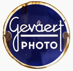
But getting back to what happened in 2002… Laura and I were in France, and I picked up an old baked enamel sign at a Paris flea market. It was a sign for Gevaert Photo, and it had an interesting script in the logo. For some reason I became intrigued by that script, and started sketching out some letterforms that were in the spirit of what was in the sign. Somehow over the next few months I kept playing with those forms. Then, early in 2003 I met Stuart Sandler who was visiting out here in Los Angeles. He convinced me that making fonts could be both creatively satisfying and lucrative, and encouraged me to start designing fonts. I showed him what I had been playing around with, but he was only kind of lukewarm about it, basically saying that he wasn’t sure that it would have more than limited appeal. But I decided to move ahead with it anyway, drawing it in Illustrator then importing it into Fontographer. So that design which was inspired by some forms I found on a baked enamel sign became my first digital font — Orion MD.
When I decided to take the plunge into creating my own digital font design, I figured that it would be really easy, considering all the experience with letterforms I’d had over the years. The big surprise for me was that I was right — but I was also very wrong. I think that all that experience I’d had creating my own letterforms set me apart from most other font designers. I was able to bring a very different aesthetic to bear on my new digital typefaces, having been in a very different realm for all those years. But I hadn’t realized that while being able to do lettering gave me a leg up on the process, font design was a very different animal from hand-lettering, and there was a ton of stuff that I didn’t know, and really hadn’t a clue about. So it’s been a fairly long learning curve for me. Luckily I’ve had the support, advice and encouragement of some great people — Stuart Sandler (my “font guru”), then Mark Simonson and Patrick Griffin.
grafika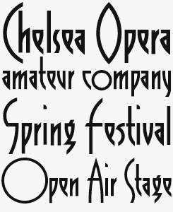
Originally created by Doret in the early 1970s for a film title sequence, Grafika combines modernist, geometric rationalism with an eye for decorative flair — in the form of those dramatic tall ascenders and some inventive alternative characters — creating something that is strikingly angular and perfect for display settings. Be advised when setting in all-caps to use the special punctuation that also falls below the baseline.
orion MD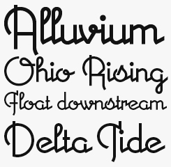
Like much of Doret’s typography, Orion MD originated in a unique hand-lettered logo: the logotype of Gevaert, the Belgian photo company that later fused with AGFA. Expanding the six letters of the logotype into a full character set resulted in an unusual font — and the genius is that the connections between letters work as well in each possible combination as they did in that original one-off design solution.
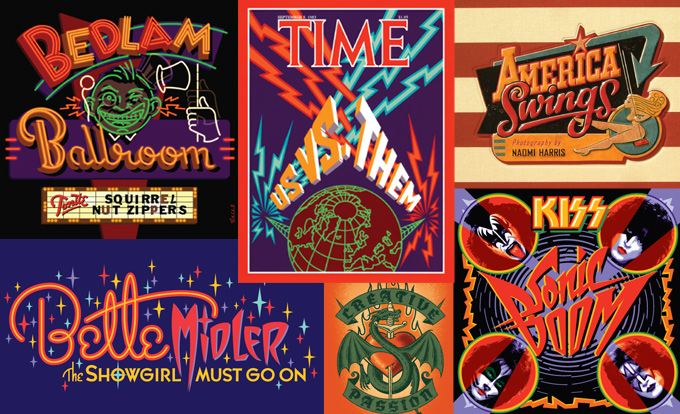
Doret’s illustration assignments are known for their tightly integrated graphics and lettering
For a designer who always used his own letterforms, it must be quite a peculiar experience seeing how other designers treat your typefaces. How has it been so far to see your fonts in use?
Well, they’re like my children. But like children, at a certain point you have to let go and send them out into the world. They’ll be whatever they’re destined to be. You might not always like what they do, but you’re always proud of them. I’ve seen some wonderful and creative applications done with some of my designs, and when I do I like to blog about them — such as I did for Metroscript’s appearance in The Incredible Hulk, a Swiss usage of Metroscript and a Spanish usage of Grafika. (I’d encourage anyone reading this to send me their designs which use my fonts.) I’ve also been witness to some treatments that I’d like to forget. The one thing that I would like to do is to tell people to read the User’s Guides that I prepare for each and every font I release. In them there are tips on the proper use of the fonts, tips on how to access certain OpenType features, and some Do’s and Don’ts. The mistakes that I see most often are most definitely from those who haven’t read the manual and don’t know how to access the OpenType features — mistakes that were easily avoidable. I feel that in those cases, the font user is not getting their money’s worth from the font. But all in all, it’s been quite an unusual and gratifying experience for me seeing what other designers do with my fonts.
What has been your most satisfying experience as a type designer?
This is really a continuation of your last question… because as I said, seeing my designs used creatively and in new and unexpected ways is a new experience for me, and can be very satisfying.
What I would also cite as having been really satisfying for me have been my collaborations with others such as Stuart, Mark and Patrick. They have helped me expand the boundaries of what it’s possible to do with a font. Whether it was the work that Mark helped me with on Metroscript, the patient tutelage that Stuart has always given me, or the OpenType programming that Patrick so expertly did on both Deliscript and Steinweiss Script, collaborating with others was always the missing ingredient from my assignment work career.
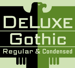
deluxe gothic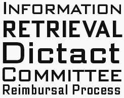
The four fonts that comprise the Deluxe Gothic family are Doret’s re-imagining of a 1930s design classic — Bank Gothic by Morris Fuller Benton. Approaching the project much as if he was remaking a film or covering a song from an earlier era, Doret has gone further than simply digitizing a font originally created for letterpress and has adapted the design to suit contemporary tastes and expectations, including the possibility to use it in text with the addition of a lower case font and a compressed width.

You must have a large arsenal of letterforms that could be made into fonts at some point. How do you decide what to work on first?
Yes, I’ve done a lot of work over the years. But there may be a lot less of that work than one might think that would be applicable to font design. In much of my work the interest doesn’t come out of the letterforms themselves as much as how the whole piece is put together.
I’ll give you a case in point: my Tribeca Film Festival design is definitely a piece of lettering, but if you take a look at the specific letterforms there’s nothing that unusual about them that would suggest that they’d make an interesting font. They’re kind of like generic block letters. What I usually do in problems such as this is I study the relationships between specific letters in specific words, determine what’s unusual about that sequence of letters, and try to create a design that takes advantage of those particular quirks. My logo for General Amusements is another case in point. This is quite the opposite from font design where you line letters up one after the other in a straight line, and where you have to make sure that any and every combination of letters looks good together.
But there is definitely work that I can draw from. The problem is knowing not only which styles would lend themselves to a new typeface, but which styles would also be commercially viable. I don’t mean to come off as being so mercenary, but creating a font for me is always a many months long process. I pour my heart and soul into it but I can’t afford to get involved with committing so much time to one thing if I don’t feel that it has something of a chance to sell well. That’s why my font production is so much less than that of other designers — in any given year I might only release one design, or two at the most. Before I created Metroscript I had shown Stuart various pieces of my work. Among them were one of my covers for TIME Magazine “The Selling of America”, and my scorebook cover design for the Toronto Bluejays. In both of those pieces I had used a kind of ’40s script design that I had devised and had used many times before in my work. Stuart immediately zeroed in on that script, and said that if I figured out how to turn it into a font, that it would do well. He was absolutely correct. But he’d had a lot more practical experience than me with selling fonts, and was able to recognize a winner when he saw it. At that point, I couldn’t. But since then I think I’ve been developing a better sense for what might survive commercially.
One example of my better sense of this would be Steinweiss Script. That project started out as an assignment to do lettering for the cover of Taschen’s huge book which chronicled the history of Alex Steinweiss’ work. After doing that lettering for Taschen I started to have the feeling that a script done in the spirit of Steinweiss’ calligraphy might now have wide appeal if done properly. I consulted with Stuart on that, and he pretty much concurred, although we had a few differences on how to implement the design. I’m extremely pleased with the result, and feel that I may finally be versed enough with the ins and outs of this business to make myself believe that I actually know what I’m doing.
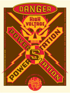
power station
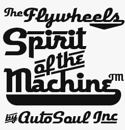
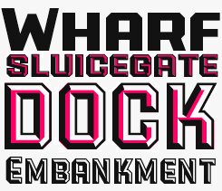
Naturally enough for a designer who counts all sorts of signage and physical lettering amongst his key influences and interests, Doret says he has long been interested in the dimensionality of lettering. Layer the various styles to be found in the complete Power Station family, and that physicality is easily and instantly brought to the page or the screen.
What’s next for Alphabet Soup in 2011 and beyond?
Well, you’d expect me to say that I’m going to be coming up with new, innovative fonts — and that is absolutely my intention. But I’m also starting to think beyond that: I’d like to expand the scope of Alphabet Soup to include the work of others. I’ll be looking for designers with fresh ideas, who share a common outlook and aesthetic sense with me, and about whose typeface designs I might be able to say “Yes, this looks like an Alphabet Soup font”. I wouldn’t expect their work to be carbon copies of what I do, but to somehow be in sync with my vision of design. I think this is one thing I can do to help move my font “brand” into the next decade and keep it fresh. Fresh Soup!
Just one more thing I’d like to mention here — and I hope you won’t think this is a shameless plug: I’ll be giving a free talk on March 4 at The Art Institute of California in LA. Any and all who are interested in attending can get the specifics from the news page on my website.
Wish we could be in LA that night. Thanks for your great stories and insights!

Who would you interview?
Creative Characters is the MyFonts newsletter dedicated to people behind the fonts. Each month, we interview a notable personality from the type world. And we would like you, the reader, to have your say.
Which creative character would you interview if you had the chance? And what would you ask them? Let us know, and your choice may end up in a future edition of this newsletter! Just send an email with your ideas to [email protected].
For a complete overview of past Creative Characters newsletters, have a look at the archive.
Colophon
This newsletter was edited by Jan Middendorp and designed using Nick Sherman’s original template, with specimens and type descriptions by Anthony Noel.
The Creative Characters nameplate is set in Amplitude and Farnham; the intro image features Metroscript and Power Station; the pull-quotes are set in Steinweiss Script; and the large question mark is in Farnham.
Comments?
We’d love to hear from you! Please send any questions or comments about this newsletter to [email protected]
Subscription info
Want to get future issues of Creative Characters sent to your inbox? Subscribe at www.myfonts.com/MailingList
Newsletter archives
Know someone who would be interested in this? Want to see past issues? All MyFonts newsletters (including this one) are available to view online here.

