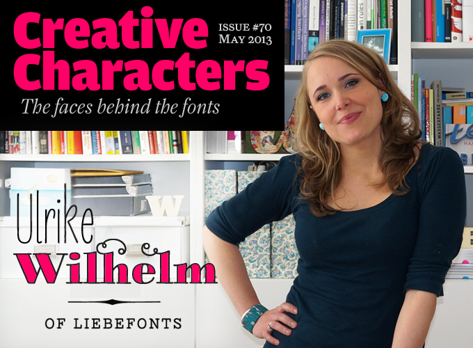
Her name does not rhyme with “bike”, but is pronounced “Ool-ree-kah” — a common girls’ name in her native Germany. Born and raised in Berlin, she studied at the University of Applied Sciences in nearby Potsdam, with a short but game-changing intermezzo in Florence, Italy. Four years ago she came to MyFonts with a collection of witty picture fonts; but it was an alphabetic typeface that gave her foundry LiebeFonts (“sweet fonts”) its first hit — LiebeErika was one of our Top Fonts of 2010. Ulrike’s skills are equal parts handicraft and digital savvy, and her fonts are as technically sophisticated as they are charming. Meet the talented Ulrike Wilhelm, in love with letterforms.
Ulrike, you studied Communications Design at the University of Applied Sciences in Potsdam near Berlin, with a focus on graphic design and illustration. At the time, did you expect that you’d become a type designer? How did that happen?
During my studies it would never have crossed my mind that I would one day be able to passionately design and successfully sell typefaces. When I studied in Potsdam, I did spend a few semesters in Luc(as) de Groot’s type design classes; but I was more intensively involved in illustration and calligraphy classes.
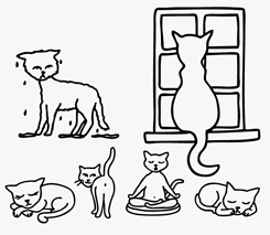
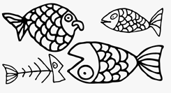
By the time I worked on my bachelor thesis, I produced — as a side-project — a series of pictograms and mini-illustrations. When I later showed these to my friends, the idea came up to create dingbat fonts. Shortly after that I released my first series of illustrations on MyFonts. The months after that I could not stop releasing more: LiebeFish, LiebeCook, LiebeTweet, and so on.
My first “real” font LiebeErika was born out of necessity: I did not find a font that matched my illustrations. Up until then I had written all text by hand (for example the email address on my on business cards). That sounds romantic, of course, but it wasn’t very practical. That is why in 2010 I designed exactly the font that was missing in my collection. When LiebeErika became really successful and became one of the Fonts of 2010, this encouraged me to design more typefaces.
Why did you decide to attend the classes of the exacting taskmaster that is Luc(as) de Groot? Did you design a complete typeface under his tuition?
Yes — I did design a typeface when studying under Luc(as): an upright with a matching italic. However, this font had only very few characters and I would never want to show it to anyone nowadays.
Initially I chose to take this class in order to get a better understanding of typography in general. I was sure that once I got busy drawing letterforms, it would help me to judge typefaces. The class did have that effect: since attending Luc(as)’s class I do enjoy working with typefaces and have more courage while doing so. Back then type design was still a big mystery to me, especially because of the huge investment in work it required.
Your illustrations are very witty and lovable. When they don’t become fonts, where do they usually end up?
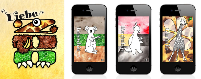
Last year I experimented with illustrating a children’s app for iPhone and iPad called LiebeZoo. In this app you combine animals by swiping through head, torso, and legs — a simple principle but tons of fun for little kids. Of course the app features one of my fonts. The assembled animal names and all menus in the app are typeset in LiebeDoni.
I recently had an opportunity to contribute illustrations and lettering for some product packaging. I enjoyed this work very much and would love to do much more of it in the future. Designing three-dimensional things fascinates me.
Liebe Ruth
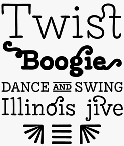
LiebeRuth is a typeface with a casual attitude but a solid work ethic, fusing an organic, natural look onto a substantial, well built structure. A four weight family, LiebeRuth will be particularly well suited to branding and packaging briefs, and will look great at both a huge scale and for more intimate, longer engagements. Its many swashes, stylistic ligatures and neat ornaments mean highly individual designs are, with the help of OpenType capable software, just a couple of clicks away.
Liebe Doni
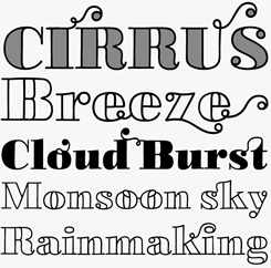
LiebeDoni is Ulrike’s take on the Didone tradition — Italian design classics defined by high contrast, thin slab serifs and a long association with fashion and glamour publishing — and applies a generous dosage of Berlin’s rough and ready attitude. LiebeDoni is more than just a playful variation on an established design: beneath the uneven, sketchy surface is some solid German engineering, with thorough attention to detail and smart thinking apparent everywhere.
LiebeZoo is LiebeFonts’ app for iPhone and iPad that combines existing animals into new ones: Chimlebit, Antpantoo, Kocopard, Jackophant — the possibilities are almost endless. LiebeZoo allows you to quickly switch between seven different languages: English, German, French, Italian, Portuguese, Polish, and Spanish.
As a designer of alphabetic fonts, who are the type designers that inspire you most?
I am a huge fan of Jessica Hische’s lettering work. Her incredible productivity makes me want to take a leaf out of her book, so to speak.
It’s also quite special to have so many fabulous fellow type designers in Berlin who meet up on a regular basis. I consider it a great luxury to be able to meet these other professionals. They are a wealth of inspiration to me. The typography scene in Berlin has grown incredibly in the last few years. This is visible in the growing number of great typography-related events. The legendary Typostammtisch (type circle) is a perfect example. Taking place every two to three months, the Who’s Who of the scene meets up. Everyone is there, ranging from gurus to newcomers and students. There usually is a short talk and afterwards we discuss everything typography and type design. These meetings with like-minded people always help me to feel not too nerdy.
All of your fonts have a hand-made touch. Where does that come from — your predilection for spontaneous and irregular shapes?
I feel magically attracted to hand-made products and designs. Posters, business cards, flyers — these things immediately have more value to me if it looks like they have not been done with a computer.
Early in my studies things were different. Back then I did everything on the computer because I was fascinated by the possibilities. I very rarely did any sketching on paper by hand. But then I went to study in Florence for one semester. It was the complete opposite of my digital habits. I studied painting at the Accademia di Belle Arti and designed nothing on the computer for half a year. So, apart from a taste for La Dolce Vita, I also learned to work manually. Mixing colors, preparing canvases, trying out painting techniques, working with every possible kind of tool — all that was a regular part of the design process there.
Working manually opened my eyes to a whole new world and fundamentally influenced my way of working when I was back in Germany to finish my studies. I started putting much more effort into working with materials in the design process and noticed that the results were suddenly more interesting and much more lively than before.
The same is true for my fonts. I love it that people have to inspect the letters really closely to verify that they were not laboriously written down by someone but instead have been reproduced digitally. I create this effect of course mainly by drawing the letters by hand before digitizing them. Beyond this I sometimes like making an ending a bit thicker, or a line a little shaky, to simulate an irregular flow of ink. There are also many alternative glyphs in my fonts that are swapped automatically via OpenType whenever the same letter appears twice in a row. In my eyes this helps a lot to make the hand-made character of my fonts more credible.
The past few years there has been a strong revival, especially among young designers, of calligraphy and hand-lettering. Do you feel part of some kind of movement? And do you follow what people are doing, via sites such as Behance, Tumblr and Flickr?
I think it is a great movement — back to our roots, in a way. Beyond all the digital media that surround us every day, working manually with pen and ink is very attractive. To me, learning a craft like calligraphy is a crucial basis for designing digital fonts. At university I spent several semesters in the class taught by the master calligrapher, Professor Hans-Jürgen Willuhn. That was fun and I also learned a lot.
Overall I am convinced that going analog is a logical consequence of our being over-exposed to digital stuff. This is a reason why I don’t see myself as being part of a movement or interest group. It just feels very natural to me. I do like checking out calligraphy and lettering works on blogs such as letteringtime.org, lettercult.com, or typeverything.com.
You’ve obviously had a love affair with Italy. Ever thought of moving there?
I go there at least once a year to visit friends and spend my vacation. When I’m in Italy, I don’t only enjoy the good food, but also the wonderful Italian language (which I speak pretty well) and the tradition. In Italy you can still find many historical signs and small shops with great lettering and typography. I love that. But right now I cannot imagine moving there for good, Berlin still feels like home.
Liebe Erika
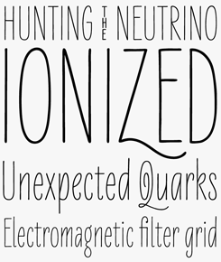
LiebeErika was Ulrike’s first departure from illustrative fonts into “real” typeface design, and was an instant hit. Released in the autumn of 2010, LiebeErika was one of the front runners in the New Wave of Skinny Narrow Type, instantly raising the bar for those who wanted to follow by including a full lowercase set, alternate characters, swashes and several variations of words like “by”, “the” and “of”.
Liebe Klara
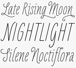
LiebeKlara is LiebeErika’s slanted cousin — not exactly an italicized version, but sharing enough common DNA to make the two of them compatible. LiebeKlara is the more flamboyant, with plenty of swashes, alternative characters and ornamental ligatures. Like LiebeErika, LiebeKlara is also a good traveling companion with excellent support for all Western and Central European languages.
Liebe Ornaments
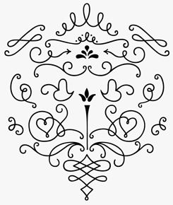
LiebeOrnaments is a down-to-earth set of swirls, loops and swashes. While at first glance these look utterly refined, closer examination shows plenty of charming and personal imperfections typical of Ulrike’s work ethic. A less hands-on designer might have created each shape just once and then used rotate and reflect transformations to produce the extra glyphs; here each one is subtly different and individual.
Users don’t always realize that the visuals on MyFonts’ font pages are not made by us, but by the designers and foundries. Yours are gorgeous. Do you design them yourself?
Thanks! Yes, I always make them myself. In fact, I look forward to that all the time while designing the typeface. After all the tedious work on the core font, it is great fun to design with it and finalize all the fancy swashes and contextual alternative glyphs. I also enjoy discovering how versatile a font can be when used in different ways. And of course I hope that my samples can be a source of inspiration for my MyFonts customers.
Liebe is German for “love”, and as an adjective it means “sweet” or “dear”. You must be a very romantic person! Speaking of names, who are Erika, Klara and Ruth?
The name LiebeFonts is meaningful to me in more ways than one. On one hand, my fonts obviously look “sweet” — in other words, friendly and lovable. And of course the name also refers to my own love of fonts. I don’t really think the name has much to do with whether I am romantic or not…
As for the female first names, up to now I have mostly wanted to honor some of my relatives. My grandmother, for instance, is called Erika. And because she doesn’t really understand what I do for a living, she can at least appreciate that I have dedicated something to her.
Liebe menu & liebe menu lettering
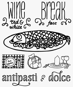
LiebeMenu and LiebeMenuLettering are two of Ulrike’s most popular pictogram fonts, showing off her skill, wit and imagination in both lettering and illustration.

Two examples of Ulrike’s blackboard lettering (no font! all done by hand!) from a series advertising popular Berlin snacks.
Your alphabets and picture fonts seem to be ideal for use on products from textiles to mugs to notebooks. Have you seen them used a lot in this way? Have you considered starting your own line of products?
Once in a while I discover logos, pictures or posters that were designed with my fonts. This is always very exciting. I find it so thrilling to see how people use my typefaces. What is a pity, though, is that most of my fonts sell overseas, so the chances of discovering my fonts in the wild are rather slim. Sometimes people send me their creations, that always makes my day.
Having my own range of LiebeFonts products would be perfect. I would absolutely love to do that. But first there are some typefaces to finish. There are so many ideas in my drawer.
Many budding designers seem to think that making a font — especially a script font — is simply a question of scanning and tracing a handmade alphabet, and putting each character in the right slot. You’ve been much more professional right from the start, drawing smooth curves, inventing witty ligatures, adding OpenType programming. So, what do you think is needed to make a good typeface?
I find it kind of frustrating when people think that they can make a hand-made looking font as a side project in two or three days. Of course it is possible to make a font with little effort. But the font is not done when all the little boxes have been filled — that’s actually where the real work starts. People are usually stunned when I tell them that developing a typeface, from the first sketches to the final OpenType font, takes me half a year!
Of course there are tools that will make a font in the blink of an eye. You can probably find the results of those on free font websites, if you are looking for that level of quality. These fonts are not necessarily badly drawn, but in my experience most of them have bad kerning and a very limited number of glyphs. The more exotic characters, if they’re there at all, did not get a lot of love or are just plain wrong.
It is very important to me that my fonts serve a wide variety of languages so that they are suitable for professional typesetting. I also invest a lot of time into sensibly grouped OpenType features like contextual and stylistic alternates as well as a wide range of ligatures and swashed letters. By the way, since I have started using Georg Seifert’s font design program Glyphs about two years ago, font production is way more fun. It has never been as easy as today to get the last production steps right. But it still is a complex endeavor.
As a type designer you need strong discipline and a lot of patience. You can only finish a typeface if you have a passion for detail.
Thanks for your words of wisdom! We’re curious to see the contents of that drawer.
Liebe Kitty
Liebe Fish
Liebe Robots
Liebe Cook
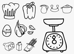
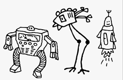
Before trying her hand at conventional alphabets, Ulrike was busy building up a library of imaginative and spirited pictogram fonts. Food is clearly a passion, as are animals and characters, but she also has a good sense for usefulness too, witness the collections geared towards Twitter users and for holiday celebrations.
MyFonts is on Twitter and Facebook!
Join the MyFonts community on Twitter and Facebook. Tips, news, interesting links, personal favorites and more from MyFonts’ staff.

Who would you interview?
Creative Characters is the MyFonts newsletter dedicated to people behind the fonts. Each month, we interview a notable personality from the type world. And we would like you, the reader, to have your say.
Which creative character would you interview if you had the chance? And what would you ask them? Let us know, and your choice may end up in a future edition of this newsletter! Just send an email with your ideas to [email protected].
In the past, we’ve interviewed the likes of Sibylle Hagmann, Laura Worthington, Melle Diete, Veronika Burian, Ronna Penner, Vera Evstafieva, Alexandra Korolkova and Elena Novoselova. If you’re curious to know which other type designers we’ve already interviewed as part of past Creative Characters newsletters, have a look at the archive.
Colophon
This newsletter was edited by Jan Middendorp and designed using Nick Sherman’s original template, with specimens and type descriptions by Anthony Noel.
The Creative Characters nameplate is set in Amplitude and Farnham; the intro image features LiebeErika, LiebeDoni and LiebeRuth; the pull quote is set in LiebeRuth Light; and the large question mark is in Farnham.
Comments?
We’d love to hear from you! Please send any questions or comments about this newsletter to [email protected]
Subscription info
Want to get future issues of Creative Characters sent to your inbox? Subscribe at www.myfonts.com/MailingList
Newsletter archives
Know someone who would be interested in this? Want to see past issues? All MyFonts newsletters (including this one) are available to view online here.

