This quarter brings us a very impressive number of designers and foundries new to MyFonts, and releases from many already-established MyFonts designers.
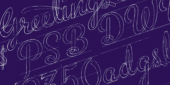
We are especially proud to have the very talented letterer and type designer Michael Doret in our catalog. As Alphabet Soup, Doret has transformed some of his most popular and successful lettering designs into full-featured OpenType fonts; his Metroscript, with its hundreds of ligatures and alternate characters as well as a full range of tails, is one of the most attractive and useful advertising scripts in years. Strongly informed by the lettering of baseball logotypes and the advertising scripts of the 1930s and 40s, it works in a wide variety of applications and when set well looks classical but never dated — indistinguishable from well-done hand lettering.
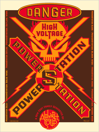
The solid and masculine PowerStation, available in multiple weights, styles, and widths, can have its various iterations stacked to add contrast and give the illusion of depth. It’s especially useful for 2- and 3-color spot work, making it an easy workaround for any designer who has struggled to generate eye-catching type effects with a limited color palette.
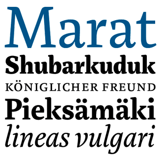
Principal Ludwig Übele is the designer of the excellent award-winning text face Marat (it received a Certificate of Excellence in Type Design from the TDC this year) and the incised, edgy Mokka. Both include multiple weights, italics, small caps, and various OpenType features including a wide range of language support.
Hubert Jocham’s graphic design degree and early experience with metal type sparked an interest in typography that has never died down. Currently, Jocham designs type and branding marks for leading branding agencies, and has produced display and text families for numerous international magazines and publishing houses, as well as what promises to be a steady stream of type which he markets and sells here at MyFonts.
His first releases are the feather-like and expressive script Schoko, the sharp- edged Rudoph, and informal angled types like Drop and Schwung .
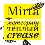
Active and well-known since the mid-90s as a print and interactive design agency in Moscow, Art. Lebedev Studio has recently begun to release original display type. They come to MyFonts with a number of attractive and useful display faces, most of which include Cyrillic and Roman alphabets. Their first eight releases with us include Argus, an intricate and friendly decorative script; Mirta, a high-contrast slab- serif text face, and several edgy and modern sans families.
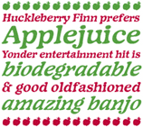
Per Baasch Jørgensen’s foundry is Jorgensen-fonts, and their first MyFonts release is Applejack, an accessible and friendly display face with a sort of smoothed-out roughness that makes it especially appealing for children’s books and youth-oriented advertising.
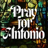
Polish-born Thaddeus Szumilas, a Parson’s graduate, has worked with a number of great designers, including a stint at Lubalin, Smith & Carnase. Teaching at Brooklyn ’s Pratt Institute for the past 10 years, his interest in type has never waned, and he’s constantly been working on both text and display faces.
He recently joined MyFonts as Thaddeus Typographic Center with ten releases, among them Agitas Gallery, a stylized and modern take on English blackletter; several distressed scripts, most successful among them On The Line; and Stigmal, a bold and stylish display face with some science fiction influences.
Wordshape is a small boutique foundry — designing type for private clients and public sale — based in Tokyo; recent clients have included Nike, Adidas, Conde Nast, Boeing, Bon Appetit and others.
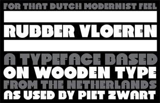
Their first two releases available here at MyFonts are the long-awaited revival Cooper Black Swash Italic, which Oz Cooper fans have been awaiting for years, and the bold, sharp-edged Rubber Vloeren, a heavy geometric display face adapted from original drawings by Piet Zwart.
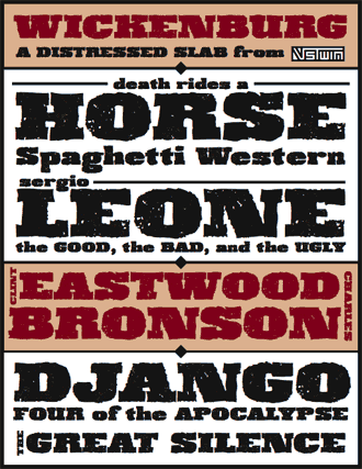
VersusTwin is a partnership between Astigmatic’s Brian Bonislawsky and type and apparel designer Brian Jaramillo; their first releases are the detailed and distressed slab face Wickenburg, and the heavy flare-serif family Sistine, whose extensive styles and weights include a stencil style, narrower widths, various ligatures and a number of stylistic alternates.
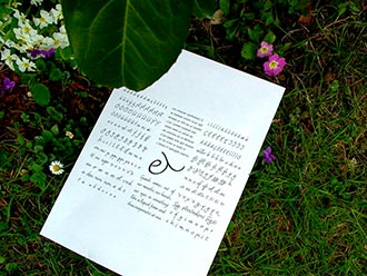
Anatoletype has three exciting releases from Elena Albertoni: the subtle monolinear connecting script Dolce, loaded with alternates and ligatures, which won a TDC Certificate of Excellence in 2005, while the richly-featured Dyna has a more varied rhythm and also includes a large variety of ligatures. The third, Kigara, is a light and subtle sans with a humanist flare that looks almost hand- lettered; it comes with a large character set and a number of ligatures.
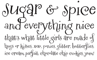
Letterer and illustrator Crystal Kluge, aka Tart Workshop, brings us four new faces and the promise of many more. Her playful Henparty Serif and Sans are fun, outgoing faces that don’t need to sacrifice readability for character, and her other work — Silverstein specifically — has lots of motion and enough alternates to keep the illusion of handwriting alive. No wonder, as Kluge has relied on collaborator Stuart Sandler, of Font Diner fame, to ensure that the designs are well-produced, useable and useful.
Crystal Kluge’s charming lettering and designs have graced magazine pages, a multitude of giftware & stationery products, advertising campaigns, logos & store fronts, art museum walls, and an eclectic range of special events from swank Hollywood parties to an intimate mountain wedding in a yurt.
Other new foundries include ActiveSphere, who so far have produced some very clean extended, space-age display faces; Ramiz Guseynov’s TipografiaRamis; London-based designed Jonathan Sleeman’s foundry, The Tree is Green, brings us his first face, the distressed and perspective-heavy Road Art; Fascination Workshop’s useful and surreal picture fonts; the Nouveau & Deco-influenced JAB'M foundry; Ukraine’s 4th february; Andrejs Grinbergs, chief typographer at the Latvian software firm Tilde, whose typeface development wing specializes in Eastern European and Cyrillic localizations of designs licensed from Bitstream Inc; and phospho, whose first release is an especially attractive distressed blackletter. Gilles Le Corre, a French artist and lettering aficionado, comes to us with several faces, mostly distressed blackletter revivals; Sideshow’s novelty faces and revivals include the three-style Creaky family and the useful frame fonts in the Certified Series; Moona Niederdorfer’s moon8ype has one release, the hand-drawn roman display face Mamma Mia; Gasoligne’s first three releases with MyFonts range from the classical Trajan- inspired Consortium to the sci-fi Korsen; and Maximiliano Sproviero’s Lián Types foundry rounds out the last several months’ worth of new releases and new foundries with thirteen faces, almost all of them calligraphic.
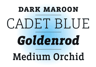
Of course, many already-established MyFonts foundries have produced notable type since our last issue. Some recent releases are especially impressive: trailblazers Emigre have added the attractive richly-featured Vista Slab to their Vista meta-family, and talented designer Alejandro Lo Celso brings us Arlt, a large and complex Latin- and Czech-inspired text and display family via his foundry PampaType.
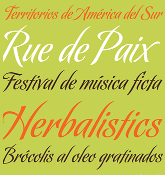
Sudtipos, the Argentinean foundry best known for the work of superstar script designer Alejandro Paul, has two new scripts — as full featured, well-produced and finely- tuned as all their releases. Paul and frequent collaborator Angel Koziupa give us Koziupack, a slightly edgier and more rigid exploration of their usually wild and organic themes, and Oxida, a sharp, fine script with a slightly worn edge, a contrast to the usually razor-sharp lines of Koziupa’s lettering.
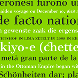
Japanese foundry Flat-it brings us Rebel Train Goes, a modernist western wood type, if you can imagine that. Jeremy Dooley’s Insigne foundry, another long-time partner with MyFonts, introduces a serif component of their growing Aviano family of display faces, and Club Type bring us Poseidon, a rhythmic condensed text face with strong slab serifs. Jelloween’s new Vinegar Pro is a rigid, masculine display roman — Tjarda Koster’s original design is strongly influenced by the Bodoni tradition of Italian type and includes “a wide range of sexy ligatures, lining & old style numerals.”
Chicago-based T-26 has 19 new releases, including Quean, a fluid advertising script in two weights by Michael Parson; Tipos Reunidos’ Cobalt, a squared-off modern stencil family; and Hannes von Dohren’s Shelton, which includes multiple alternates for each character to maintain the look of mismatched, well-worn wood type printed letterpress. Also freshly minted by T-26 are several useful picture fonts: Retro Traveler , the very cute Pawpack & Palpack, Will Scobie’s modernist cartoon face font Faced, and Cake Walk, by Thai design group Cadson Demak Pi — the last a must for any typographically- inclined baker or designers doing much work for restaurant and hospitality industry clients.
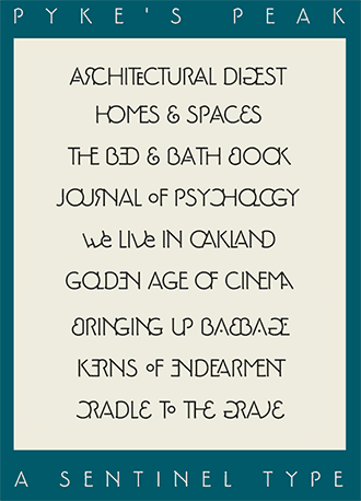
James Arboghast’s Pykes Peak is a bit of an odd fish. A mix of formal Roman forms and architectural lettering with an art deco twist, it’s an awful lot of fun to play with. Loaded with over 500 characters, including “(m)irror capitals, phantom forms, dot phantoms, ‘superposed’ (overlapping) ligatures, capitalized ligatures and fitted pairs,” it has support for a 14 languages and comes in both the fully-loaded “pro” version, for $30, and a free version — Pyke’s Peak Zero — that does not include all the bells and whistles.
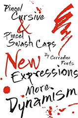
This has been an excellent few months for scripts, with a number of attractive and very useful new faces in addition to the two Sudtipos faces noted above. Corradine’s Pincel, a whole family of related informal brush lettering styles accompanied by two entire fonts’ worth of spatters and flourishes, is dynamic and expressive; the same designer, Manuel Eduardo Corradine, also recently released the Abuelito family, a much more controlled and formal — but still obviously handmade — script. Canada Type’s Mullen Hand is a revival of the 1953 ATF release Repro, originally designed by Jerry Mullen; Canada Type has, of course, added a large number of ligatures and alternates, as well as language support for many European and other languages. Mexico’s JonahFonts’ newest release is Lyanna, a free-flowing connecting script especially well-suited to large settings. John Bomparte, who learned the game under Ed Benguiat, brings us the very fashionable upright monoline Johnny Script; Michael Clark, via IHOF and P22, brings us Sneaky, a pretty, high-contrast connecting script which is a “sibling of his popular Pooper Black type which shares a similar flow and casual elegance” — the two share a number of details and a common size, and may be mixed and matched to great effect.
Other new script releases include Schriftgestaltung’s interesting Rosa Stencil, Georg Seifert’s somewhat industrial take on Spencerian script. Rob Leuschke, master of the calligraphic brush and a terrific type designer in his own right, has GreyQo, the very leafy FleurDeLeah, and the edgy, muscular MySoulOne; Insigne ’s Kasuga is a “contemporary Oriental script” in two weights, merging the sharp and open forms of some Asian pictorial art and calligraphy with bamboo and other natural forms.
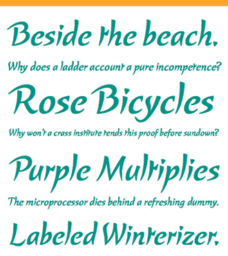
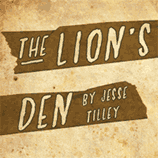
There are also a number of new additions in various handwritten styles, some of which can be called scripts and some of which can’t. Jesse Tilley’s Lion’s Den is an upright condensed all-caps face inspired by the movie posters of the 1940s, while Robbie de Villiers’ Ziro is almost its stylistic opposite, low and wide where Lion’s Den is tall and narrow. Ziro is equally influenced by contemporary comic lettering and graffiti; edgy but extremely readable, it includes two sets of unicase characters in order to emulate a more natural handwriting effect. Wilton Foundry’s designs tend to be a bit more formal and far more classical than Ziro, and it ’s refreshing to see that de Villiers brings that same technical virtuosity to this much more informal project.
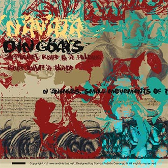
Andinistas’ Navaja faces — each release a pairing of a dingbat and sometimes unidentifiable alphabet — are experiments in controlled chaos, as many of their releases are; Blambot’s Sangre is a tall and narrow — but definitely informal — “handwriting font with a decidedly sexy, Mediterranean flair,” and includes “a plethora” of European characters. Finally, Chank, the free-fonts pioneer, brings David Art Wales’ 1999 bouncy and childlike design Naughties to MyFonts.
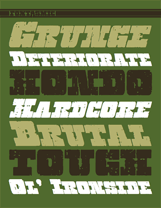
Several notable distressed faces have also been made available, including two interesting clean / dirty pairings: Fontasmic’s Hondo and Hondo Grunge, and Phat Phonts’ Carbon Tax and Carbon Credit, which could more accurately be called a dirty/really dirty pairing. Other dirtied-up faces include Typodermic’s Teeshirt, which has been through the wringer a few times; 066.font’s Old Stefan, probably the most complete clogged / broken typewriter font made, and Mark Simonson’s masterful and subtle Metallophile Sp8, which has recently been updated.
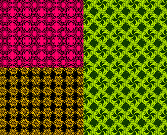
In addition to T26’s several already-mentioned new picture fonts, other foundries have also contributed a number of icon & picture faces, all of which are useful, fun or otherwise interesting. Outside the Line’s Fruit & Veggie Doodles, Food Doodles Too and Home Sweet Home Dingbats are all useful for spot illustrations and icons; Okaycat’s Little Japan and Lolo Animals are whimsical and cute; Outras Fontes’ Gaia would be great for building patterns and borders, and Fonthead’s Infobits Things & Infobits Symbols are a great addition to their already very-useful and complete bits series.

Never buy type simply based on the name — you might not get what you expected (thanks to Hoefler & Frere-Jones); Steven Sagmeister’s body-modifying typomania might be contagious; the UK’s finest letterer / sculptor / stonecutter / printmaker / type designer has lost his chance to have a new road named after him, after his (well-known in some circles) sexual exploits came to light — and let that be a lesson in discretion for young folks on MySpace and Facebook.
 For those with a traveling jones, SOTA invites you to attend TypeCon 2008 from July 15 to 20 in Buffalo NY; ATypI extends an invitation to their annual conference, this year in St. Petersburg, Russia, from
September 17 to 21, and the AIGA extends an invitation to practicing designers, educators and students to their 2008 Business and Design Conference, October 23 to 25 in New York City.
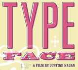
Finally, please do take a few minutes to check out the Typeface documentary from Justine Nagan and Kartemquin Films. The film is a work in progress, exploring the people and work of the historic Hamilton Wood Type & Printing Museum in Two Rivers, Wisconsin. The factory is, unfortunately, threatened by large-scale shifts in American manufacturing industries; hopefully the film will help raise enough awareness to keep this wonderful graphic arts resource and piece of design history open and working. We look forward to seeing the final product!
[email].
If you no longer wish to receive this newsletter, you may change your subscription settings at: http://www.myfonts.com/MailingList
