elcome to our June newsletter — another Rising Stars dominated by script fonts. A script font is like a personal voice, and if you want to impersonate different kinds of talkers — solemn or cheeky, bubbly or sloppy — you may want to put together an entire collection of them. With the affordable prices many foundries offer, that’s what a lot of our users do. They have discovered that collecting fonts can be fun! Of course, some fonts are more sophisticated than others; so if you want to add a classy touch to your work, don’t forget to look beyond the basic font samples. Many fonts have a downloadable PDF that you can zoom into to check if the curves are smooth enough for your taste. Enjoy!
This month’s Rising Stars
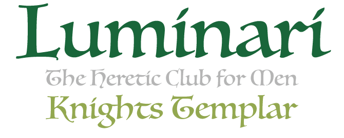
Philip Bouwsma’s Luminari is the result of thorough historical studies, but it is not a reconstruction of one particular calligraphic style. Luminari is a clever combination of different medieval scripts, from ornate Church penmanship to the simple Carolingian invented for day-to-day writing under Charlemagne’s rule. The minuscules also show some influence from the early fifteenth century — the handwriting of the humanist Poggio Bracciolini. The result is a calligraphic typeface with a distinct, eclectic look, combining economic round forms with angular “gothic” styling.
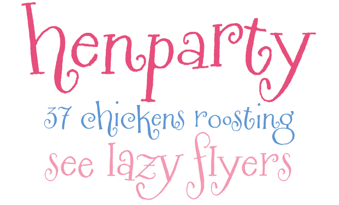
A recent addition to MyFonts’ list of foundries is the Tart Workshop, a venture of Minneapolis lettering artist and illustrator Crystal Kluge. Her charming lettering oozes fun and wit, and some of it is so irregular and whimsical that it would be a shame to try and drill it into a well-behaved font. But for some of her alphabets it works brilliantly: with the help of the prolific Stuart Sandler, they were transferred to the OpenType format. Using OT here has a great advantage. For instance, when you type “ee” in a program that supports OpenType functionality, you get a ligature of two different e’s, jumping up and down along the baseline. Henparty Sans and Henparty Serif were originally designed for an online tea store for chicks. Both fonts are ideal for kid projects, scrapbooking, and much more.
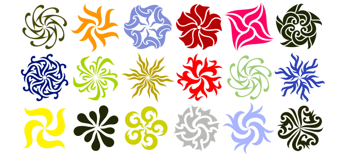
After the beautifully idiosyncratic Jana Thork, Brazilian designer Ricardo Esteves Gomes has now released his first dingbat font. Gaia is a dazzling series of ornaments, each of which can be used as a single form or as a part of a graphic pattern. Combining and repeating these swirling shapes in different hues can result in stunning optical effects.
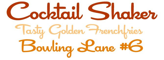
Designing a connected script that works really smoothly is a job for specialists, and Cocktail Shaker is a job well done. Stuart Sandler has managed to make virtually every letter combination look natural and tasty. While the lowercase characters form a calmly undulating chain of connected shapes, with just a few tactfully placed interruptions, the capitals stand alone — and it works perfectly. These are not swash initials, and when used with care they even function in all-caps setting. Cocktail Shaker combines playfulness with clean readability and a twist of Atomic Age retro-futurism.
Text family of the month
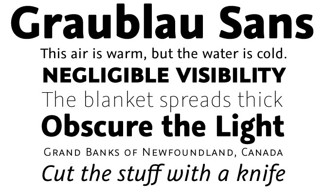
There is a kind of new wave of great new text typefaces from German designers happening this spring: after Marat and Haptic, this month’s most successful text font is Graublau Sans Pro by Georg Seifert.
An earlier version of Graublau caused a stir a while ago, being one of the first free fonts specially made for embedding in websites. The full family, Graublau Pro, is not free but it has considerably more to offer. It took Seifert five years to complete the family. With 7 weights and over 1000 glyphs per style, the new sans-serif is an impressive type family that suits a wide array of typographic needs.
Graublau means “grey-blue” and, like this color, the typeface’s upright styles evoke the clean coolness and neutrality of modern offices. The difference is in the italics. Derived from handwriting, they stand out by their lively design and human appearance.
The character set is truly professional: it supports many languages and includes Greek and Cyrillic. Graublau Pro comes with several sets of figures, beautiful small caps and lovingly designed ligatures. For use in headlines and logotypes, there is a special Display version with rounded corners and tighter spacing.
After last year’s OliveGreen Mono and the recent Rosa Stencil, Graublau Pro is another proof that Georg Seifert is a type designer to be reckoned with.
Follow-Up
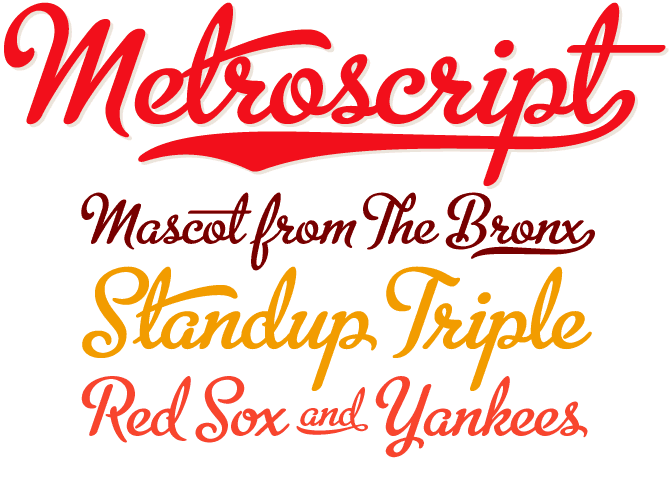
Featured in last month’s Rising Stars, Metroscript is one of the most complex digital script systems on the market. It uses OpenType functionality to successfully emulate hand-rendered brush script lettering. Considering its level of sophistication, its price is more than reasonable; but it isn’t cheap. So we were happy to see that quality pays off: Metroscript has remained one of our most successful new fonts throughout May. With its wealth of ligatures, swashes, alternates, foreign accented characters and tails — all of which connect seamlessly — Metroscript is a joy to play with, and it might be just perfect for that soup packaging, sports magazine, or summer camp signage project.
If you liked this font by Michael Doret’s Alphabet Soup foundry, check out his other fonts:
Orion MD
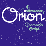
When Michael Doret picked up the enamel sign that inspired Orion while strolling through a Paris flea market, he realized these were letterforms that connected in a way that he had never seen in a contemporary digital font. And so he fleshed out the sign’s seven letters into a complete typeface. It’s one of those Deco alphabets that are geometric without seeming calculated. Charming and communicative, it’s a font that builds instant logos.
PowerStation
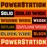
Power Station is an impressive display suite full of hidden possibilities. Originally conceived as part of a design for Hershey’s flagship store in New York, the PowerStation family comes in two “three-dimensional” versions. In Block, the dark side is dominant; in Wedge, you see more light than shadow. Besides the Plain, Solid and Outline varieties, each version also offers additional High and Low fonts for suggestive layering in two colors.
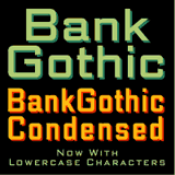
Bank Gothic AS
Bank Gothic has been a longtime favorite for corporate identities and magazine design; but for over 70 years it was uppercase-only. Michael Doret felt that a set of lowercase characters would greatly enhance the typeface’s usability. He carefully drew the lowercase alphabets, constantly mindful of the impressive work of its original designer, Morris Fuller Benton.
Have your say
— Kiwi from Bali, USA
8 May, 2008
Your opinion matters to us! Feel free to share your thoughts or read other people’s comments at the MyFonts Testimonials page.
Font credits
The Rising Stars masthead and subheading are set in Auto 3 and Bryant, respectively. The drop-cap M in the introduction is set in Sciptofino, and the “Have your say” quotation in Graublau Sans Pro. The small pixel typeface used at the very top is Unibody 8.
Unsubscribe info
This newsletter was sent to [email]. You may unsubscribe at any time at: www.myfonts.com/MailingList
Want more?
All of our previous newsletters are available online at myfonts.com/newsletters/
Comments?
Please send any questions or comments regarding this newsletter to: [email protected]

