hese are tempestuous times. While the world is discussing the outcome of presidential elections and financial turbulence, we at MyFonts have no other ambition than to make your life easier and typographically more interesting. This month’s very welcome key word is “affordable.” Some of our designers are extremely generous this month — we say no more. Have a look and take your pick.
This month’s Rising Stars
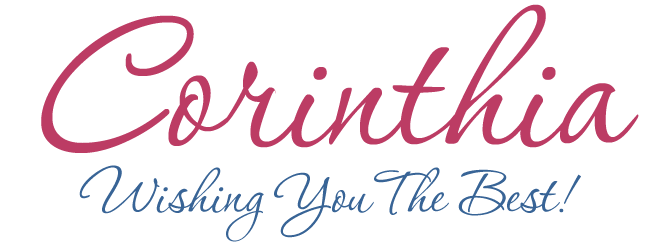
Rob Leuschke’s foundry, TypeSETit, describes their current best-seller Corinthia in just two words: “Elegant font.” That’s something of an understatement. Like all of Leuschke’s scripts, Corinthia displays the designer’s dazzling craftsmanship, acquired while working at Hallmark Cards and as a designer of custom fonts and lettering. Corinthia is gracious and more formal than some of Leuschke’s other steady sellers such as Inspiration and Ambiance, but it is never stiff or stuffy. It connects beautifully into a confident cursive flow. A perfect script for invitations or classy packaging.
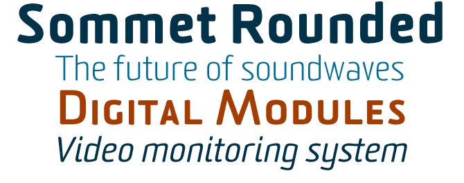
Earlier this year the insigne foundry presented Sommet, Jeremy Dooley’s take on the popular model of the computer-age simplified sans-serif. Sommet Rounded, the new variant, enhances the typeface’s retro-futurist feel by rounding off the terminals. Sommet Rounded does not look very different from its predecessor — its condensed, squarish silhouette and angled horizontals are immediately recognizable — but the overall impression is friendlier and less formal. In a layout requiring a wider range of type styles, the new variant can be easily mixed with the original Sommet. It has several figure styles as well as small caps, which you won’t find among the font’s OpenType functions — but they’re there!
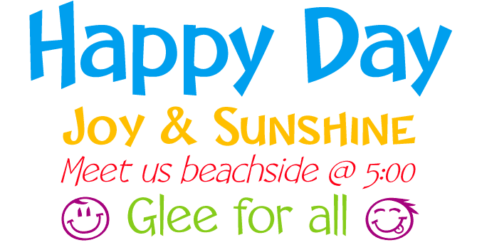
Columbian designer Manuel Eduardo Corradine has been hugely successful with his recent bunch of releases. His informal scripts Memoria and Salpicon are doing very well and Happy Day is one of this month’s absolute best sellers. With its range of weights and shadowed versions, the Happy Day family gives you access to the kind of crazy comic-book alphabets ideal for kids’ projects or scrapbooking. You can use the Black version as a “filler” for the Black Shadow, although that requires some tweaking: they aren’t designed to line up seamlessly. The festive dingbats are ideal for adding pizzazz to any birthday party invitation.
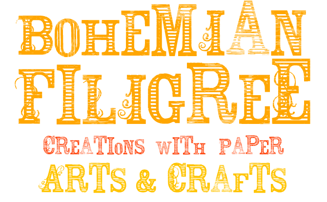
Bohemian Filigree is, as they say, a beautiful mess. Its 19th-century-style capitals and numerals show signs of wear and tear in various degrees and directions of corrosion. The upper- and lowercase sets are whimsical collections of letterforms that may be large or small, light or dark, straightforward or ornamented. This can be great fun if you like surprises, and will no doubt lend a sense of Bohemian anarchy to your greeting cards, newsletters, scrapbook journaling, and other desktop publications.
Text family of the month
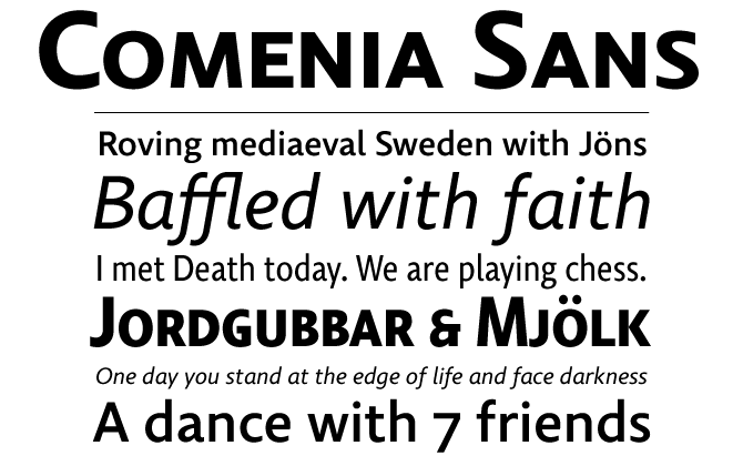
Comenia Sans is Tomáš Brousil’s first new release since we interviewed the young Czech designer in July. Like all releases from his Suitcase foundry, it is a beautiful and very thorough piece of work. Originally drawn as a sans-serif companion to František Štorm’s Comenia (which will soon be available from MyFonts), Comenia Sans is also a great stand-alone text and display face. Its open counters, overall roundness and relatively wide italics make it extremely legible even in very small sizes. At display sizes, Comenia reveals interesting little details, which lend it its unique character without compromising legibility or utility. Comenia Sans Italic has several shapes that derive from the hand-written heritage, so that italicized words stand out not just by their slope, but also by the shapes of the letters themselves. As is standard practice at the Suitcase Type Foundry, Comenia Sans has extensive language sets with carefully placed diacritics, small caps, mathematical symbols and several types of numerals. The family also contains six condensed styles for striking, space-saving headlines.
Follow-Up
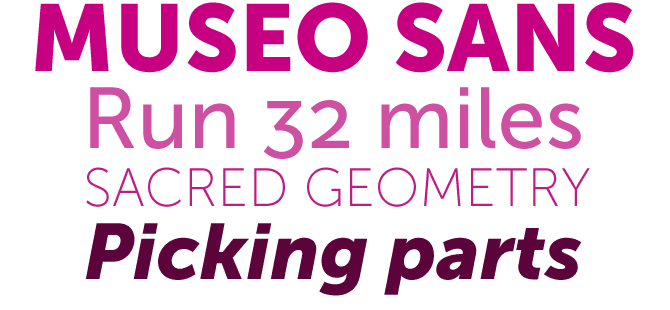
Dutchman Jos Buivenga’s Museo Sans has been at the top of our Bestsellers list for most of October. A geometric sans-serif with some characteristics borrowed from the humanist sans model, it is as clean and clear as they come. It is also very affordable and has very nice oldstyle figures…
If you like this font by exljbris, check out their other typefaces on MyFonts:
Museo
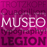
Museo is the spirited semi-serif family that preceded Museo Sans. It is based on the same open, geometric structure, but has unusual, highly original details. Thanks to its asymmetric serifs it makes for striking headlines; it is also very readable in medium-sized texts.
Anivers
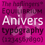
Anivers' whimsical shapes evolved out of Museo’s, although it took major tweaking and redrawing for one font to become the other. According to designer Jos Buivenga the font is “robust and rigid, forgiving, flexible and elegant.” It is especially suited to be used big in magazines and on posters.
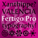
Fertigo Pro
MyFonts regularly receives emails summoning us to give away more fonts for free. Although this is not as great a business model as some may think, with the help of our designers it does sometimes become possible. And if a font is as lovely and well made as the calligraphically inspired Fertigo Pro, then why not show the designer your gratitude by buying some of their other fonts?
Have your say
— Jo in Adelaide, Australia
9 October, 2008
Your opinion matters to us! Feel free to share your thoughts or read other people’s comments at the MyFonts Testimonials page.
Font credits
The Rising Stars masthead and subheading are set in Auto 3 and Bryant, respectively. The drop-cap T in the introduction is set in Tomate, and the Have your say quotation in Comenia Sans. The small pixel typeface used at the very top is Unibody 8.
Unsubscribe info
This newsletter was sent to [email]. You may unsubscribe at any time at: www.myfonts.com/MailingList
Want more?
All of our previous newsletters are available online at myfonts.com/newsletters/
Comments?
Please send any questions or comments regarding this newsletter to: [email protected]

