It has often been noted that the best general-purpose typefaces are those that were made with a specific function in mind. Purpose-driven thinking has produced successful “no-nonsense” sans-serifs such as DIN, a great new incarnation of which is introduced in this newsletter. But even fancy display type may owe its inspiration to specific circumstances and precise briefings. The story of Memoriam, told below, is a case in point. And those are just two of a bunch of inspiring new faces that make up this May newsletter. Enjoy.
This month’s Rising Stars
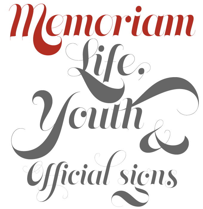
Each December, the last issue of New York Times magazine is dedicated to the people who passed away during the year. For the 2008 issue, art director Nancy Harris Rouemy commissioned Canada Type’s Patrick Griffin to design a new typeface especially for that project. Based on ideas found in the foundry’s Jezebel and Treasury typefaces, Memoriam decidedly takes a more luxurious approach, tapping into an elegant and contrast-rich brand of poster calligraphy. A great success with the editors and designers, the typeface ended up being used all over the magazine instead of just the cover – and, at the request of many, is now available for retail.
Memoriam contains a lot of alternates, so it was divided into three separate fonts for the Postscript and True Type formats. The OpenType version, Memoriam Pro, combines all three fonts, plus some extras, in one OT-programmed file.
A warning, though: due to the extreme thinness of the hairlines it is recommended to use Memoriam at large display sizes only.
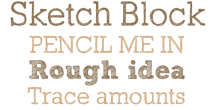
Sketch Block is based on a clever concept – not new, but smartly executed. It is basically a bold slab serif (or block serif, hence the name), hatched with a marker or ballpoint pen. Its effect resembles the mockups that art directors used to make to simulate display type: by hand-sketching the type exactly the way they wanted it set. As Sketch Block closely follows the shapes of the most famous and streetwise slab serif of all, Rockwell, it is a natural display companion to that font family. It works well as a standalone solution too, and the Light version is surprisingly readable at small sizes.
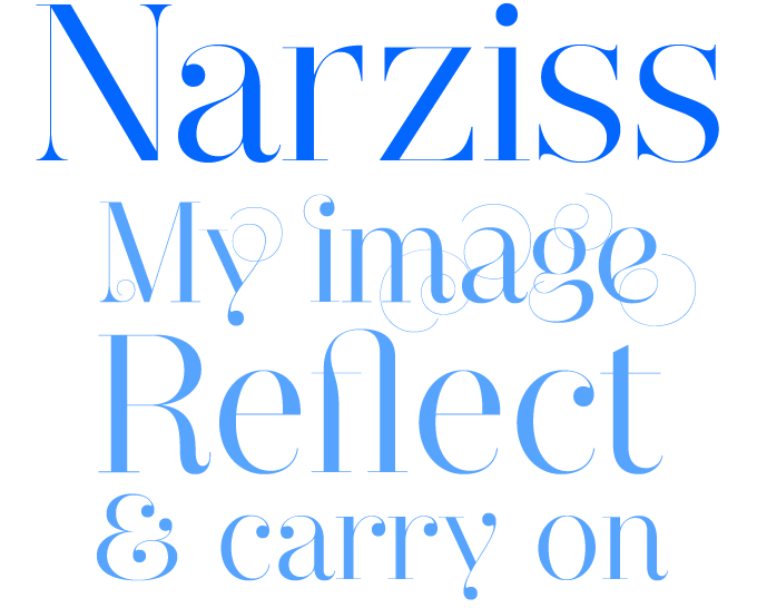
German designer Hubert Jocham is well known in the international magazine world for his luscious hand-lettering. He also made custom typefaces such as Mommie, which he originally drew for fashion magazine L’Officiel. After making Mommie, Jocham got more into swirly ornaments – an interest which is apparent in his latest offering Narziss. Not unlike Memoriam above, Narziss explores the extreme contrast of the neoclassical style, with thin hairlines and whimsical details. Choose the Drops style if you like ball terminals, and Swirls if you prefer your headlines curly. And use it big!
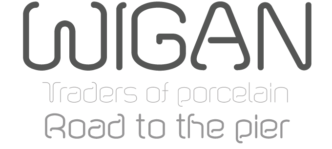
Wigan by Bulgarian designer Svetoslav Simov is a constructed display face with a distinctive 1980s look. In spite of its simple and modular structure its has a certain playfulness about it, and as geometric typefaces go Wigan is more human and charming than most. With its retro-futurist look, it is easy to imagine Wigan used to full effect on techno party flyers or game packaging; but we wouldn’t be surprised if it soon starts gracing art catalogues, motion graphics or T-shirts as well.
Text family of the month
The DIN typeface has a long history, which goes back to the lettering of the Prussian railways around 1900. In the 1920s, the railways alphabet became part of that thorough German system of standards known as DIN (for Deutsches Institut für Normung, or German Institute for Standardization). From 1936 onwards, DIN 1451 was the standard type of lettering for road signage, described as “a style of lettering which is timeless and easily legible”.
Designed in an era when most signage was hand-painted by anonymous workers, the original DIN alphabets are fool-proof: monolinear, geometric, easily made with ruler and compass. In order to use DIN as a text face, drastic optical adaptations need to be made.
That is exactly what the Parachute foundry from Greece has done with their PF Din series. Based on the original standards, it was completely redesigned to fit typographic requirements. Besides the standard version, the series includes condensed, compressed, and display versions, with true italics for all. Upon its release in 2003, PF Din became an instant hit.
New to MyFonts are the improved Pro versions, enhanced with more weights, multilingual support and OpenType features in all styles. With its wide range of weights and widths, extensive language support (including Greek and Cyrillic) and additional copyright-free symbols, the PF Din Pro series is an impressive superfamily — a versatile tool for corporate design, branding, signage and editorial design.
Follow-Up
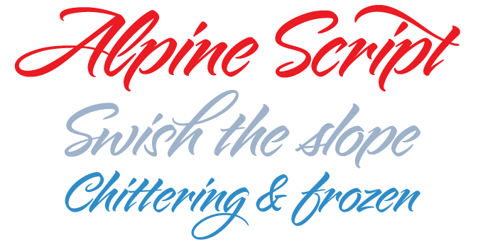
Alpine Script from lettering artist Charles Borges de Oliveira is one of the most successful brush script fonts we’ve seen in a while; it is also one of the most charming. It’s got dash and confidence. With its 30 alternate characters it allows the user to personalize the look of a headline or logo. A beauty!
If you like this font from Borges Lettering & Design, check out some of their other fonts:
Sarah Script was one of Charles’ earliest fonts, designed because he “could not find a script font like it.” Sarah is a cheerful, sassy and wonderfully drawn.
Enchanted mimics the style of handwriting and brush scripts; yet it is neither. The letters do not connect, and in spite of its nonchalant hand-drawn shapes
Bounce Script has the structure of a cursive script, yet it is so upright that is almost leans backward. The font has an appealing “bounce” characteristic which gives it its charm.
Sponsored font
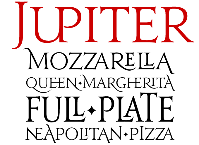
Jupiter from Canada Type was one of MyFonts’ typefaces of the year 2007. Inspired by the monumental capitals of ancient Rome, Jupiter recreates the alphabet of Roman antiquity in a way that no other printing typeface ever has. Designer Patrick Griffin provided the font with an unprecedented number of variations and ligatures, and thus presented the design world with a splendid, useful alternative to Hollywood’s default titling font, Trajan. Jupiter Pro, the OpenType version, uses programmed features and stylistic sets to combine all these alternates to splendid effect. Thanks to the new Condensed version, the Jupiter family has now become even more versatile and flexible.
Have your say
— DJ (former Letraset designer) in London
14 Apr, 2009
Your opinion matters to us! Feel free to share your thoughts or read other people’s comments at the MyFonts Testimonials page.
Colophon
The Rising Stars nameplate is set in Auto 3 and Bryant, and the Have your say quotation in PF DIN.
Subscription info
Want to get future MyFonts newsletters sent to your inbox? Subscribe at myfonts.com/MailingList
Comments?
We’d love to hear from you! Please send any questions or comments about this newsletter to [email protected]


